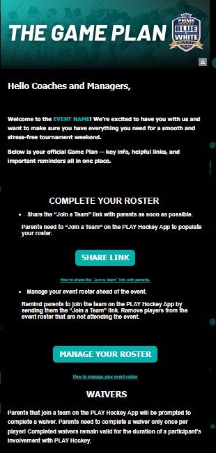
Clickfused
Email Review
“Email us”
Kopi AI analysis from May 10, 2026
The email snippet is a functional utility block but fails as a conversion asset due to the lack of a hero section, value proposition, and primary CTA. To improve, this must be integrated into a larger narrative that gives the user a specific reason to engage beyond technical support.
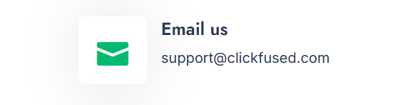
Email Screenshot
Quick Wins
- Convert the email address into a primary action button.
- Add a 'Typical response time' metric to set expectations.
- Bold the 'Email us' heading to increase visual anchor strength.
Priority Actions
- Establish a clear hero section that frames why the user should be contacting support or engaging with the brand.
- Implement a card-based layout to separate this contact utility from the rest of the email content.
- Introduce a secondary CTA or link to a Help Center/FAQ to provide immediate self-service value.
Category Breakdown
Detailed Feedback
Hero Impact
10/100The 'Email us' heading is clear and identifies the purpose of the section immediately.
Visual Hierarchy & Layout
45/100The layout is clean with adequate white space and a recognizable icon for context.
CTA Strength
20/100The email address is provided clearly for manual copying.
Message Clarity & Tone
80/100The language is direct and unambiguous about how to contact the brand.
Offer & Value Proposition
10/100It identifies the support channel.
Color & Contrast Notes
- The green icon (#1DB954-style) has high visibility against the white background.
- Dark navy text provides excellent legibility for the primary header.
- The subtle grey border around the icon container is too faint to provide structural definition.
- Lack of a brand accent color in the text makes the link feel like a default system element.
Want to Create Better Emails?
Use Kopi AI to generate professional, on-brand marketing emails that convert. AI-powered email creation in seconds.