Zimyo
Email Review
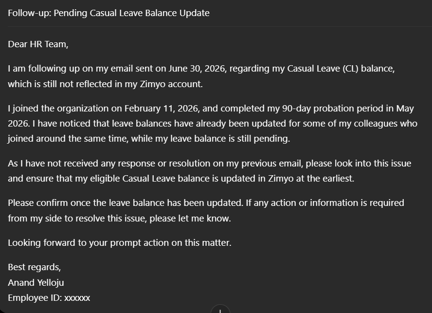
“Follow-up: Pending Casual Leave Balance Update”
Kopi AI analysis from July 9, 2026
The email provides clear context and a professional tone, but it fails as a conversion asset because the primary request is buried in a dense wall of text. The lack of a clear, visually distinct call-to-action (CTA) makes it easy for the recipient to overlook the specific task required. Moving the core request to a standalone, highlighted section is the most critical fix.
Email Screenshot
Quick Wins
- Bold the request in the third paragraph to make it stand out.
- Convert the timeline in paragraph two into a bulleted list.
- Add a direct link to the Zimyo dashboard for the HR team's convenience.
Priority Actions
- Transform the buried text request into a prominent button or a standalone 'Action Required' block.
- Implement a 'Summary' line at the very top (e.g., 'Summary: Requesting leave balance update post-probation').
- Use bold headers for 'Status' and 'Next Steps' to improve the scan path for busy administrators.
Category Breakdown
Detailed Feedback
Hero Impact
40/100The subject line and first sentence immediately identify the purpose of the email without preamble.
Visual Hierarchy & Layout
25/100Paragraph breaks provide some separation of ideas.
CTA Strength
10/100The request itself is specific and mentions the exact platform (Zimyo).
Message Clarity & Tone
85/100The chronology of events (joining date, probation end, follow-up date) is logical and easy to follow.
Offer & Value Proposition
60/100The value proposition is clear: resolving an administrative error to ensure accurate records.
Content Structure & Flow
55/100The email follows a standard narrative flow from history to current problem to desired solution.
Readability & Scannability
50/100The high-contrast white text on a dark background is legible.
Personalization & Audience Fit
70/100Includes specific employee data like ID and joining dates to help HR identify the user.
Color & Contrast Notes
- The high contrast between text and background is excellent for legibility.
- The lack of any accent color (e.g., brand blue or green) means no single element pops during a squint test.
- The uniform color palette makes the email feel like a document rather than an actionable request.
Want to Create Better Emails?
Use Kopi AI to generate professional, on-brand marketing emails that convert. AI-powered email creation in seconds.