Clickfuse
Email Review
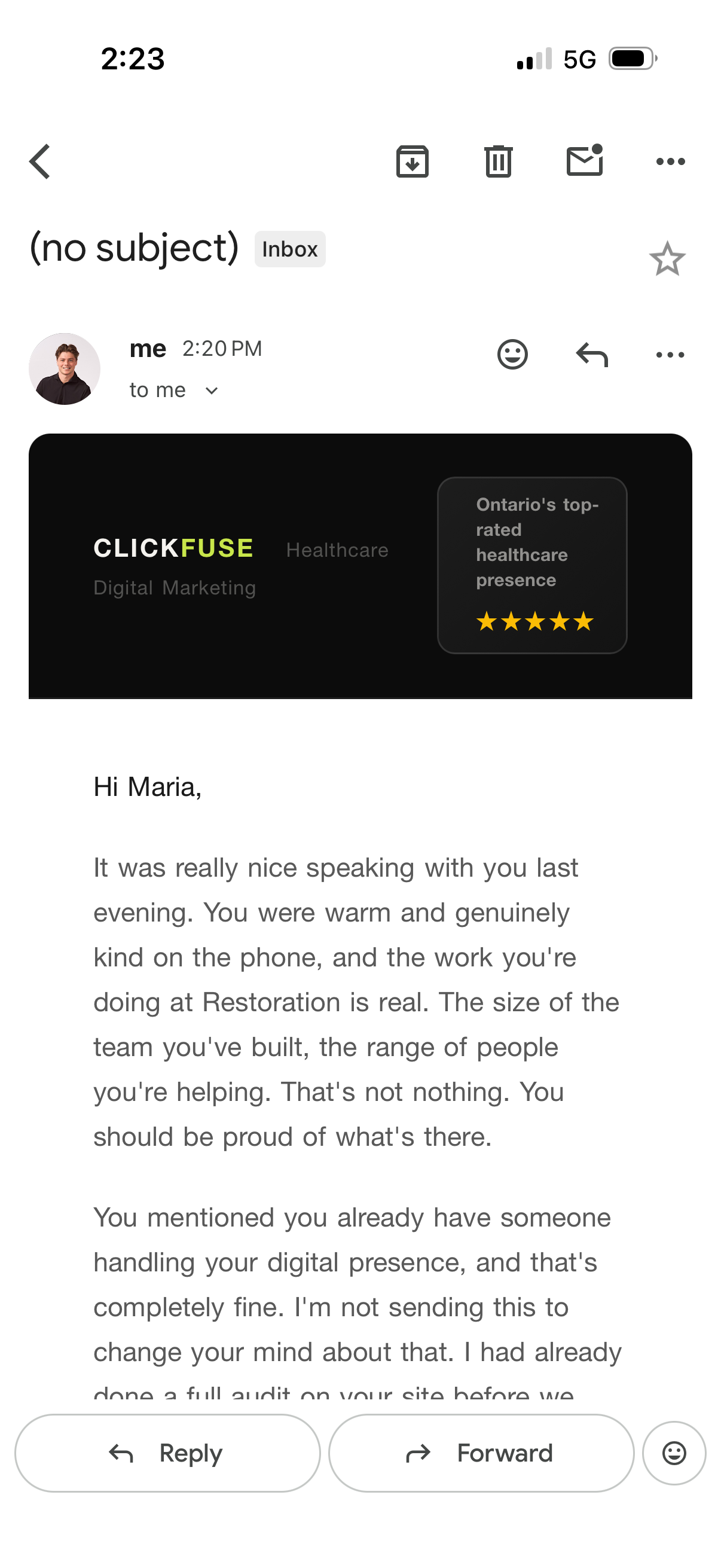
“(no subject)”
Kopi AI analysis from April 28, 2026
The email demonstrates exceptional personalization and a warm, human tone that builds trust quickly. However, it fails fundamentally as a conversion tool because there is no visible call-to-action (CTA) in the primary viewport, and the text density is too high for mobile users. To fix this, you must move the 'site audit' value proposition higher and add a clear, high-contrast button immediately after it.
Email Screenshot
Quick Wins
- Change the body text color to #111111 for better legibility.
- Bold the name of the recipient's company ('Restoration') to catch their eye during a skim.
- Add a subject line so the email doesn't appear as '(no subject)' in the inbox.
Priority Actions
- Insert a primary CTA button 'View My Audit Findings' immediately following the second paragraph.
- Restructure the paragraphs into 1-2 sentence 'micro-chunks' to suit mobile reading patterns.
- Add a P.S. line at the bottom that summarizes the main benefit of clicking the link.
Category Breakdown
Detailed Feedback
Hero Impact
55/100The professional black header and 'top-rated' social proof badge immediately establish authority and brand identity.
Visual Hierarchy & Layout
45/100The use of a dark header versus a light body creates a clear distinction between brand identity and the personal message.
CTA Strength
20/100N/A - No CTA is present in the visible screenshot.
Message Clarity & Tone
88/100The tone is empathetic, disarming ('that's completely fine'), and feels like a genuine 1-to-1 communication.
Offer & Value Proposition
60/100Offering a 'full audit' is a high-value lead magnet that addresses the recipient's specific business needs.
Color & Contrast Notes
- The yellow 'FUSE' and stars provide excellent contrast against the black header.
- The body text color (medium grey) is slightly too light for easy reading on mobile screens; it should be darkened.
- The white canvas provides a clean background, but the lack of a colored CTA button makes the whole email feel like a plain document rather than a marketing asset.
Want to Create Better Emails?
Use Kopi AI to generate professional, on-brand marketing emails that convert. AI-powered email creation in seconds.