Fashion & Apparel Announcement Email Template
“Why Sonnet & Vine began”
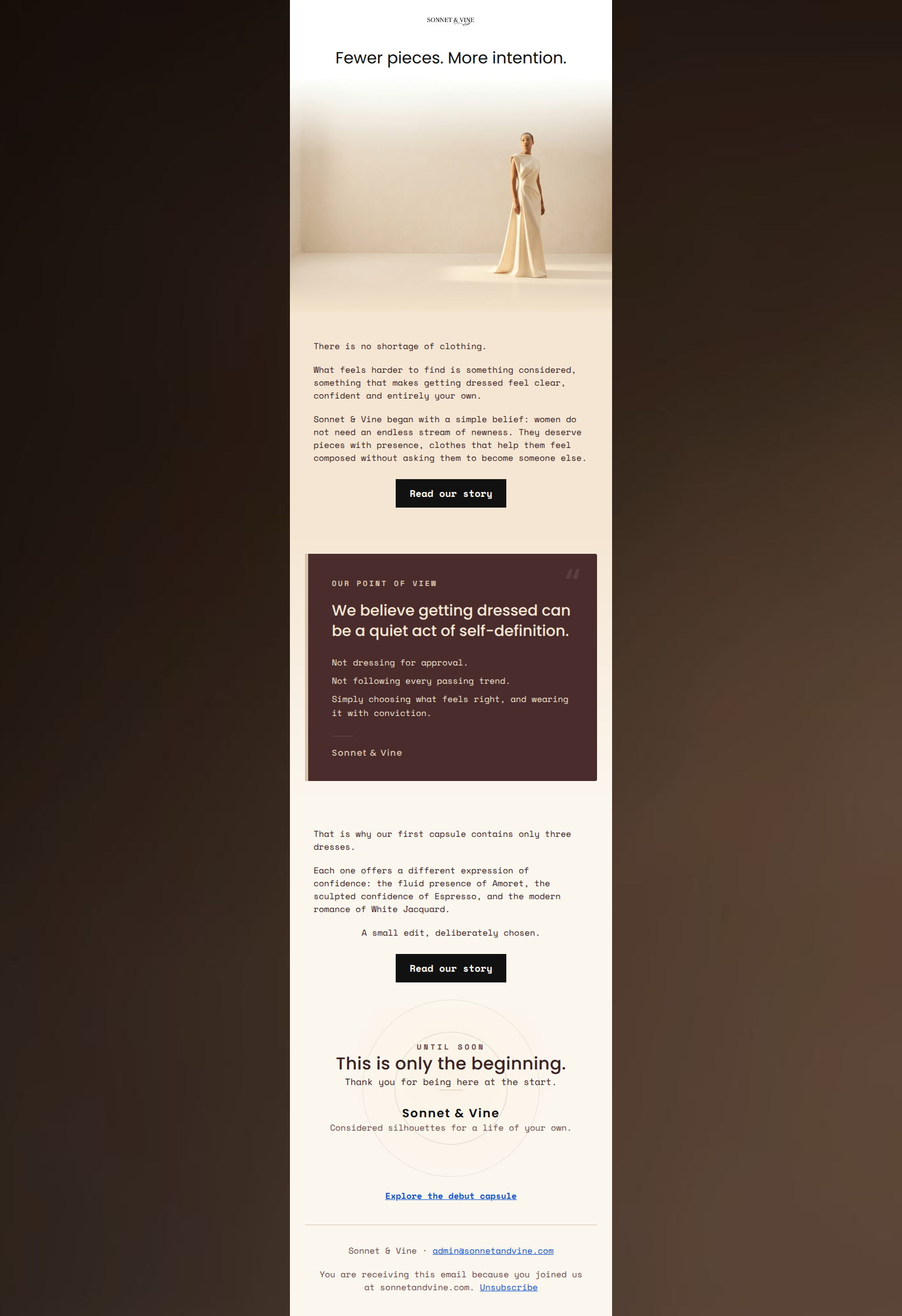
Design Score
86/100This is an exceptionally strong, brand-aligned narrative email. It successfully executes the 'quiet luxury' aesthetic and speaks directly to the target audience's desire for intentionality over excess. The visual hierarchy is elegant, and the copy is evocative without being verbose. To push this from an 86 to a 95+, the email needs to reduce friction in the scan-path and ensure the visual payoff matches the copy's promises—specifically, when referencing the three specific capsule dresses, the lack of accompanying imagery creates a slight cognitive disconnect.
Create Your Own
Generate professional email designs like this one in seconds with Kopi AI.
Email Details
- Subject Line
- Why Sonnet & Vine began
- Brand
- Sonnet and Vine
- Industry
- Fashion & Apparel
- Email Type
- Announcement
- Created
- July 14, 2026
Brand Colors
Email Copy
Fewer pieces. More intention.
There is no shortage of clothing.
What feels harder to find is something considered, something that makes getting dressed feel clear, confident and entirely your own.
Sonnet & Vine began with a simple belief: women do not need an endless stream of newness. They deserve pieces with presence, clothes that help them feel composed without asking them to become someone else.
→ Read our story
That is why our first capsule contains only three dresses.
Each one offers a different expression of confidence: the fluid presence of Amoret, the sculpted confidence of Espresso, and the modern romance of White Jacquard.
A small edit, deliberately chosen.
→ Read our story
Explore the debut capsule
Sonnet & Vine · admin@sonnetandvine.com
You are receiving this email because you joined us at sonnetandvine.com. Unsubscribe
Why This Email Works
This is an exceptionally strong, brand-aligned narrative email. It successfully executes the 'quiet luxury' aesthetic and speaks directly to the target audience's desire for intentionality over excess. The visual hierarchy is elegant, and the copy is evocative without being verbose. To push this from an 86 to a 95+, the email needs to reduce friction in the scan-path and ensure the visual payoff matches the copy's promises—specifically, when referencing the three specific capsule dresses, the lack of accompanying imagery creates a slight cognitive disconnect.
Hero (top/initial part) Impact
90/100- Flawless alignment between the headline ('Fewer pieces. More intention.') and the brand's 'less but better' value proposition.
- High-quality, evocative imagery that instantly communicates the sculpted, structural nature of the garments.
Content Structure & Flow
85/100- The use of the dark 'Point of View' card breaks up the linear flow perfectly, acting as a visual anchor that forces the reader to pause and absorb the core message.
Visual Hierarchy & Layout
88/100- Excellent use of contrasting blocks (ivory vs. deep espresso) to define distinct sections without relying on heavy borders.
- The concentric circle design in the footer is an elegant, subtle touch that reinforces the brand's sophisticated identity.
Call-to-Action Strength
88/100- Perfect consistency in the primary CTA destination and language across the email.
- High-contrast black buttons stand out sharply against the ivory background, passing the squint test with ease.
Message Clarity & Tone
96/100- Phrases like 'quiet act of self-definition' and 'composed without asking them to become someone else' speak directly to the audience's psychological pain points.
- The POV card uses sparse, punchy statements ('Not dressing for approval. Not following every passing trend.') that read like a powerful manifesto.
Readability & Scannability
76/100- Generous line height and comfortable padding prevent the text from feeling cramped.
- The shift to uppercase, tracked-out font ('OUR POINT OF VIEW') creates clear typographical hierarchy.
Offer & Value Proposition
85/100- Leaning into 'fewer pieces' turns a potential negative (small inventory) into a massive positive (curation and exclusivity).
Personalization & Audience Fit
90/100- Directly addresses the frustration of the 'endless stream of newness' found in fast fashion.
- The imagery reflects the precise demographic and attitude of the target buyer.
Copy Conciseness & Word Economy
84/100- Avoids empty adjectives (like 'stunning' or 'gorgeous') in favor of descriptive, architectural terms ('sculpted', 'fluid').
Quick Wins
- Override the default blue styling on the 'Explore the debut capsule' text link at the bottom to match the brand's dark text colors.
- Trim the opening sentence ('There is no shortage of clothing.') to get to the core message faster.
- Apply subtle bolding to one or two key phrases in the opening text block to improve scannability.

Create Professional Email Designs
Generate beautiful, on-brand email designs in seconds. Just enter your brand URL and let AI do the rest.