Fashion & Apparel Welcome Email Template
“Welcome. Here's what we do differently.”
Design Score
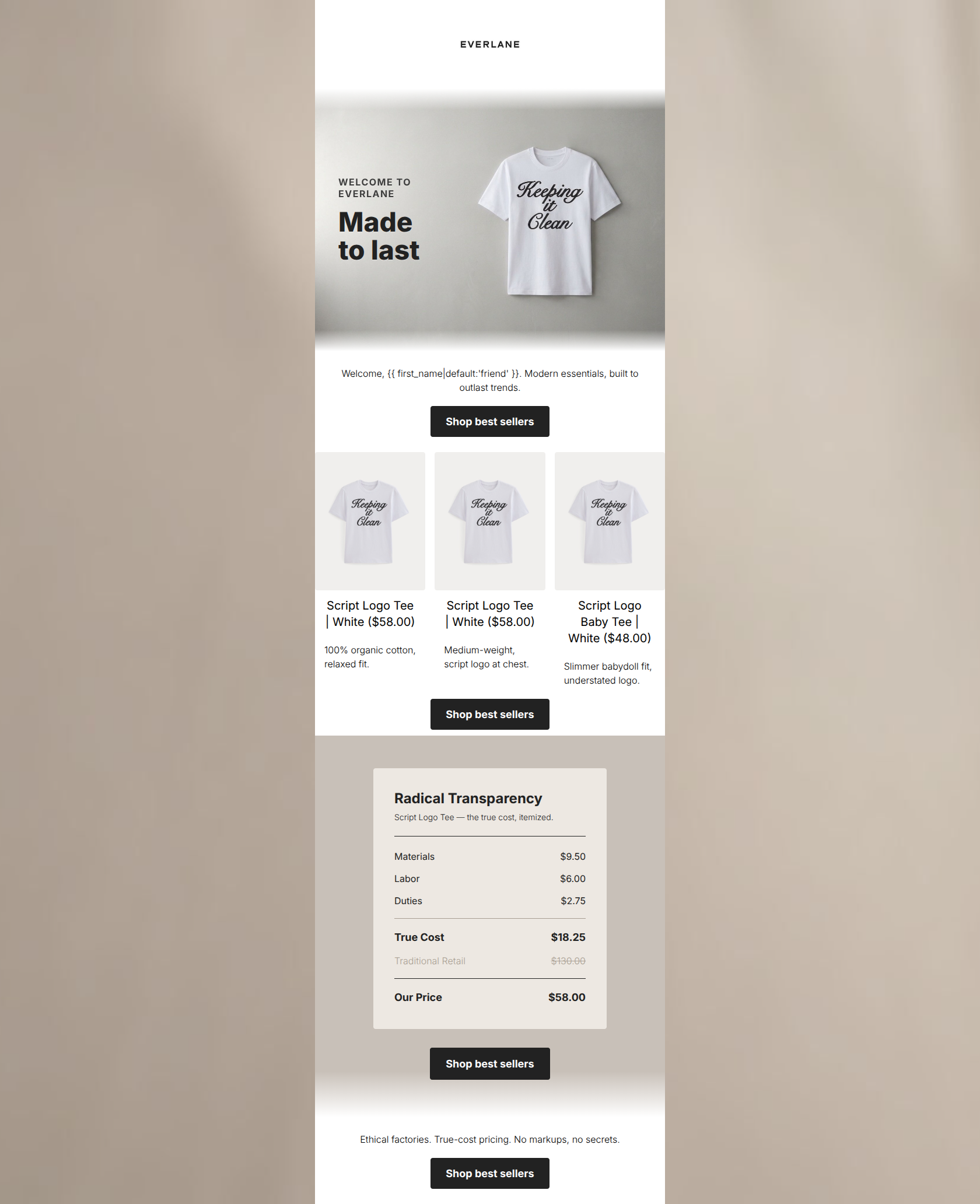
85/100A visually striking and on-brand welcome email that beautifully executes Everlane's 'Radical Transparency' value proposition. The structural flow, word economy, and disciplined CTA strategy are excellent. However, it leaves significant money on the table by featuring three nearly identical products in the main merchandise block, failing to showcase the necessary breadth of the 'best sellers' category to convert a new subscriber who might not want a graphic tee.
Create Your Own
Generate professional email designs like this one in seconds with Kopi AI.
Email Details
- Subject Line
- Welcome. Here's what we do differently.
- Brand
- Everlane [eval-prod 2026-06-04]
- Industry
- Fashion & Apparel
- Email Type
- Welcome
- Created
- July 14, 2026
Brand Colors
Email Copy
Welcome, friend. Modern essentials, built to outlast trends.
→ Shop best sellers
Script Logo Tee | White ($58.00)
100% organic cotton, relaxed fit.
Script Logo Tee | White ($58.00)
Medium-weight, script logo at chest.
Script Logo Baby Tee | White ($48.00)
Slimmer babydoll fit, understated logo.
→ Shop best sellers
Ethical factories. True-cost pricing. No markups, no secrets.
→ Shop best sellers
Why This Email Works
A visually striking and on-brand welcome email that beautifully executes Everlane's 'Radical Transparency' value proposition. The structural flow, word economy, and disciplined CTA strategy are excellent. However, it leaves significant money on the table by featuring three nearly identical products in the main merchandise block, failing to showcase the necessary breadth of the 'best sellers' category to convert a new subscriber who might not want a graphic tee.
Hero Impact
75/100- Strong brand identity immediately established.
- Clean, minimalist aesthetic that sets the right tone.
Content Structure & Flow
65/100- Logical narrative progression from welcome to justification.
- The transparency receipt is perfectly placed to close the sale after showing products.
Visual Hierarchy & Layout
80/100- Excellent use of whitespace throughout the canvas.
- The 'Radical Transparency' card uses background contrast effectively to highlight the core value prop.
Call-to-Action Strength
95/100- Unambiguous, single-minded conversion goal.
- High contrast buttons that easily pass the squint test.
Message Clarity & Tone
92/100- Perfectly captures the grounded, honest Everlane voice.
- The transparency receipt demonstrates value without needing excessive explanation.
Readability & Scannability
82/100- The receipt section is highly scannable.
- Good overarching typography and font sizing.
Offer & Value Proposition
90/100- The itemized receipt visually proves the core value proposition.
- Strong differentiation from competitors based on radical transparency.
Personalization & Audience Fit
88/100- Speaks directly to the psychographics of the conscious consumer.
- Aligns perfectly with the target audience's values.
Copy Conciseness & Word Economy
95/100- Highly economical copy with zero fluff.
- Punchy, impactful closing statement that summarizes the brand.
Quick Wins
- Add a 'Shop best sellers' button directly inside the hero image composition.
- Reformat the text under the 3-column product grid to put the price on a separate line for better scannability.
- Warm up the opening sentence to sound more conversational.




Create Professional Email Designs
Generate beautiful, on-brand email designs in seconds. Just enter your brand URL and let AI do the rest.