Fashion & Apparel Welcome Email Template
“Welcome to fewer, better things.”
Design Score
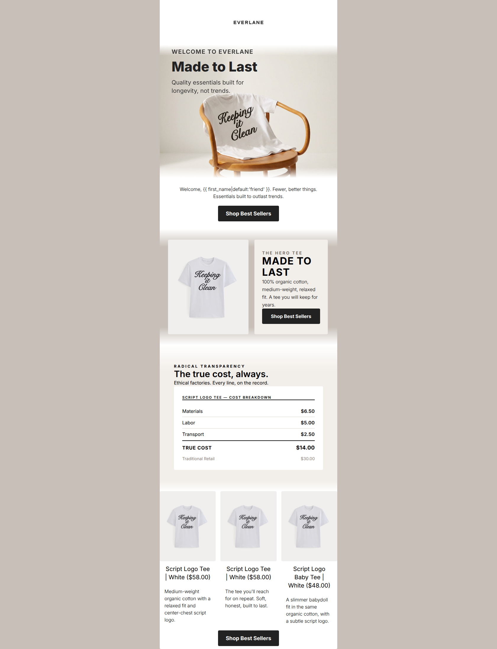
82/100This welcome email presents a visually stunning, editorial-quality layout that perfectly captures Everlane's minimalist and transparent brand identity. The structural flow—from high-level value proposition to a concrete cost breakdown, ending with a shoppable grid—is a masterclass in narrative email design. Furthermore, the disciplined, consistent repetition of the 'Shop Best Sellers' CTA is exactly how conversion-focused emails should operate. However, a significant disconnect between the 'Radical Transparency' cost ledger (showing a $30 Traditional Retail price) and the actual product pricing in the grid ($58) completely undermines the brand's core message of fair pricing, creating massive cognitive dissonance for the reader.
Create Your Own
Generate professional email designs like this one in seconds with Kopi AI.
Email Details
- Subject Line
- Welcome to fewer, better things.
- Brand
- Everlane [eval-prod 2026-06-04]
- Industry
- Fashion & Apparel
- Email Type
- Welcome
- Created
- July 14, 2026
Brand Colors
Email Copy
Welcome, friend. Fewer, better things. Essentials built to outlast trends.
→ Shop Best Sellers
Script Logo Tee | White ($58.00)
Medium-weight organic cotton with a relaxed fit and center-chest script logo.
Script Logo Tee | White ($58.00)
The tee you'll reach for on repeat. Soft, honest, built to last.
Script Logo Baby Tee | White ($48.00)
A slimmer babydoll fit in the same organic cotton, with a subtle script logo.
→ Shop Best Sellers
Why This Email Works
This welcome email presents a visually stunning, editorial-quality layout that perfectly captures Everlane's minimalist and transparent brand identity. The structural flow—from high-level value proposition to a concrete cost breakdown, ending with a shoppable grid—is a masterclass in narrative email design. Furthermore, the disciplined, consistent repetition of the 'Shop Best Sellers' CTA is exactly how conversion-focused emails should operate. However, a significant disconnect between the 'Radical Transparency' cost ledger (showing a $30 Traditional Retail price) and the actual product pricing in the grid ($58) completely undermines the brand's core message of fair pricing, creating massive cognitive dissonance for the reader.
Hero (top/initial part) Impact
85/100- Strong, brand-aligned headline ('Made to Last').
- Excellent use of the kicker ('WELCOME TO EVERLANE') to establish context instantly.
- High-quality lifestyle imagery that fits the calm, grounded psychographics of the target audience.
Content Structure & Flow
92/100- Logical progression from brand introduction to product education to conversion.
- The two-column 'Hero Tee' section acts as a perfect bridge between the high-level hero and the granular cost breakdown.
- Use of distinct background colors (white to taupe) effectively sections the content without relying on harsh divider lines.
Visual Hierarchy & Layout
88/100- Excellent use of the taupe and cream brand colors to create a sophisticated, editorial feel.
- The large '01' numeral in the two-column section provides a great magazine-like visual hook.
- Headings are consistently sized and easily scannable.
Call-to-Action Strength
95/100- Strict adherence to a single primary conversion goal.
- High-contrast button design that passes the squint test easily.
- Perfect spacing of CTAs throughout the scroll depth.
Message Clarity & Tone
65/100- Tone is confident, calm, and jargon-free.
- Uses declarative, punchy sentences ('The true cost, always.').
Readability & Scannability
85/100- Great contrast ratio between text and background colors.
- Clear hierarchy between H2s, H3s, and body text.
Offer & Value Proposition
60/100- The concept of using a 'receipt' to prove the value proposition is highly compelling for this specific target audience.
Personalization & Audience Fit
80/100- Aesthetic perfectly matches the urban, design-appreciative target demographic.
- Copy appeals to the intelligence and ethical concerns of the reader.
Copy Conciseness & Word Economy
85/100- The transparency ledger uses zero filler words.
- The two-column section body copy is highly descriptive yet brief ('100% organic cotton, medium-weight, relaxed fit.').
Quick Wins
- Delete the redundant 'Welcome, {{ first_name }}...' text block immediately below the hero image to streamline the scroll path.
- Fix the duplicate image issue in the final product grid (Columns 1 and 3 are using the exact same image asset).
- Shorten the descriptive copy in the 3-column product grid to a single line to prevent awkward text wrapping.




Create Professional Email Designs
Generate beautiful, on-brand email designs in seconds. Just enter your brand URL and let AI do the rest.