Jewelry & Accessories Welcome Email Template
“What truly matters in a diamond”
Design Score
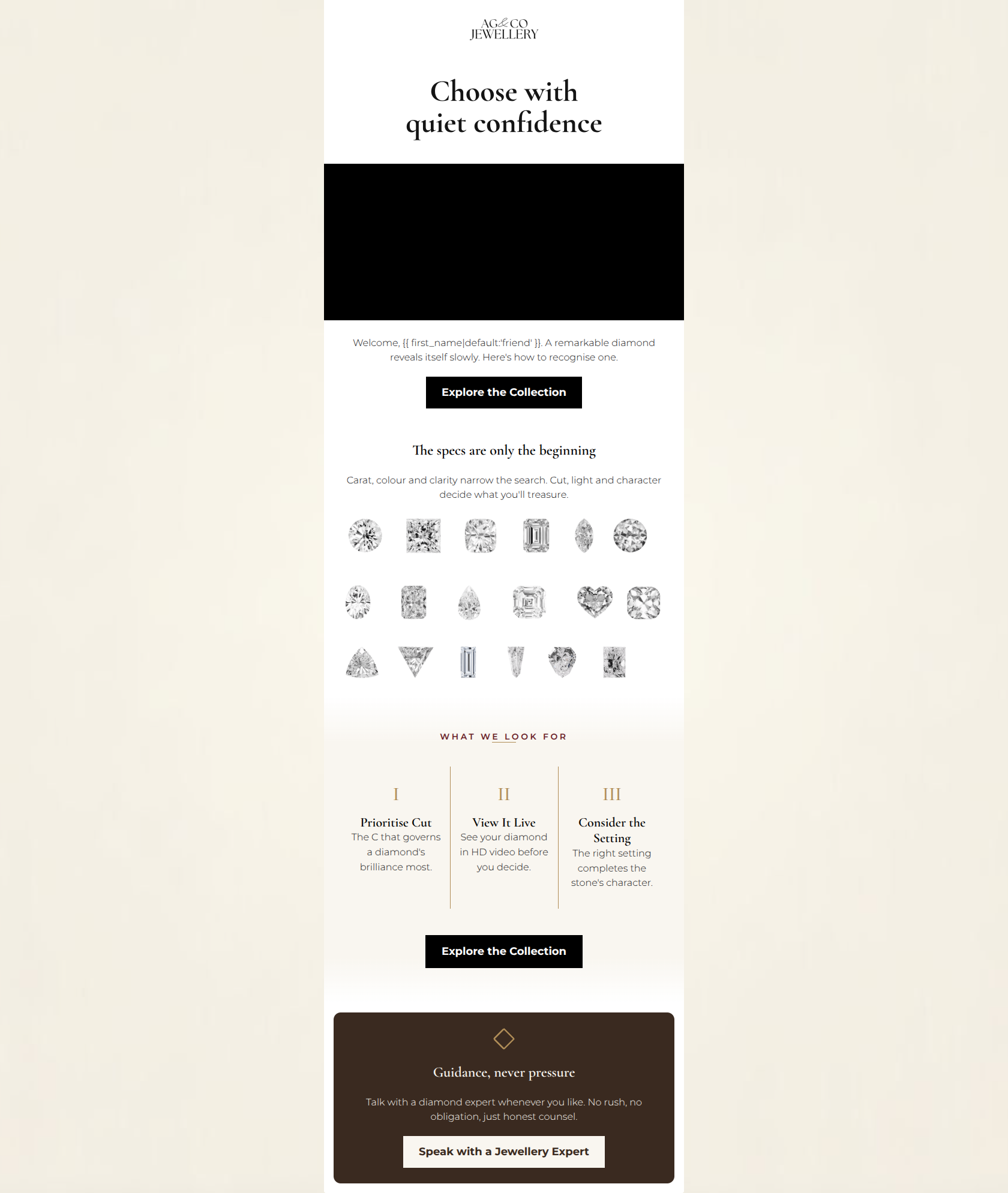
83/100This welcome email beautifully captures the AG & CO Jewellery brand voice. The tone is authoritative, romantic, and reassuring, perfectly targeting the 'smart luxury' buyer who wants guidance without high-pressure sales tactics. The typography and copy are incredibly tight and effective. However, the email suffers from a disjointed hero section where a massive dark image block interrupts the flow between the headline and the introductory copy. Furthermore, the email features competing primary-styled CTAs leading to different destinations, violating conversion best practices by forcing the user to choose between exploring the collection and booking a consultation. Color and Contrast Notes: The use of the #F7F5F0 canvas behind the #FFFFFF body creates a subtle, premium framing effect. Contrast is handled exceptionally well throughout; the stark black primary buttons pop clearly against the white background, and the final #3A2A20 dark brown card provides a beautiful, highly readable contrast for the #F9F6F0 text and button.
Create Your Own
Generate professional email designs like this one in seconds with Kopi AI.
Email Details
- Subject Line
- What truly matters in a diamond
- Brand
- AG & CO Jewellery
- Industry
- Jewelry & Accessories
- Email Type
- Welcome
- Created
- July 13, 2026
Brand Colors
Email Copy
Welcome, friend. A remarkable diamond reveals itself slowly. Here's how to recognise one.
→ Explore the Collection
The specs are only the beginning
Carat, colour and clarity narrow the search. Cut, light and character decide what you'll treasure.
Guidance, never pressure
Talk with a diamond expert whenever you like. No rush, no obligation, just honest counsel.
→ Speak with a Jewellery Expert
Why This Email Works
This welcome email beautifully captures the AG & CO Jewellery brand voice. The tone is authoritative, romantic, and reassuring, perfectly targeting the 'smart luxury' buyer who wants guidance without high-pressure sales tactics. The typography and copy are incredibly tight and effective. However, the email suffers from a disjointed hero section where a massive dark image block interrupts the flow between the headline and the introductory copy. Furthermore, the email features competing primary-styled CTAs leading to different destinations, violating conversion best practices by forcing the user to choose between exploring the collection and booking a consultation. Color and Contrast Notes: The use of the #F7F5F0 canvas behind the #FFFFFF body creates a subtle, premium framing effect. Contrast is handled exceptionally well throughout; the stark black primary buttons pop clearly against the white background, and the final #3A2A20 dark brown card provides a beautiful, highly readable contrast for the #F9F6F0 text and button.
Hero Impact
60/100- Headline copy perfectly matches the brand's sophisticated mentor persona.
- The minimalist typographic approach feels highly premium.
Content Structure & Flow
85/100- Excellent narrative progression from education to action.
- The transition from technical specs to 'Guidance, never pressure' feels seamless and natural.
Visual Hierarchy & Layout
78/100- The triptych breaks down complex information beautifully.
- The final dark card creates a strong visual anchor that draws the eye down the page.
Call-to-Action Strength
65/100- Buttons are visually prominent with excellent contrast against their respective backgrounds.
- The primary action is repeated, which is a strong pattern when kept consistent.
Message Clarity & Tone
95/100- Exceptional use of luxury phrasing without being pretentious.
- Perfectly validates the customer's desire for a thoughtful, unhurried purchase.
Readability & Scannability
92/100- The strict limit on sentence length prevents visual fatigue.
- Roman numerals in the triptych create an immediate, clear scanning path.
Offer & Value Proposition
80/100- The 'Guidance, never pressure' section perfectly positions the brand's customer service as a premium feature.
Personalization & Audience Fit
90/100- Validates the buyer's intelligence by focusing on deep education over superficial marketing.
- Addresses the specific anxieties of a high-ticket jewelry purchase.
Copy Conciseness & Word Economy
98/100- Zero fluff or filler words.
- High-impact, poetic but precise sentences that deliver maximum meaning with minimal reading effort.
Quick Wins
- Reduce the vertical height of the hero image block to pull the introductory text up and repair the top-funnel reading flow.
- Update the Explore the Collection buttons to link directly to a specific product or category page rather than the generic homepage to reduce friction.
- Change the first name fallback from 'friend' to something more elevated, or simply omit the word entirely.



Create Professional Email Designs
Generate beautiful, on-brand email designs in seconds. Just enter your brand URL and let AI do the rest.