Fashion & Apparel Welcome Email Template
“Welcome to Quince (Here’s $20 off)”
Design Score
78/100This welcome email effectively communicates Quince's "Honest Luxury" brand identity through a clean, minimalist aesthetic and educational copy. While the visual hierarchy is strong and the value proposition is clear, the email suffers from a disconnected offer strategy where the incentive is buried at the bottom, and the primary CTAs are generic. It successfully builds trust but misses opportunities to drive immediate action with specific, benefit-led buttons.
Create Your Own
Generate professional email designs like this one in seconds with Kopi AI.
Email Details
- Subject Line
- Welcome to Quince (Here’s $20 off)
- Brand
- Quince
- Industry
- Fashion & Apparel
- Email Type
- Welcome
- Created
- February 6, 2026
Brand Colors
Email Copy
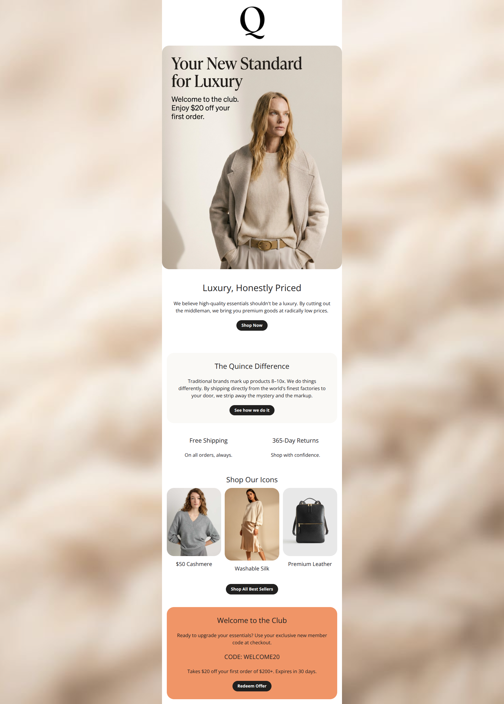
Luxury, Honestly Priced
We believe high-quality essentials shouldn't be a luxury. By cutting out the middleman, we bring you premium goods at radically low prices.
→ Shop Now
The Quince Difference
Traditional brands mark up products 8–10x. We do things differently. By shipping directly from the world's finest factories to your door, we strip away the mystery and the markup.
→ See how we do it
Free Shipping
On all orders, always.
365-Day Returns
Shop with confidence.
Shop Our Icons
$50 Cashmere
Washable Silk
Premium Leather
→ Shop All Best Sellers
Welcome to the Club
Ready to upgrade your essentials? Use your exclusive new member code at checkout.
CODE: WELCOME20
Takes $20 off your first order of $200+. Expires in 30 days.
→ Redeem Offer
Why This Email Works
This welcome email effectively communicates Quince's "Honest Luxury" brand identity through a clean, minimalist aesthetic and educational copy. While the visual hierarchy is strong and the value proposition is clear, the email suffers from a disconnected offer strategy where the incentive is buried at the bottom, and the primary CTAs are generic. It successfully builds trust but misses opportunities to drive immediate action with specific, benefit-led buttons.
Hero Impact
75/100- High-quality, aspirational photography that perfectly matches the brand's 'quiet luxury' aesthetic.
- Clean, uncluttered opening view.
Content Structure & Flow
80/100- Clear demarcation of sections using background colors helps segment the storytelling.
- Strong use of trust signals (Free Shipping, Returns) early in the scroll.
Visual Hierarchy & Layout
85/100- Excellent contrast and spacing make the content feel premium and easy to read.
- Product imagery in the grid is consistent in tone and lighting.
Call-to-Action Strength
70/100- Primary buttons use the brand's high-contrast black style effectively.
- Adequate padding around buttons prevents accidental clicks.
Message Clarity & Tone
85/100- Concise, educational copy that respects the reader's intelligence.
- Headline 'Luxury, Honestly Priced' effectively summarizes the entire brand value prop in three words.
Readability & Scannability
80/100- Good font sizing and line height throughout.
- Minimal clutter; no dense walls of text.
Offer & Value Proposition
75/100- The '$50 Cashmere' price point is a powerful hook that anchors the 'accessible luxury' claim immediately.
Personalization & Audience Fit
70/100- The content assumes the user values quality and price, which aligns perfectly with the target psychographic.
Quick Wins
- Rename the primary CTA from 'Shop Now' to 'Shop Best Sellers' or 'Explore The Collection'.
- Move the coupon code details (CODE: WELCOME20) higher up, perhaps adding it as a text line under the main hero button.
- Standardize the product grid titles to be consistent (e.g., '$50 Cashmere', '$60 Silk Skirt', '$100 Leather Bag').
- Bold the key phrase 'cutting out the middleman' in the body copy to aid skimmers.


Create Professional Email Designs
Generate beautiful, on-brand email designs in seconds. Just enter your brand URL and let AI do the rest.