Outdoor & Sports Welcome Email Template
“Bem-vindo à família Nike”
Design Score
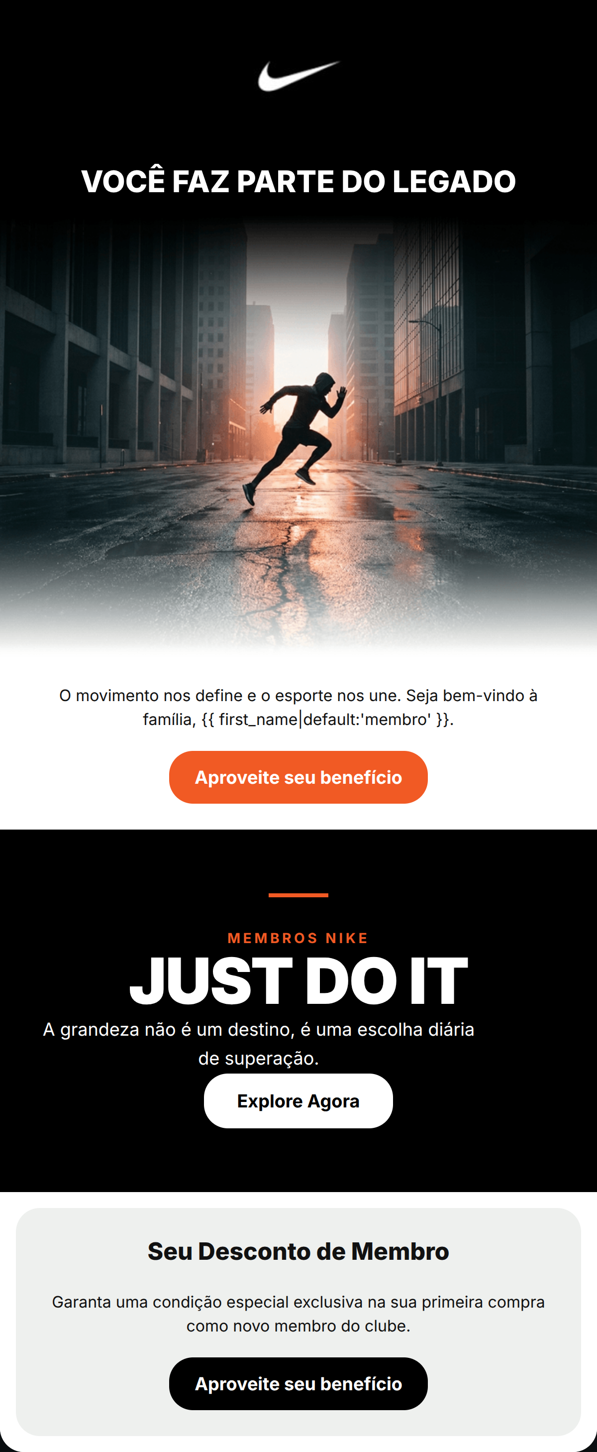
82/100This welcome email successfully captures the elite, motivational Nike brand persona through high-impact photography and a clean, high-contrast aesthetic. The messaging moves the user from brand identity ('Legacy') to a specific value proposition ('Member Discount'). While the structure is strong, conversion is slightly hindered by three different button color styles and a vague 'special condition' offer that lacks the immediate punch expected from the brand's 'Just Do It' ethos.
Create Your Own
Generate professional email designs like this one in seconds with Kopi AI.
Email Details
- Subject Line
- Bem-vindo à família Nike
- Brand
- Nike
- Industry
- Outdoor & Sports
- Email Type
- Welcome
- Created
- August 1, 2026
Brand Colors
Email Copy
Preview text: Descubra o legado que move o esporte e garanta seu desconto exclusivo de novo membro.
VOCÊ FAZ PARTE DO LEGADO
O movimento nos define e o esporte nos une. Seja bem-vindo à família, membro.
→ Aproveite seu benefício
Seu Desconto de Membro
Garanta uma condição especial exclusiva na sua primeira compra como novo membro do clube.
→ Aproveite seu benefício
Why This Email Works
This welcome email successfully captures the elite, motivational Nike brand persona through high-impact photography and a clean, high-contrast aesthetic. The messaging moves the user from brand identity ('Legacy') to a specific value proposition ('Member Discount'). While the structure is strong, conversion is slightly hindered by three different button color styles and a vague 'special condition' offer that lacks the immediate punch expected from the brand's 'Just Do It' ethos.
Hero (top/initial part) Impact
88/100- High-energy, aspirational photography.
- Authoritative and direct headline.
- Perfect use of brand-aligned typography and contrast.
Content Structure & Flow
82/100- Alternating background colors create clear visual boundaries between sections.
- Inverted pyramid structure in the hero leads naturally to the first CTA.
Visual Hierarchy & Layout
75/100- Excellent use of white space and vertical padding to prevent clutter.
- Typography sizes clearly distinguish headlines from body copy.
Call-to-Action Strength
88/100- Consistent HREFs across all buttons prevent user confusion.
- Repeated CTAs (3 times) provide ample opportunity for conversion as the user scrolls.
Message Clarity & Tone
80/100- Use of 'Você' (You) and 'Membro' (Member) creates personal resonance.
- Avoids flowery language in favor of punchy, high-impact statements.
Readability & Scannability
92/100- Bold, high-contrast headings.
- Minimalist body copy that avoids the 'wall of text' trap.
Offer & Value Proposition
70/100- Correctly identifies the benefit as being 'exclusive' to members.
Personalization & Audience Fit
85/100- Effective use of dynamic tags for the greeting.
- Imagery appeals to the broad 'active lifestyle' demographic.
Copy Conciseness & Word Economy
85/100- The bottom card gets straight to the point without 'throat-clearing' language.
Quick Wins
- Unify all CTA button colors to one high-contrast style (e.g., all Heritage Orange or all Black) to create a consistent scan path.
- Change 'Condição especial' to a specific benefit like 'Seu desconto de 10%' to make the offer concrete.




Create Professional Email Designs
Generate beautiful, on-brand email designs in seconds. Just enter your brand URL and let AI do the rest.