Home & Garden Welcome Email Template
“Welcome aboard. Your calm move starts here.”

Design Score
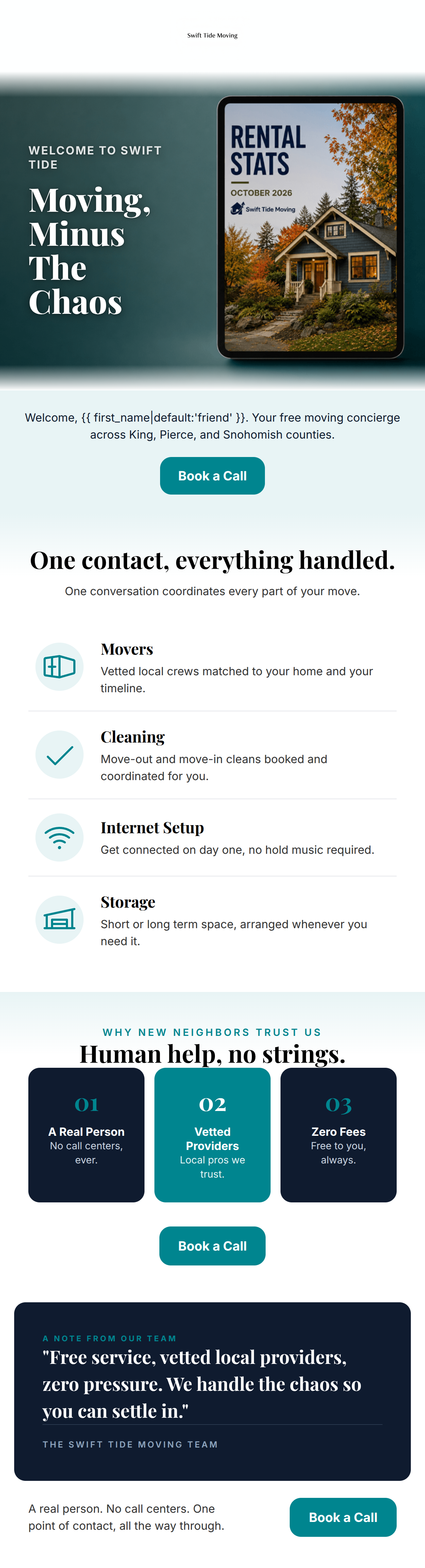
81/100This welcome email presents a visually stunning, premium aesthetic that perfectly aligns with Swift Tide's 'Premium Utility' brand identity. The layout is highly scannable, and the repetition of the primary 'Meet your concierge' CTA is text-book execution for driving clicks. However, a major messaging contradiction severely undermines the clarity: the hero features a prominent '15% OFF' badge, while the footer explicitly states the service is 'Always 100% Free'. This forces the reader to guess how the pricing works, introducing unnecessary friction that will depress conversion rates. Clarifying the offer and trimming some redundant copy will elevate this email from good to outstanding.
Create Your Own
Generate professional email designs like this one in seconds with Kopi AI.
Email Details
- Subject Line
- Welcome aboard. Your calm move starts here.
- Brand
- Swift Tide Moving
- Industry
- Home & Garden
- Email Type
- Welcome
- Created
- August 9, 2026
Brand Colors
Why This Email Works
This welcome email presents a visually stunning, premium aesthetic that perfectly aligns with Swift Tide's 'Premium Utility' brand identity. The layout is highly scannable, and the repetition of the primary 'Meet your concierge' CTA is text-book execution for driving clicks. However, a major messaging contradiction severely undermines the clarity: the hero features a prominent '15% OFF' badge, while the footer explicitly states the service is 'Always 100% Free'. This forces the reader to guess how the pricing works, introducing unnecessary friction that will depress conversion rates. Clarifying the offer and trimming some redundant copy will elevate this email from good to outstanding.
Hero Impact
75/100- Headline speaks directly to the target audience's desired emotional outcome (calm).
- The teal CTA button pops brilliantly against the deep navy background.
Content Structure & Flow
88/100- Distinct visual blocks (navy to white to navy) segment the information perfectly.
- The triptych layout for services provides an excellent scanning path.
Visual Hierarchy & Layout
95/100- Impeccable use of brand colors to create a premium, authoritative feel.
- Section headers ('One Point Of Contact') effectively guide the reader's eye downward.
Call-to-Action Strength
98/100- Consistent CTA copy eliminates decision fatigue.
- High-contrast teal buttons ensure the conversion goal is always the most prominent element on screen.
Message Clarity & Tone
68/100- Phrases like 'no call centers' and 'quietly lines up' perfectly establish trust and competence.
- The tone avoids aggressive sales tactics, fitting the 'concierge' positioning.
Readability & Scannability
90/100- Excellent contrast between text and background colors.
- Generous line-height and padding prevent the text from feeling cramped.
Offer & Value Proposition
65/100- The core utility of the brand (handling the logistics) is well communicated.
- The 'Swift Tide Promise' section acts as a strong risk-reversal mechanism.
Personalization & Audience Fit
88/100- Explicit mention of 'Western Washington' builds immediate local trust.
- Addressing the reader as a 'first-time neighbor' creates a warm, welcoming connection.
Copy Conciseness & Word Economy
78/100- The triptych section uses incredibly economical copy to explain three distinct services.
- Headlines are punchy and waste no words.
Quick Wins
- Clarify the '15% OFF' badge text or surrounding copy to explicitly state it applies to partner vendor services, resolving the conflict with the '100% Free' coordination message.
- Remove the repeated phrase 'no call centers' from the final block to tighten word economy.
- Bold 'Western Washington' in the hero text to ensure the local relevance is caught by skimmers.



Create Professional Email Designs
Generate beautiful, on-brand email designs in seconds. Just enter your brand URL and let AI do the rest.