Fashion & Apparel Welcome Email Template
“Welcome. Here's where to start.”
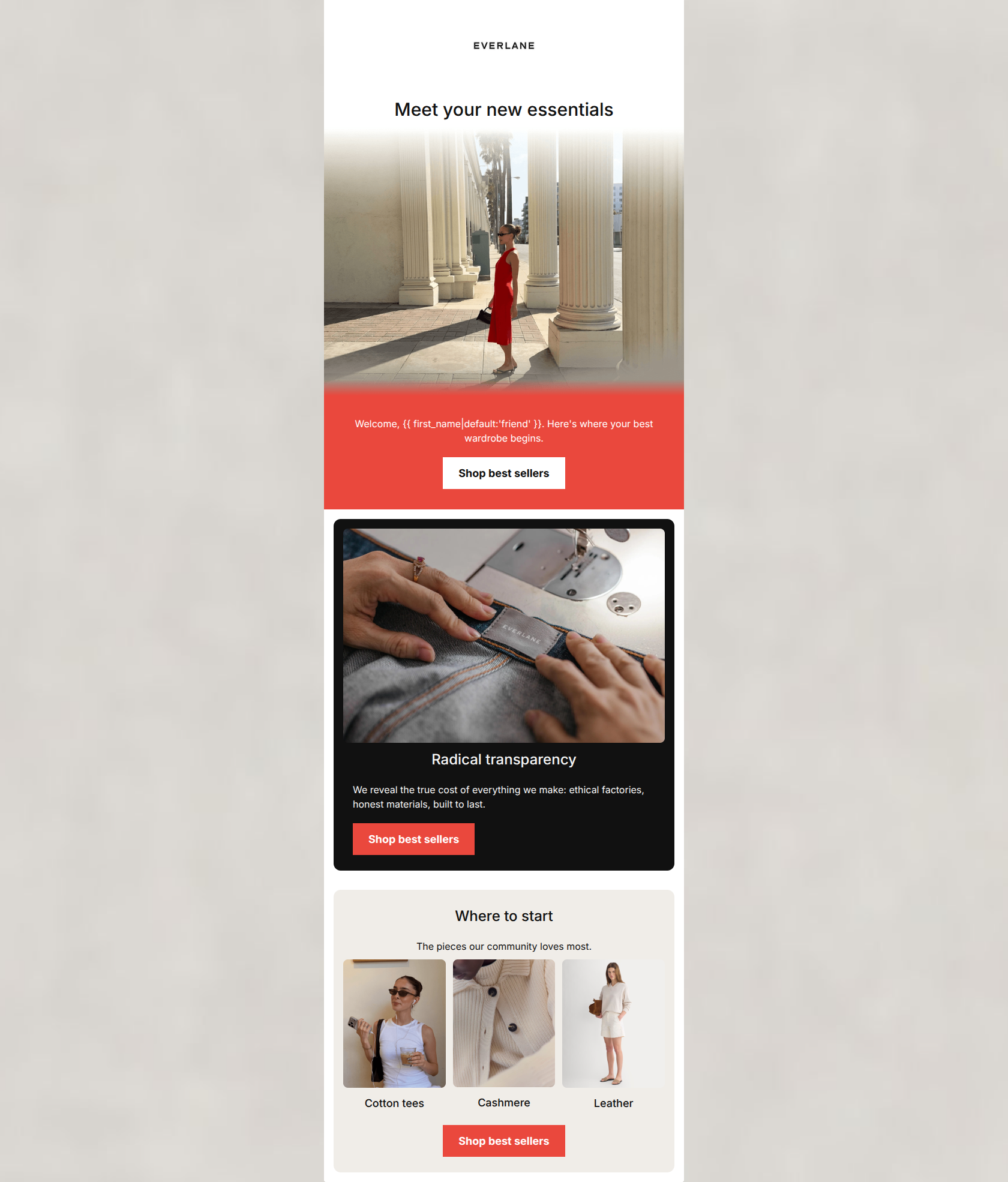
Design Score
84/100This welcome email correctly executes fundamental conversion principles, particularly with its flawless, repetitive primary CTA strategy. However, the visual execution creates a disjointed 'patchwork' effect through heavy, alternating color blocks that contradict Everlane's typically minimalist and editorial brand aesthetic. Tightening the visual design while maintaining the strong structural flow will elevate this from a competent email to a high-converting, brand-aligned asset.
Create Your Own
Generate professional email designs like this one in seconds with Kopi AI.
Email Details
- Subject Line
- Welcome. Here's where to start.
- Brand
- Everlane [eval 2026-07-01]
- Industry
- Fashion & Apparel
- Email Type
- Welcome
- Created
- July 1, 2026
Brand Colors
Email Copy
Meet your new essentials
Welcome, friend. Here's where your best wardrobe begins.
→ Shop best sellers
Radical transparency
We reveal the true cost of everything we make: ethical factories, honest materials, built to last.
→ Shop best sellers
Where to start
The pieces our community loves most.
Cotton tees
Cashmere
Leather
→ Shop best sellers
Why This Email Works
This welcome email correctly executes fundamental conversion principles, particularly with its flawless, repetitive primary CTA strategy. However, the visual execution creates a disjointed 'patchwork' effect through heavy, alternating color blocks that contradict Everlane's typically minimalist and editorial brand aesthetic. Tightening the visual design while maintaining the strong structural flow will elevate this from a competent email to a high-converting, brand-aligned asset.
Hero (top/initial part) Impact
78/100- Directly addresses the user with a welcoming tone.
- Features a high-contrast, immediately visible primary CTA above the fold.
Content Structure & Flow
85/100- Logical flow from macro (wardrobe) to micro (specific categories).
- Breaks up the content into distinct, digestible thematic sections.
Visual Hierarchy & Layout
70/100- Excellent use of high-contrast elements to ensure text and buttons stand out.
- Generous padding prevents the content from feeling cramped.
Call-to-Action Strength
95/100- All buttons use the exact same destination URL.
- All buttons feature consistent, clear action-oriented copy ('Shop best sellers').
- Buttons possess excellent color contrast against their respective backgrounds.
Message Clarity & Tone
88/100- Directly communicates the 'Radical transparency' pillar.
- Tone is straightforward, educational, and avoids quirky fluff.
Readability & Scannability
90/100- Short, punchy sentences.
- Clear typographical hierarchy between headings and body text.
Offer & Value Proposition
85/100- Strong focus on the 'ethical factories' and 'built to last' differentiators.
- Positions the products as 'wardrobe beginnings' rather than just items on sale.
Personalization & Audience Fit
82/100- Highlights values (transparency, honesty) that directly appeal to the target millennial/Gen Z professional demographic.
- Attempts basic first-name personalization to establish a connection.
Copy Conciseness & Word Economy
92/100- No walls of text.
- The sustainability message is conveyed powerfully in a single, well-crafted sentence.
Quick Wins
- Remove the 'friend' default fallback in the welcome string; use a conditional statement to rephrase seamlessly if the first name is missing.
- Center-align the CTA in the dark block to match the alignment rhythm of the other buttons in the email.
- Change the heavy red background in the welcome text block to white or light canvas, relying on typography to establish hierarchy.




Create Professional Email Designs
Generate beautiful, on-brand email designs in seconds. Just enter your brand URL and let AI do the rest.