Fashion & Apparel Welcome Email Template
“Welcome to Everlane.”
Design Score
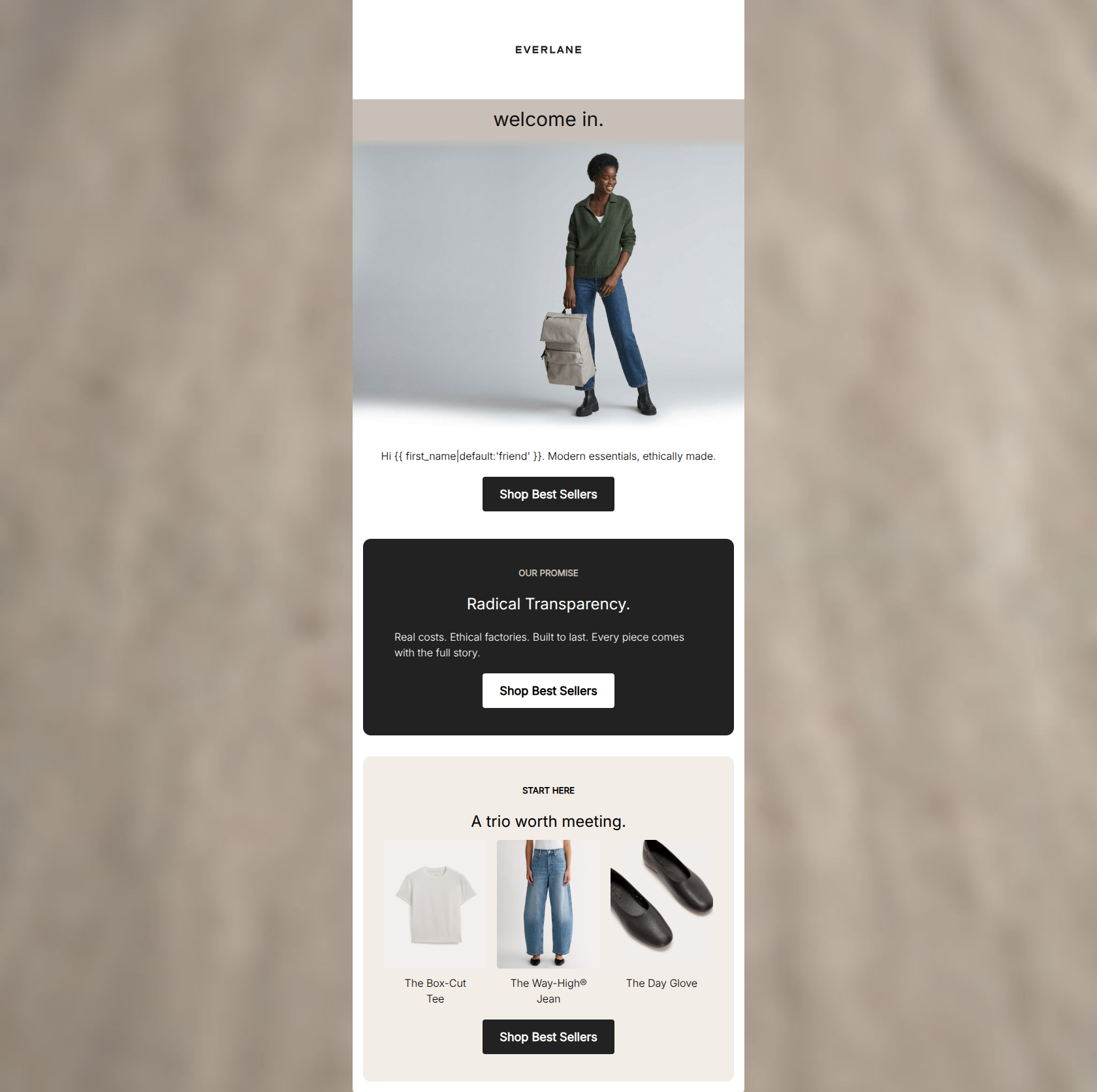
84/100This is a visually striking and structurally sound welcome email that perfectly captures Everlane's minimalist, utilitarian aesthetic. The copy is tight, the visual contrast is excellent, and the deliberately repeated call-to-action creates a frictionless path to the website. However, while it establishes the brand ethos effectively, it lacks a compelling initial offer to tip a new subscriber into becoming a first-time buyer.
Create Your Own
Generate professional email designs like this one in seconds with Kopi AI.
Email Details
- Subject Line
- Welcome to Everlane.
- Brand
- Everlane [eval-prod 2026-06-04]
- Industry
- Fashion & Apparel
- Email Type
- Welcome
- Created
- June 4, 2026
Brand Colors
Email Copy
Preview text: Modern essentials, ethically made. Here's where to begin.
welcome in.
Hi friend. Modern essentials, ethically made.
→ Shop Best Sellers
OUR PROMISE
Radical Transparency.
Real costs. Ethical factories. Built to last. Every piece comes with the full story.
→ Shop Best Sellers
START HERE
A trio worth meeting.
The Box-Cut Tee
The Way-High® Jean
The Day Glove
→ Shop Best Sellers
Why This Email Works
This is a visually striking and structurally sound welcome email that perfectly captures Everlane's minimalist, utilitarian aesthetic. The copy is tight, the visual contrast is excellent, and the deliberately repeated call-to-action creates a frictionless path to the website. However, while it establishes the brand ethos effectively, it lacks a compelling initial offer to tip a new subscriber into becoming a first-time buyer.
Hero Impact
72/100- High-quality, on-brand imagery immediately sets the minimalist aesthetic tone.
- The neutral canvas background perfectly frames the hero image.
Content Structure & Flow
92/100- Distinct sections guide the user smoothly from brand ethos to product discovery.
- Excellent use of spacing and padding between sections to give the content room to breathe.
Visual Hierarchy & Layout
90/100- The stark contrast between light and dark sections makes the email highly scannable.
- Clean, unembellished borders and background colors align perfectly with the brand's 'utilitarian' mandate.
Call-to-Action Strength
95/100- Total alignment on a single conversion goal with zero friction or confusion.
- High-contrast button design, particularly the inverted white button on the dark card.
Message Clarity & Tone
88/100- Zero jargon or fluff.
- The brand's positioning is communicated with authority and brevity.
Readability & Scannability
94/100- High contrast text-to-background ratios.
- Short line lengths and distinct visual blocks make it impossible to get lost in the copy.
Offer & Value Proposition
60/100- Strong communication of intrinsic brand value and ethical manufacturing.
Personalization & Audience Fit
80/100- The aesthetic and ethical messaging resonate strongly with the defined millennial/Gen Z conscious consumer.
Copy Conciseness & Word Economy
96/100- Absolutely zero throat-clearing or filler adjectives.
- Highly scannable, punchy sentence structures.
Quick Wins
- Move the 'Hi {{ first_name }}... Modern essentials' text block above the hero image to establish immediate context.
- Inject a welcome offer or specific incentive (e.g., 20% off) into the hero copy to drive immediate click-throughs.




Create Professional Email Designs
Generate beautiful, on-brand email designs in seconds. Just enter your brand URL and let AI do the rest.