Fashion & Apparel Welcome Email Template
“Welcome to Everlane.”
Design Score
80/100This welcome email establishes a strong visual and tonal foundation for Everlane, nailing the minimalist aesthetic and 'Radical Transparency' messaging. The copy is tight, scannable, and the layout guides the eye naturally down the page. However, it leaves significant conversion opportunities on the table by omitting a clear welcome incentive (despite one existing on the website) and creating unnecessary friction by routing specific product clicks to a generic collection page. It is a highly competent brand introduction that needs to work harder as a sales mechanism.
Create Your Own
Generate professional email designs like this one in seconds with Kopi AI.
Email Details
- Subject Line
- Welcome to Everlane.
- Brand
- Everlane [eval-prod 2026-06-04]
- Industry
- Fashion & Apparel
- Email Type
- Welcome
- Created
- June 4, 2026
Brand Colors
Email Copy
Preview text: Modern essentials, made the right way. Here's where to begin.
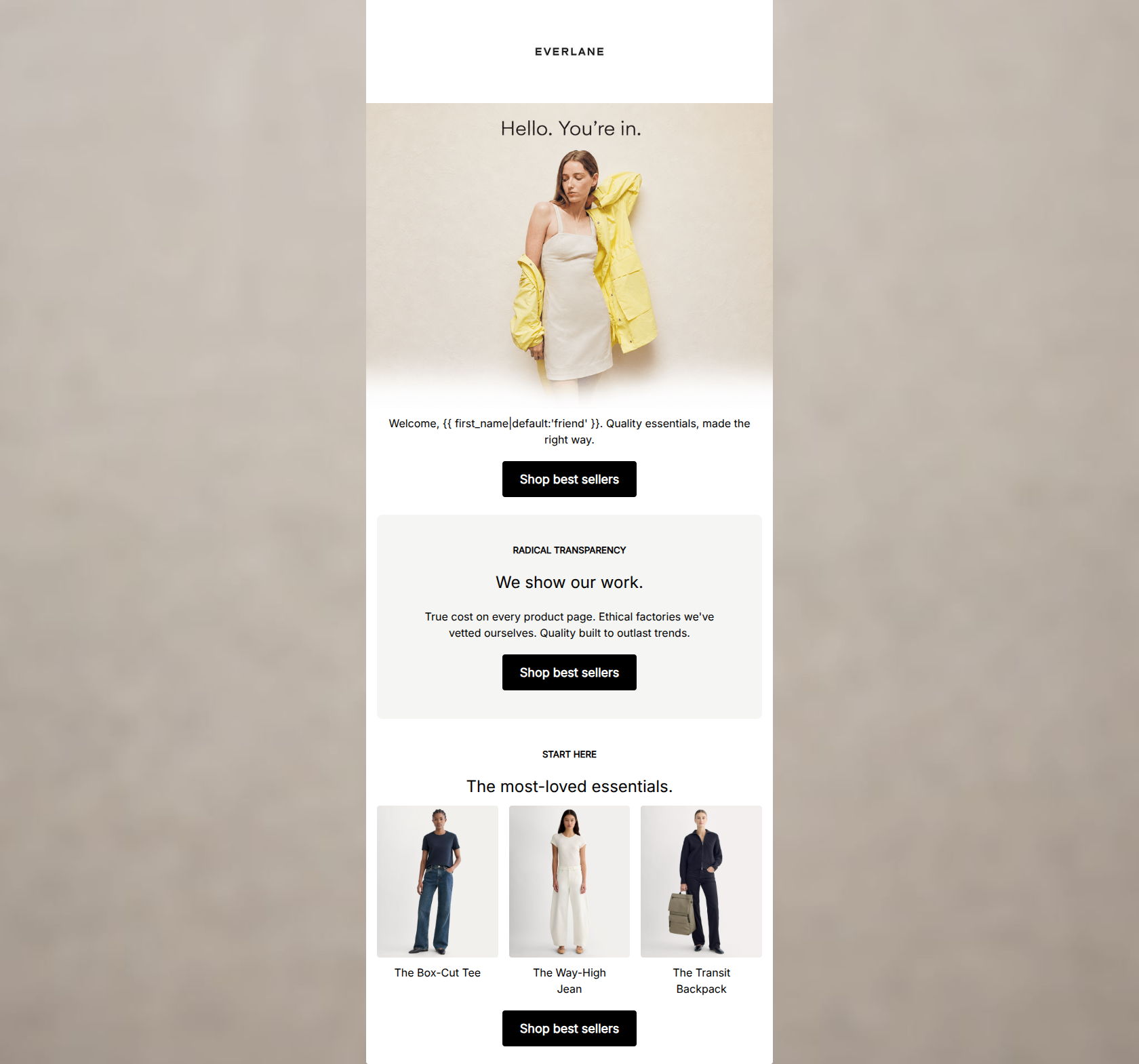
Welcome, friend. Quality essentials, made the right way.
→ Shop best sellers
RADICAL TRANSPARENCY
We show our work.
True cost on every product page. Ethical factories we've vetted ourselves. Quality built to outlast trends.
→ Shop best sellers
START HERE
The most-loved essentials.
The Box-Cut Tee
The Way-High Jean
The Transit Backpack
→ Shop best sellers
Why This Email Works
This welcome email establishes a strong visual and tonal foundation for Everlane, nailing the minimalist aesthetic and 'Radical Transparency' messaging. The copy is tight, scannable, and the layout guides the eye naturally down the page. However, it leaves significant conversion opportunities on the table by omitting a clear welcome incentive (despite one existing on the website) and creating unnecessary friction by routing specific product clicks to a generic collection page. It is a highly competent brand introduction that needs to work harder as a sales mechanism.
Hero (top/initial part) Impact
75/100- Beautiful, brand-aligned lifestyle imagery sets the right mood instantly.
- The copy is welcoming and establishes the core promise: 'Quality essentials, made the right way.'
Content Structure & Flow
85/100- Clear progression from brand introduction to product discovery.
- The use of the grey background block effectively breaks up the visual flow and highlights the core value proposition.
Visual Hierarchy & Layout
88/100- Excellent use of negative space; the email feels uncluttered and sophisticated.
- The 3-column product grid is a classic, effective way to showcase variety without overwhelming the reader.
Call-to-Action Strength
78/100- Perfect execution of the primary CTA repetition rule; the primary action is unambiguous.
- The black buttons offer excellent contrast against the white and light grey backgrounds, drawing the eye immediately.
Message Clarity & Tone
92/100- 'We show our work' is a brilliant, concise distillation of the brand's ethos.
- The tone is confident and informative without being pushy.
Readability & Scannability
95/100- Excellent use of hierarchy (H2, H5) to guide the reader's eye to key concepts.
- No dense blocks of text; formatting respects the reader's time.
Offer & Value Proposition
60/100- The core brand differentiators (ethical factories, true cost) are communicated effectively.
Personalization & Audience Fit
70/100- Aesthetic and messaging align perfectly with the target demographic's desire for minimalist, conscious consumerism.
- First-name personalization creates a slightly warmer introduction.
Copy Conciseness & Word Economy
90/100- The 'Radical Transparency' block communicates a complex supply-chain concept in just three short sentences.
- Elimination of throat-clearing intro copy; it gets straight to the point.
Quick Wins
- Update the links on the specific product images in the 3-up grid to point to their respective Product Detail Pages (PDPs) rather than the general best-sellers collection.
- Add a bold, explicit welcome offer (e.g., 'Take 20% off your first order') to the hero section.




Create Professional Email Designs
Generate beautiful, on-brand email designs in seconds. Just enter your brand URL and let AI do the rest.