Fashion & Apparel Welcome Email Template
“Welcome to Everlane”
Design Score
68/100This welcome email successfully captures Everlane’s signature minimalist aesthetic and 'clean luxury' vibe through excellent photography and generous whitespace. However, it suffers functionally from severe repetition and structural redundancy. By deploying three identical 'Shop Best Sellers' CTAs in rapid succession and repeating the word 'essentials' in the opening copy, the email feels more like a stacked template than a thoughtfully curated brand introduction. To elevate this from acceptable to highly converting, the email needs to diversify its click paths, fix glaring typographical inconsistencies, and integrate its strong value propositions higher in the visual hierarchy.
Create Your Own
Generate professional email designs like this one in seconds with Kopi AI.
Email Details
- Subject Line
- Welcome to Everlane
- Brand
- Everlane [eval 2026-03-26]
- Industry
- Fashion & Apparel
- Email Type
- Welcome
- Created
- March 26, 2026
Brand Colors
Email Copy
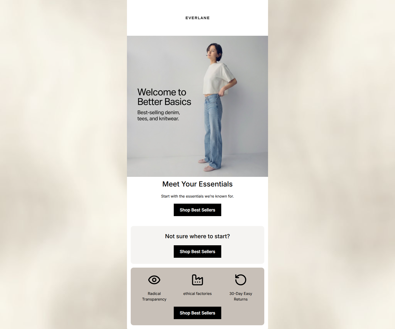
Meet Your Essentials
Start with the essentials we’re known for.
→ Shop Best Sellers
Not sure where to start?
→ Shop Best Sellers
Radical Transparency
ethical factories
30-Day Easy Returns
→ Shop Best Sellers
Why This Email Works
This welcome email successfully captures Everlane’s signature minimalist aesthetic and 'clean luxury' vibe through excellent photography and generous whitespace. However, it suffers functionally from severe repetition and structural redundancy. By deploying three identical 'Shop Best Sellers' CTAs in rapid succession and repeating the word 'essentials' in the opening copy, the email feels more like a stacked template than a thoughtfully curated brand introduction. To elevate this from acceptable to highly converting, the email needs to diversify its click paths, fix glaring typographical inconsistencies, and integrate its strong value propositions higher in the visual hierarchy.
Hero Impact
75/100- High-quality imagery that perfectly fits the Everlane brand aesthetic.
- Clear, confident declaration of what the brand sells ('Better Basics').
Content Structure & Flow
58/100- Generous use of whitespace prevents the email from feeling cluttered.
- Distinct background colors clearly delineate different content zones.
Visual Hierarchy & Layout
72/100- The 3-column icon layout successfully breaks up the vertical flow and makes the brand pillars easy to digest.
- Centered alignment creates a calming, balanced aesthetic.
Call-to-Action Strength
55/100- The black CTA buttons offer maximum contrast against the white and light grey backgrounds, making them impossible to miss.
- The button copy is action-oriented.
Message Clarity & Tone
75/100- Avoids hyperbole or 'salesy' language, maintaining a premium feel.
- Clearly defines the brand's unique selling propositions in the bottom module.
Readability & Scannability
88/100- Excellent use of clear, bold headings.
- Text lines are kept short, reducing cognitive load.
Offer & Value Proposition
68/100- Clearly communicates the 30-Day return policy, lowering the barrier to entry for first-time buyers.
Personalization & Audience Fit
60/100- Aesthetic and messaging align perfectly with the target demographic's desire for clean, anti-fast-fashion apparel.
Copy Conciseness & Word Economy
65/100- No lengthy paragraphs or dense walls of text.
Quick Wins
- Fix the capitalization of 'ethical factories' in the icon section to match the Title Case of the other pillars.
- Delete the middle module ('Not sure where to start?'). It is purely filler.
- Rewrite the HTML body copy under 'Meet Your Essentials' to remove the second use of the word 'essentials'.
Create Professional Email Designs
Generate beautiful, on-brand email designs in seconds. Just enter your brand URL and let AI do the rest.