Fashion & Apparel Welcome Email Template
“Welcome to Everlane.”
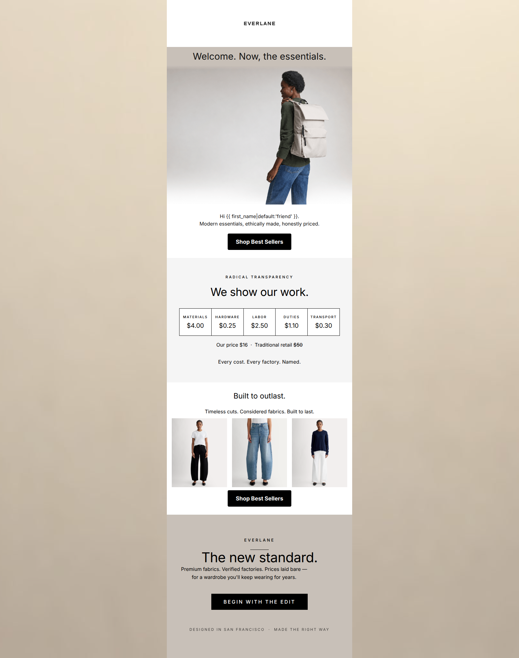
Design Score
88/100This is a highly effective, aesthetically polished welcome email that perfectly translates Everlane's 'radical transparency' positioning into direct-response copy. The structural flow—moving from a clean greeting to a concrete cost breakdown, then to product proof—is an excellent example of an inverted pyramid that builds trust before asking for the click. While it excels in visual hierarchy and tone, minor copy redundancies and a slight drift in the final CTA copy hold it back from a near-perfect score.
Create Your Own
Generate professional email designs like this one in seconds with Kopi AI.
Email Details
- Subject Line
- Welcome to Everlane.
- Brand
- Everlane [eval-prod 2026-06-04]
- Industry
- Fashion & Apparel
- Email Type
- Welcome
- Created
- June 4, 2026
Brand Colors
Email Copy
Preview text: Modern essentials, ethically made, honestly priced. Start with our best sellers.
Welcome. Now, the essentials.
Hi friend. Modern essentials, ethically made, honestly priced.
→ Shop Best Sellers
Built to outlast.
Timeless cuts. Considered fabrics. Built to last.
→ Shop Best Sellers
Why This Email Works
This is a highly effective, aesthetically polished welcome email that perfectly translates Everlane's 'radical transparency' positioning into direct-response copy. The structural flow—moving from a clean greeting to a concrete cost breakdown, then to product proof—is an excellent example of an inverted pyramid that builds trust before asking for the click. While it excels in visual hierarchy and tone, minor copy redundancies and a slight drift in the final CTA copy hold it back from a near-perfect score.
Hero Impact
85/100- Extremely clear, concise introductory copy that distills the brand ethos into three quick points.
- Excellent use of high-contrast typography immediately draws the eye down to the first CTA.
Content Structure & Flow
95/100- Masterful pacing and use of color blocking to separate distinct messages.
- The placement of the 'Radical Transparency' module serves as a powerful credibility builder right before asking users to evaluate the products below.
Visual Hierarchy & Layout
92/100- The cost-breakdown graphic is an outstanding piece of visual communication—complex data presented simply and elegantly.
- Whitespace is used aggressively and effectively to give the content room to breathe.
Call-to-Action Strength
84/100- Excellent visual prominence; the black buttons anchor each section.
- Strong repetition of the primary action throughout the scroll depth.
Message Clarity & Tone
96/100- Unapologetic, straightforward language ('Every cost. Every factory. Named.').
- Avoids generic hyperbole in favor of concrete statements of fact.
Readability & Scannability
88/100- Excellent contrast ratios across all text elements.
- Short, punchy sentence structures make the email effortless to skim.
Offer & Value Proposition
90/100- The cost comparison graphic does the heavy lifting of proving value far better than generic copy could.
- Clearly defines the brand's position against traditional retail markup.
Personalization & Audience Fit
85/100- The emphasis on 'Built to outlast' directly addresses the audience's pain point regarding fast fashion and disposable clothing.
- Aesthetic choices perfectly mirror the aesthetic preferences of the target demographic.
Copy Conciseness & Word Economy
75/100- The hero and transparency sections use absolute minimal word counts to convey complex ideas.
- No throat-clearing openers or filler adjectives.
Quick Wins
- Remove the redundant 'Built to last' sentence directly beneath the 'Built to outlast' headline.
- Change the text of the final button from 'BEGIN WITH THE EDIT' to 'SHOP BEST SELLERS' to ensure absolute CTA consistency.
- Add simple product names under the three images in the grid to provide immediate context before the click.




Create Professional Email Designs
Generate beautiful, on-brand email designs in seconds. Just enter your brand URL and let AI do the rest.