Fashion & Apparel Welcome Email Template
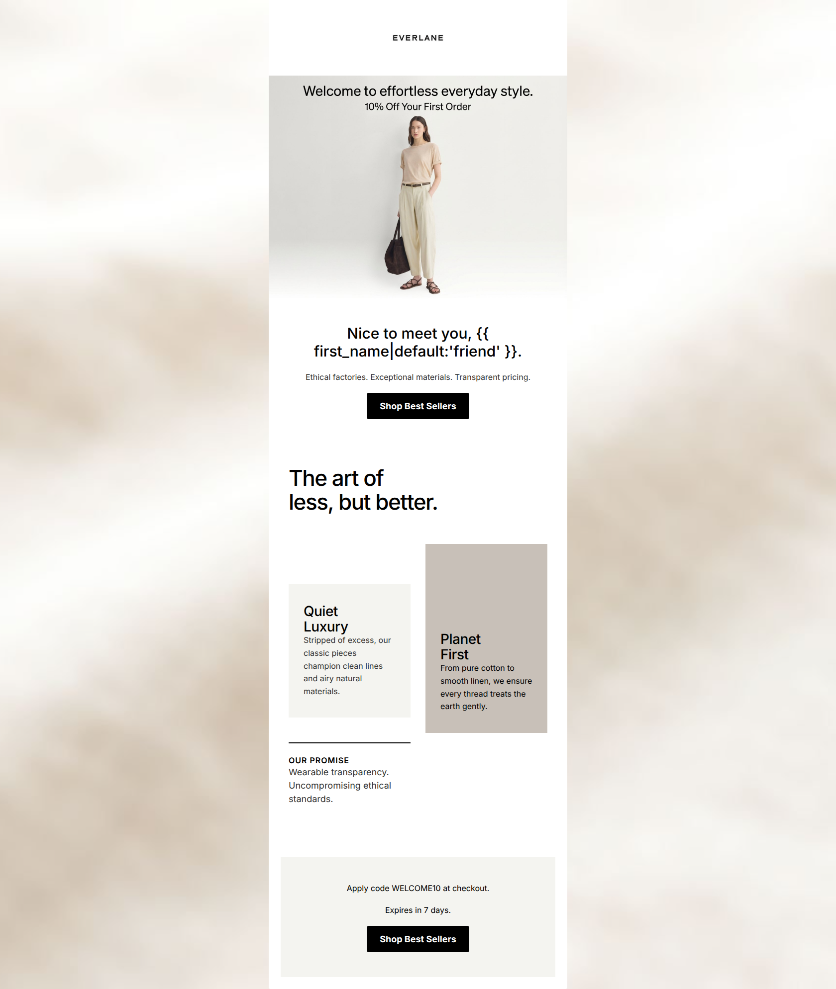
“Welcome to Everlane. Here is 10% off.”
Design Score
74/100This welcome email successfully establishes Everlane's minimalist, 'quiet luxury' aesthetic and clearly communicates its core value pillars (ethical factories, exceptional materials). The copy is tight and on-brand. However, the email suffers from a significant structural flaw: it separates the offer (10% off in the hero image) from the redemption mechanism (the promo code at the very bottom). This disjointed flow creates unnecessary friction for a new subscriber trying to make their first purchase. Consolidating the offer details above the fold would dramatically improve conversion likelihood.
Create Your Own
Generate professional email designs like this one in seconds with Kopi AI.
Email Details
- Subject Line
- Welcome to Everlane. Here is 10% off.
- Brand
- Everlane [eval 2026-03-26]
- Industry
- Fashion & Apparel
- Email Type
- Welcome
- Created
- March 26, 2026
Brand Colors
Email Copy
Nice to meet you, friend.
Ethical factories. Exceptional materials. Transparent pricing.
→ Shop Best Sellers
Apply code WELCOME10 at checkout.
Expires in 7 days.
→ Shop Best Sellers
Why This Email Works
This welcome email successfully establishes Everlane's minimalist, 'quiet luxury' aesthetic and clearly communicates its core value pillars (ethical factories, exceptional materials). The copy is tight and on-brand. However, the email suffers from a significant structural flaw: it separates the offer (10% off in the hero image) from the redemption mechanism (the promo code at the very bottom). This disjointed flow creates unnecessary friction for a new subscriber trying to make their first purchase. Consolidating the offer details above the fold would dramatically improve conversion likelihood.
Hero (top/initial part) Impact
75/100- Strong, on-brand imagery immediately establishes the 'quiet luxury' aesthetic.
- Clear, high-contrast primary CTA button above the fold.
Content Structure & Flow
60/100- Logical thematic progression from greeting -> brand values -> final reminder.
- Generous spacing between sections prevents visual clutter.
Visual Hierarchy & Layout
78/100- Excellent use of whitespace to let the content breathe.
- High-contrast black buttons stand out clearly against the white/off-white backgrounds.
Call-to-Action Strength
72/100- Buttons are clearly defined, high-contrast, and easy to locate.
- Bulletproof button styling ensures consistent rendering.
Message Clarity & Tone
85/100- Tone is highly consistent with the 'trusted advisor' persona.
- Brand pillars are communicated succinctly and clearly.
Readability & Scannability
88/100- Excellent typography choices with clear hierarchy between H1s, subheads, and body copy.
- Text alignment and short line lengths make reading effortless.
Offer & Value Proposition
65/100- The offer is straightforward with no complex conditions (other than the 7-day expiry).
- The value proposition goes beyond price, clearly stating the ethical and material benefits of the brand.
Personalization & Audience Fit
75/100- Design and copy heavily resonate with the 'quiet luxury' psychographic.
- Use of a dynamic name tag adds a touch of personalized welcome.
Copy Conciseness & Word Economy
92/100- Zero fluff or repetitive copy.
- Highly effective use of punchy, fragmented sentences for emphasis.
Quick Wins
- Move the text 'Apply code WELCOME10 at checkout' from the bottom footer block to immediately below the hero image or the first H1.
- Update the primary CTA copy from 'Shop Best Sellers' to 'Shop With 10% Off' to reinforce the welcome offer.
- Replicate the 'Expires in 7 days' urgency messaging closer to the top of the email.


Create Professional Email Designs
Generate beautiful, on-brand email designs in seconds. Just enter your brand URL and let AI do the rest.