Fashion & Apparel Welcome Email Template
“Welcome to Cuts. Claim your 15% welcome discount.”
Design Score
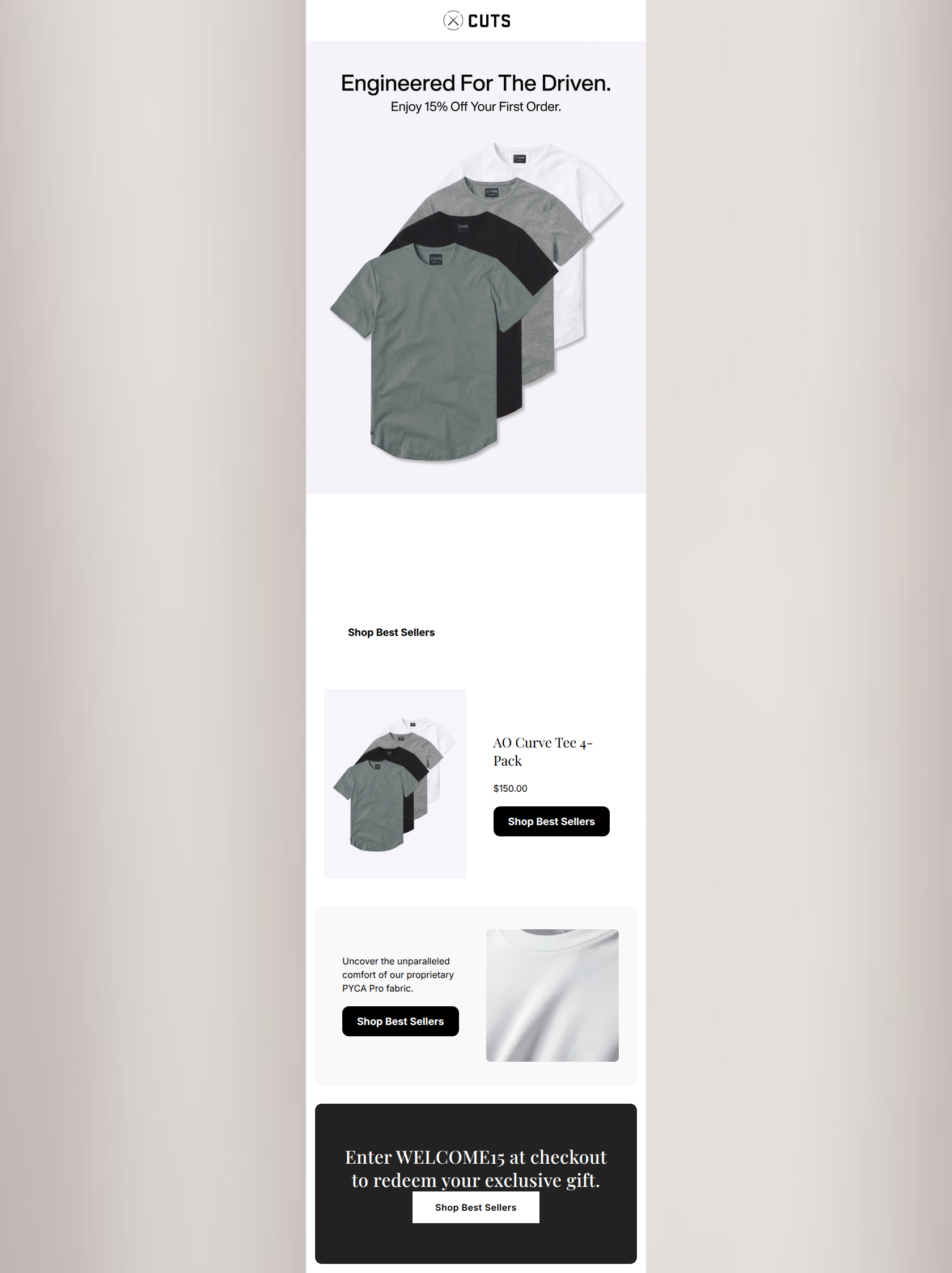
71/100The email establishes a strong visual baseline with a high-contrast, minimalist design and aspirational copy that fits the 'Cuts Clothing' persona perfectly. However, it suffers from a severe case of repetitive, context-blind calls-to-action and a disjointed offer presentation. While the aesthetic feels premium, the conversion mechanics are clunky. The user is forced to connect a 15% discount promised in the hero with a promo code buried at the very bottom of the email, and every single button lazily relies on identical copy regardless of the surrounding content.
Create Your Own
Generate professional email designs like this one in seconds with Kopi AI.
Email Details
- Subject Line
- Welcome to Cuts. Claim your 15% welcome discount.
- Brand
- Cuts Clothing
- Industry
- Fashion & Apparel
- Email Type
- Welcome
- Created
- March 20, 2026
Brand Colors
Email Copy
Built For The Ambitious
Welcome to Cuts Clothing. We design versatile, highly functional apparel that seamlessly transitions from professional obligations to everyday life. Elevate your wardrobe with our meticulously tailored fits and proprietary fabrics.
→ Shop Best Sellers
AO Curve Tee 4-Pack
$150.00
→ Shop Best Sellers
Uncover the unparalleled comfort of our proprietary PYCA Pro fabric.
→ Shop Best Sellers
Why This Email Works
The email establishes a strong visual baseline with a high-contrast, minimalist design and aspirational copy that fits the 'Cuts Clothing' persona perfectly. However, it suffers from a severe case of repetitive, context-blind calls-to-action and a disjointed offer presentation. While the aesthetic feels premium, the conversion mechanics are clunky. The user is forced to connect a 15% discount promised in the hero with a promo code buried at the very bottom of the email, and every single button lazily relies on identical copy regardless of the surrounding content.
Hero Impact
75/100- Striking, on-brand cinematic imagery.
- Immediate introduction of a strong financial incentive (15% off).
- Aspirational phrasing ('Engineered For The Driven') aligns perfectly with the target psychographic.
Content Structure & Flow
65/100- Alternating layout (left/right image alignments) keeps the eye moving.
- Adequate breathing room between sections prevents visual fatigue.
- Logical progression of content types (Brand -> Product -> Tech).
Visual Hierarchy & Layout
70/100- Excellent use of negative space.
- High contrast makes individual sections easy to distinguish.
- Clean, grid-based alignment feels premium and organized.
Call-to-Action Strength
40/100- Buttons are visually prominent with strong contrast against their backgrounds.
- Adequate padding makes them clear focal points within their respective sections.
Message Clarity & Tone
85/100- Highly resonant vocabulary ('meticulously tailored', 'proprietary fabrics').
- Concise paragraphs respect the busy user's time.
- Tone is authoritative without being arrogant.
Readability & Scannability
85/100- Stark black text on white/light grey backgrounds ensures high legibility.
- No text is overlaid on busy images.
- Clear hierarchy between headings, body copy, and buttons.
Offer & Value Proposition
75/100- Clear financial incentive for new users.
- Functional benefits of the clothing are clearly stated alongside the discount.
Personalization & Audience Fit
80/100- Directly addresses the audience's desire to look professional while remaining comfortable.
- Visuals match the elevated lifestyle expectations of the demographic.
Quick Wins
- Rewrite every CTA button to accurately reflect the destination and context of the block it sits within.
- Move the 'WELCOME15' promo code up to the hero section so the user has the information immediately without scrolling.
- Change the heading font to a clean, modern sans-serif to better match the brand's 'athletically built' visual identity.


Create Professional Email Designs
Generate beautiful, on-brand email designs in seconds. Just enter your brand URL and let AI do the rest.