Apparel & Fashion Welcome Email Template
“Welcome. Here's what makes us different.”
![Apparel & Fashion Welcome email design for Everlane [eval-prod 2026-06-04] — "Welcome. Here's what makes us different."](https://file.rendit.io/n/dd4d28bbc53f.png)
Design Score
73/100This email effectively communicates Everlane's core brand pillars, utilizing a strong, scannable 'Radical transparency' section that perfectly matches their psychographic profile. The use of consistent, high-contrast calls-to-action provides a clear conversion path. However, the execution is hampered by a visually disjointed hero section, a jarringly heavy design in the lower checkerboard module, and severe copy redundancy regarding the product's durability. It reads like a brand manifesto that forgot it needs to drive a click today.
Create Your Own
Generate professional email designs like this one in seconds with Kopi AI.
Email Details
- Subject Line
- Welcome. Here's what makes us different.
- Brand
- Everlane [eval-prod 2026-06-04]
- Industry
- Apparel & Fashion
- Email Type
- Welcome
- Created
- July 14, 2026
Brand Colors
Email Copy
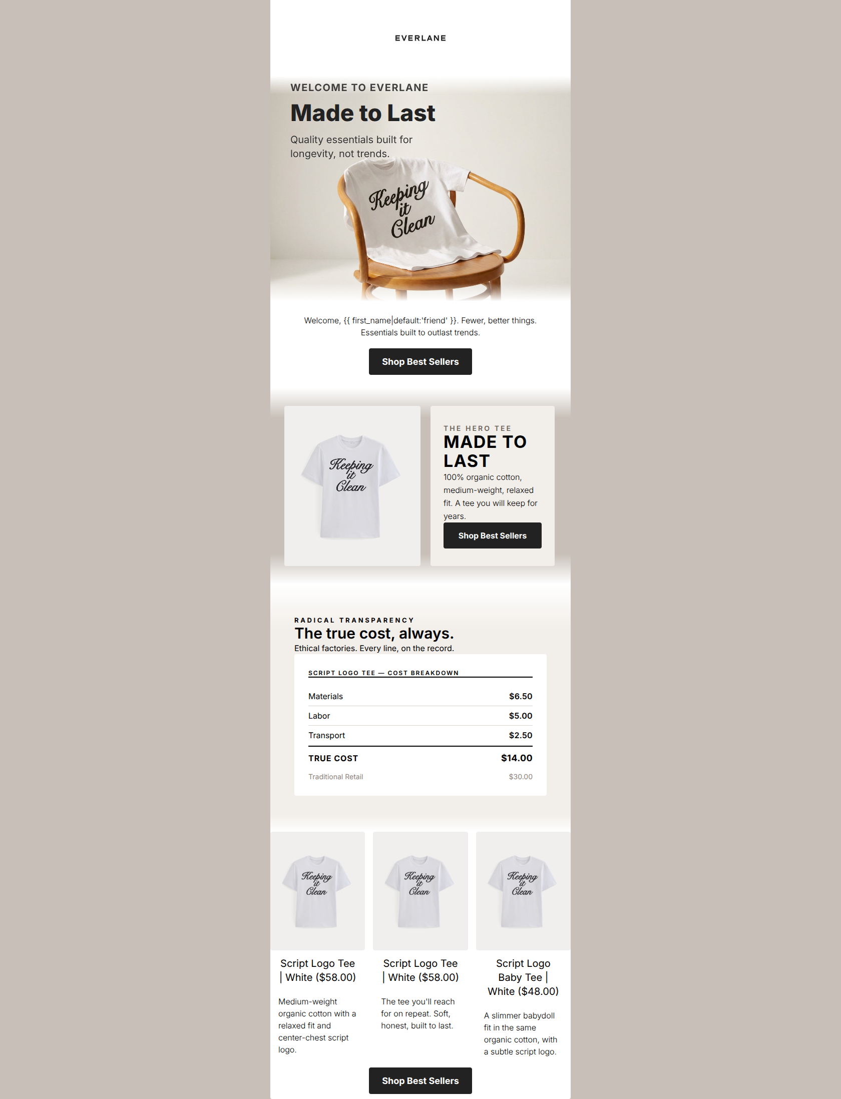
Welcome, friend. Timeless essentials, made to last for years.
→ Shop Best Sellers
Why This Email Works
This email effectively communicates Everlane's core brand pillars, utilizing a strong, scannable 'Radical transparency' section that perfectly matches their psychographic profile. The use of consistent, high-contrast calls-to-action provides a clear conversion path. However, the execution is hampered by a visually disjointed hero section, a jarringly heavy design in the lower checkerboard module, and severe copy redundancy regarding the product's durability. It reads like a brand manifesto that forgot it needs to drive a click today.
Hero (top/initial part) Impact
45/100- Features a strong, candid lifestyle image that aligns with Everlane's aesthetic.
- The Everlane logo is clearly positioned for immediate brand recognition.
Content Structure & Flow
75/100- Clear delineation between different content blocks.
- Ends on a strong reassurance note (30-day returns) to lower purchase hesitation.
Visual Hierarchy & Layout
65/100- Excellent use of whitespace in the 'What makes us different' section.
- The two-column product card uses a warm taupe background (#c8c0b8) effectively to make the white product card pop.
Call-to-Action Strength
95/100- Consistent use of 'Shop Best Sellers' reinforces the single primary action.
- Solid black buttons (#000000) with white text provide maximum contrast and are impossible to miss.
Message Clarity & Tone
85/100- The transparency points (Real cost, Ethical factories) are articulated with confident, fluff-free language.
- The voice feels like a trusted advisor rather than a pushy salesperson.
Readability & Scannability
82/100- Great use of bullet-style icons paired with bold headers and short, muted descriptive text.
- Eyebrows (e.g., 'THE HERO STAPLE') effectively guide the reader into the section content.
Offer & Value Proposition
75/100- The 'No traditional markup' point clearly explains the pricing benefit to the consumer.
- The 30-day easy returns policy is prominently featured, removing friction for a new buyer.
Personalization & Audience Fit
75/100- The messaging speaks directly to the audience's desire for sustainability ('responsibly sourced fabrics', 'ethical factories').
- Uses a liquid tag for first-name personalization.
Copy Conciseness & Word Economy
60/100- The descriptive copy for the transparency icons is tight and precise ('No secrets, just honest math').
Quick Wins
- Delete the redundant 'Welcome...' text block immediately below the hero image.
- Remove the heavy black borders from the bottom checkerboard section to unify the visual design.
- Fix the layout of the hero text so it is legible and centered, rather than floating on the edges.
Create Professional Email Designs
Generate beautiful, on-brand email designs in seconds. Just enter your brand URL and let AI do the rest.