Fashion & Apparel Welcome Email Template
“Welcome. Here's 10% off.”
Design Score
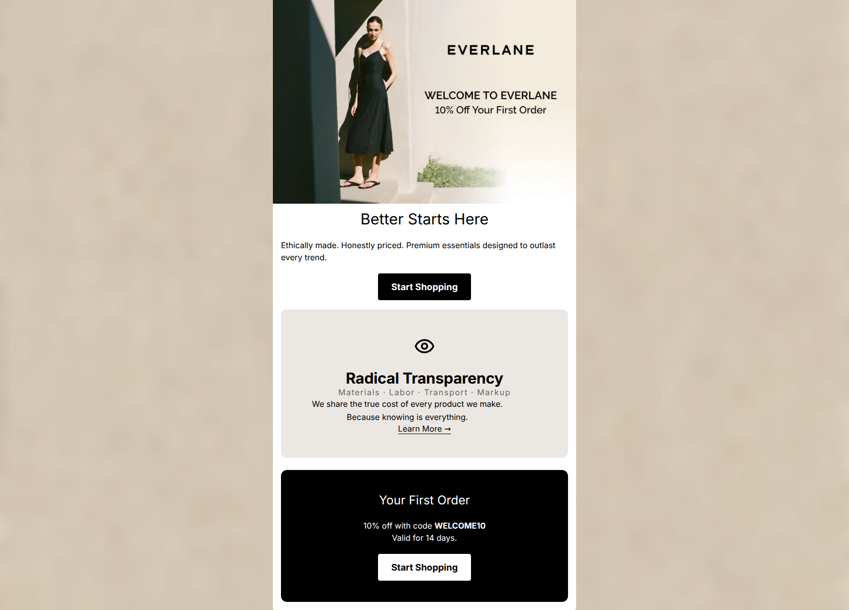
78/100This welcome email effectively establishes Everlane's minimalist aesthetic and core value proposition of 'Radical Transparency.' The visual hierarchy is stark and scannable, and the copy is impressively concise. However, it suffers from a significant structural flaw: the primary conversion incentive (the 10% off welcome code) is introduced in the hero image but the actual promo code is buried at the very bottom of the email. This forces the user to scroll past brand philosophy to get the code they need to convert, introducing unnecessary friction.
Create Your Own
Generate professional email designs like this one in seconds with Kopi AI.
Email Details
- Subject Line
- Welcome. Here's 10% off.
- Brand
- Everlane [eval 2026-03-26]
- Industry
- Fashion & Apparel
- Email Type
- Welcome
- Created
- March 26, 2026
Brand Colors
Email Copy
Better Starts Here
Ethically made. Honestly priced. Premium essentials designed to outlast every trend.
→ Start Shopping
Your First Order
10% off with code WELCOME10 Valid for 14 days.
→ Start Shopping
Why This Email Works
This welcome email effectively establishes Everlane's minimalist aesthetic and core value proposition of 'Radical Transparency.' The visual hierarchy is stark and scannable, and the copy is impressively concise. However, it suffers from a significant structural flaw: the primary conversion incentive (the 10% off welcome code) is introduced in the hero image but the actual promo code is buried at the very bottom of the email. This forces the user to scroll past brand philosophy to get the code they need to convert, introducing unnecessary friction.
Hero (top/initial part) Impact
75/100- High-quality editorial imagery aligns perfectly with the brand's 'clean luxury' positioning.
- Clear, unmissable statement that this is a welcome email with an incentive.
Content Structure & Flow
60/100- Distinct, separated content blocks make the email easy to parse visually.
- Logical progression from greeting -> brand differentiator -> closing call to action (if the offer wasn't split).
Visual Hierarchy & Layout
85/100- Perfect execution of the brand's stark, minimalist visual identity.
- High contrast between sections effectively guides the eye downward.
Call-to-Action Strength
65/100- Buttons have excellent contrast against their respective backgrounds (black on white, white on black).
- Generous breathing room around the buttons makes them clear tap targets.
Message Clarity & Tone
85/100- Punchy, memorable value proposition: 'Ethically made. Honestly priced.'
- Avoids marketing fluff and technical jargon entirely.
Readability & Scannability
90/100- Excellent use of negative space to prevent text crowding.
- Clear typographical hierarchy between H1, H2, and body text.
Offer & Value Proposition
75/100- The core brand value proposition is articulated clearly and concisely in the hero text.
- The 14-day validity creates a mild, realistic sense of urgency.
Personalization & Audience Fit
85/100- The 'Radical Transparency' module perfectly targets the audience's pain point regarding opaque industry practices.
- The editorial imagery appeals to the 'style-conscious' demographic.
Copy Conciseness & Word Economy
95/100- Avoids phrases like 'We are excited to announce' or 'Check out our...'.
- The breakdown of 'Materials · Labor · Transport · Markup' conveys a complex concept in just four words.
Quick Wins
- Update the top CTA button copy from 'Start Shopping' to 'Shop With 10% Off'.
- Add the text 'Code: WELCOME10' immediately above or below the top CTA button so users have it before scrolling.


Create Professional Email Designs
Generate beautiful, on-brand email designs in seconds. Just enter your brand URL and let AI do the rest.