Fashion & Apparel Promotional Email Template
“The tee everyone keeps buying”
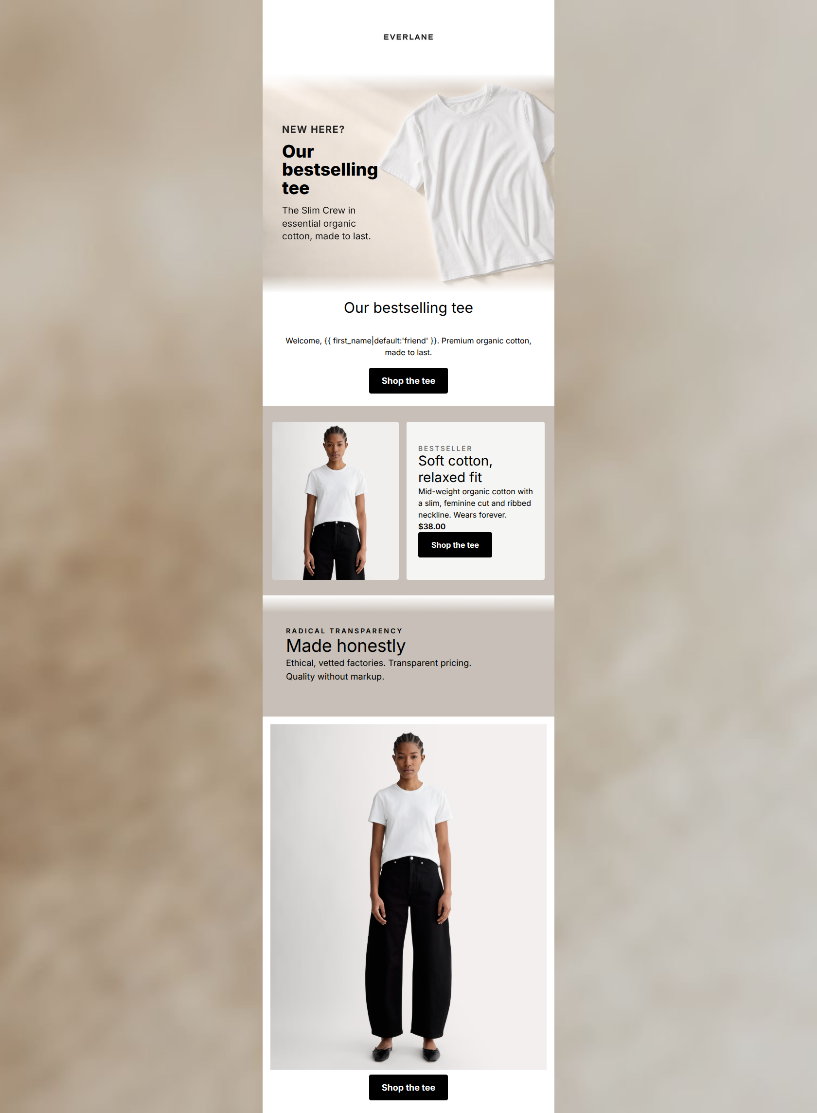
Design Score
68/100This email fundamentally understands the Everlane brand—it looks clean, highlights 'Radical Transparency,' and features high-quality editorial photography. However, it suffers from severe structural and copy repetition in the critical upper half. The email forces the reader to consume the exact same headline and subcopy twice in a row before presenting the first CTA, breaking the 'inverted pyramid' rule and artificially inflating cognitive load. The product card and bottom half are strong, but the clunky introduction leaves a lot of conversion potential on the table.
Create Your Own
Generate professional email designs like this one in seconds with Kopi AI.
Email Details
- Subject Line
- The tee everyone keeps buying
- Brand
- Everlane [eval-prod 2026-06-04]
- Industry
- Fashion & Apparel
- Email Type
- Promotional
- Created
- July 14, 2026
Brand Colors
Email Copy
Preview text: Meet the bestselling tee — crafted from premium organic cotton and made to last.
Our bestselling tee
Welcome, friend. Premium organic cotton, made to last.
→ Shop the tee
→ Shop the tee
Why This Email Works
This email fundamentally understands the Everlane brand—it looks clean, highlights 'Radical Transparency,' and features high-quality editorial photography. However, it suffers from severe structural and copy repetition in the critical upper half. The email forces the reader to consume the exact same headline and subcopy twice in a row before presenting the first CTA, breaking the 'inverted pyramid' rule and artificially inflating cognitive load. The product card and bottom half are strong, but the clunky introduction leaves a lot of conversion potential on the table.
Hero (top/initial part) Impact
65/100- The 'NEW HERE?' kicker instantly establishes relevance for a new subscriber.
- The imagery highlights the texture and quality of the organic cotton.
Content Structure & Flow
50/100- The transition from product specific features to the brand's 'Radical Transparency' value prop follows a logical conversion narrative.
Visual Hierarchy & Layout
75/100- Excellent use of whitespace throughout.
- The two-column product card breaks up the vertical scrolling monotony perfectly.
Call-to-Action Strength
95/100- Perfect consistency in CTA copy ('Shop the tee').
- High-contrast black buttons demand attention against the light background.
Message Clarity & Tone
80/100- Nails the 'Radical Transparency' messaging with succinct, impactful copy.
- Product descriptions focus on tangible outcomes ('Wears forever').
Readability & Scannability
60/100- Generous line height and clear sans-serif typography make the text physically easy to read.
- Good use of varying font weights to establish hierarchy within the product card.
Offer & Value Proposition
85/100- Explicitly states the price, removing friction and setting expectations before the click.
- Ties material quality directly to longevity ('Mid-weight organic cotton... Wears forever').
Personalization & Audience Fit
75/100- Perfectly targets the audience's desire for sustainable, long-lasting wardrobe essentials.
- The 'NEW HERE?' framing correctly contextualizes the email for recent sign-ups.
Copy Conciseness & Word Economy
45/100- The product card and transparency sections are beautifully concise and punchy.
Quick Wins
- Delete the redundant `<HEADING>` and `<TEXT>` blocks immediately following the hero image to eliminate repetitive copy.
- Move the first 'Shop the tee' button directly below the hero image (or embed it within the hero HTML).
- Crop the final bottom lifestyle image to reduce the amount of empty vertical scrolling required to reach the final CTA.

Create Professional Email Designs
Generate beautiful, on-brand email designs in seconds. Just enter your brand URL and let AI do the rest.