Fashion & Apparel Promotional Email Template
“The tee everyone's reaching for”
Design Score
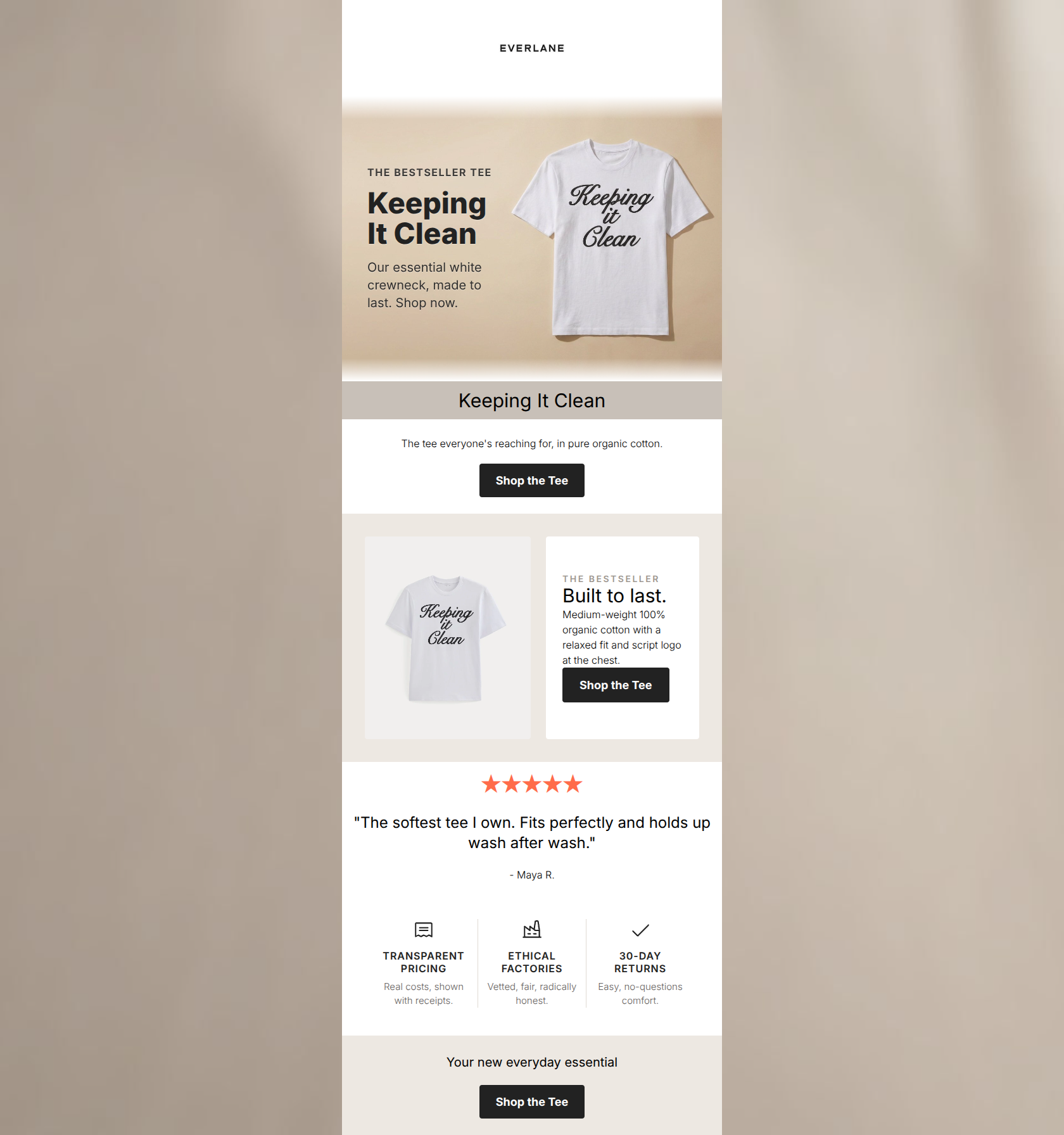
84/100This is a strong, on-brand promotional email that effectively leverages Everlane's minimalist aesthetic and core value propositions. It successfully highlights a single product with clear, repetitive CTAs and supportive social proof. However, the email suffers from immediate copy redundancy at the top and a missed opportunity to place a clear, clickable button shape directly within the hero section, which creates a slight friction point for immediate converters.
Create Your Own
Generate professional email designs like this one in seconds with Kopi AI.
Email Details
- Subject Line
- The tee everyone's reaching for
- Brand
- Everlane [eval-prod 2026-06-04]
- Industry
- Fashion & Apparel
- Email Type
- Promotional
- Created
- July 14, 2026
Brand Colors
Email Copy
Keeping It Clean
The tee everyone's reaching for, in pure organic cotton.
→ Shop the Tee
★★★★★
"The softest tee I own. Fits perfectly and holds up wash after wash."
- Maya R.
Your new everyday essential
→ Shop the Tee
Why This Email Works
This is a strong, on-brand promotional email that effectively leverages Everlane's minimalist aesthetic and core value propositions. It successfully highlights a single product with clear, repetitive CTAs and supportive social proof. However, the email suffers from immediate copy redundancy at the top and a missed opportunity to place a clear, clickable button shape directly within the hero section, which creates a slight friction point for immediate converters.
Hero (top/initial part) Impact
75/100- High-quality, brand-aligned photography that immediately showcases the product.
- Clear, concise headline and subheadline within the image.
Content Structure & Flow
80/100- Excellent use of the inverted pyramid strategy across the entire email.
- Clear separation of sections using subtle background color changes (white to taupe).
Visual Hierarchy & Layout
85/100- Generous whitespace allows the product and copy to breathe.
- The three-column value prop infographic at the bottom is visually distinct but perfectly on-brand.
Call-to-Action Strength
88/100- Consistent primary action reinforces the singular goal of the email.
- High contrast (white text on dark charcoal) makes the buttons pop.
Message Clarity & Tone
92/100- Authentic, unpretentious brand voice.
- Focus on tangible benefits (medium-weight, organic, relaxed fit).
Readability & Scannability
90/100- Short, punchy sentences.
- Excellent use of bolding and varied font sizes to guide the eye.
Offer & Value Proposition
85/100- Strong emphasis on product longevity and material quality.
- Brand-level value props (Ethical factories, transparent pricing) are explicitly stated.
Personalization & Audience Fit
88/100- Aesthetic and copy are tailor-made for design-appreciative, conscious consumers.
- Highlights the exact reassurance points this audience looks for.
Copy Conciseness & Word Economy
78/100- No throat-clearing intro paragraphs.
- The review chosen is brief and highly impactful.
Quick Wins
- Delete the standalone 'Keeping It Clean' H1 text block completely to remove redundancy and push the first actionable content higher.
- Change the color of the review stars from bright orange (#FF6B4A) to black or dark charcoal to maintain the strict, minimalist brand aesthetic.
- Add a distinct, clickable button shape reading 'Shop the Tee' into the hero image area instead of just having 'Shop now.' as plain text.



Create Professional Email Designs
Generate beautiful, on-brand email designs in seconds. Just enter your brand URL and let AI do the rest.