Fashion & Apparel Promotional Email Template
“The tee everyone's reaching for”
Design Score
83/100This is a highly competent, brand-aligned promotional email that effectively leverages Everlane's minimalist aesthetic and 'Radical Transparency' positioning. The visual hierarchy is strong, utilizing whitespace and high-contrast blocks to guide the eye. The repetitive use of the primary CTA ('Shop the tee') is excellent for driving conversion. However, the email suffers slightly from redundant copy across different sections and a disconnected layout immediately following the hero image. By tightening the word economy and ensuring a CTA is immediately visible above the fold, this email could easily reach top-tier performance.
Create Your Own
Generate professional email designs like this one in seconds with Kopi AI.
Email Details
- Subject Line
- The tee everyone's reaching for
- Brand
- Everlane [eval-prod 2026-06-04]
- Industry
- Fashion & Apparel
- Email Type
- Promotional
- Created
- July 14, 2026
Brand Colors
Email Copy
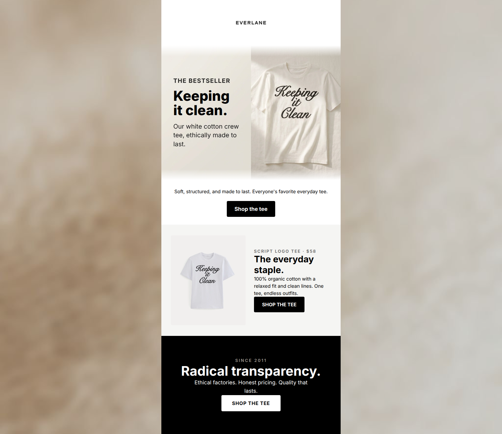
Soft, structured, and made to last. Everyone's favorite everyday tee.
→ Shop the tee
Why This Email Works
This is a highly competent, brand-aligned promotional email that effectively leverages Everlane's minimalist aesthetic and 'Radical Transparency' positioning. The visual hierarchy is strong, utilizing whitespace and high-contrast blocks to guide the eye. The repetitive use of the primary CTA ('Shop the tee') is excellent for driving conversion. However, the email suffers slightly from redundant copy across different sections and a disconnected layout immediately following the hero image. By tightening the word economy and ensuring a CTA is immediately visible above the fold, this email could easily reach top-tier performance.
Hero Impact
75/100- Strong use of an eyebrow ('THE BESTSELLER') to establish immediate value.
- Clear, high-quality product imagery integrated with text.
- Headline connects perfectly with the product graphic.
Content Structure & Flow
80/100- Clear logical progression from product awareness to brand validation.
- Distinct sections that don't overwhelm the reader with too much at once.
Visual Hierarchy & Layout
84/100- Excellent use of contrast to separate the product card and the final brand trust section.
- Generous whitespace prevents the email from feeling cluttered.
- The black footer block heavily anchors the bottom of the email.
Call-to-Action Strength
88/100- Excellent repetition of the primary goal.
- High-contrast button colors ensure they stand out in the 'squint test'.
- Clear, unambiguous action language.
Message Clarity & Tone
88/100- Brand tone is consistent and trustworthy.
- Focuses heavily on the 'everyday staple' aspect, matching customer desires for versatility.
- No hyperbole or cheap sales language.
Readability & Scannability
92/100- Short, digestible sentences.
- Excellent typographic hierarchy.
- No walls of text.
Offer & Value Proposition
85/100- Transparent pricing strategy fits the brand ethos.
- Value prop relies on quality and ethics rather than cheap discounts.
Personalization & Audience Fit
85/100- Perfectly aligned with millennial/Gen Z conscious consumerism.
- Addresses industry pain points (opacity, fast fashion) directly.
Copy Conciseness & Word Economy
78/100- No throat-clearing openers or filler adjectives.
- Sentences are brief and to the point.
Quick Wins
- Move the first 'Shop the tee' button directly into the hero section so it is visible immediately without scrolling.
- Delete the standalone text block ('Soft, structured, and made to last...') beneath the hero to remove redundancy and fix the disconnected layout.
- Standardize the casing on all three CTA buttons to match (e.g., all uppercase).



Create Professional Email Designs
Generate beautiful, on-brand email designs in seconds. Just enter your brand URL and let AI do the rest.