Fashion & Apparel Product Launch Email Template
“Polo-sæsonen er her”
Design Score
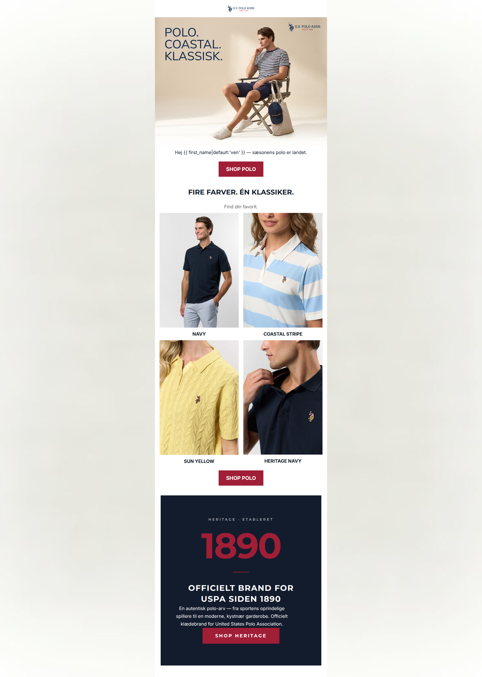
82/100This is a visually striking, highly on-brand email that perfectly captures the coastal, accessible-luxury aesthetic of U.S. Polo Assn. The typography, color usage, and structural flow are highly competent and make for an effortless reading experience. However, the email suffers from significant alignment issues between its visual content and its core message/destinations. Most glaringly, the hero image features a t-shirt while the entire email is dedicated to selling polos. Additionally, the inclusion of women's products in the body while routing all primary CTA buttons to the men's collection creates a broken user journey that will leak conversions.
Create Your Own
Generate professional email designs like this one in seconds with Kopi AI.
Email Details
- Subject Line
- Polo-sæsonen er her
- Brand
- U.S. Polo Assn. Denmark
- Industry
- Fashion & Apparel
- Email Type
- Product Launch
- Created
- May 20, 2026
Brand Colors
Email Copy
Hej ven — sæsonens polo er landet.
→ SHOP POLO
FIRE FARVER. ÉN KLASSIKER.
Find din favorit.
NAVY
COASTAL STRIPE
SUN YELLOW
HERITAGE NAVY
→ SHOP POLO
Why This Email Works
This is a visually striking, highly on-brand email that perfectly captures the coastal, accessible-luxury aesthetic of U.S. Polo Assn. The typography, color usage, and structural flow are highly competent and make for an effortless reading experience. However, the email suffers from significant alignment issues between its visual content and its core message/destinations. Most glaringly, the hero image features a t-shirt while the entire email is dedicated to selling polos. Additionally, the inclusion of women's products in the body while routing all primary CTA buttons to the men's collection creates a broken user journey that will leak conversions.
Hero Impact
70/100- Excellent, high-quality lifestyle photography that instantly communicates the brand identity.
- Clean, minimalist integration of the headline text directly into the hero composition.
Content Structure & Flow
85/100- Classic, proven layout progression (Inspiration -> Selection -> Trust).
- Excellent use of whitespace to prevent the email from feeling cluttered or overwhelming.
Visual Hierarchy & Layout
88/100- The dark heritage block creates a beautiful, heavy visual conclusion to the email.
- Symmetrical, sharp-edged layout completely aligns with the brand's stated minimalist, structured aesthetic.
Call-to-Action Strength
75/100- High-contrast CTA buttons that pass the 'squint test' effortlessly.
- Appropriate repetition of the primary conversion goal throughout the scroll depth.
Message Clarity & Tone
90/100- Tone matches the accessible luxury positioning perfectly.
- Punchy, memorable headlines that communicate value instantly.
Readability & Scannability
92/100- Zero 'walls of text'; highly optimized for scanning behavior.
- Excellent use of font weights to guide the reader's eye down the page.
Offer & Value Proposition
82/100- Brilliant use of the USPA heritage as a unique value proposition and trust builder.
- Successfully sells the 'lifestyle' rather than just a piece of fabric.
Personalization & Audience Fit
65/100- Use of first-name personalization in the opening hook.
- The overarching aesthetic perfectly targets the described young-adult-to-middle-aged psychographic.
Copy Conciseness & Word Economy
95/100- Incredibly tight, disciplined copywriting.
- Avoids the common pitfall of restating visual information in text blocks.
Quick Wins
- Replace the hero image with a photograph of a model actually wearing a polo shirt to match the headline.
- Remove the women's products from the 2x2 grid if the global CTA buttons are configured to drive traffic exclusively to the men's collection.
- Increase the font size of the personalized greeting text so it bridges the visual gap between the large hero image and the CTA button.



Create Professional Email Designs
Generate beautiful, on-brand email designs in seconds. Just enter your brand URL and let AI do the rest.