Home & Garden Promotional Email Template
“Vessels the flame marked by hand”
Design Score
84/100This email is a visually striking and tonally perfect execution of Settle Ceramics' artisanal brand identity. The photography, typography, and copy masterfully evoke the wabi-sabi, 'slow living' ethos required to sell high-ticket bespoke goods. However, to elevate this from a beautiful digital gallery into a high-converting marketing asset, the hero layout requires structural reordering, and the active 15% off promotion must be prominently featured to incentivize the final click.
Create Your Own
Generate professional email designs like this one in seconds with Kopi AI.
Email Details
- Subject Line
- Vessels the flame marked by hand
- Brand
- Settle Ceramics
- Industry
- Home & Garden
- Email Type
- Promotional
- Created
- October 22, 2026
Brand Colors
Email Copy
Preview text: Wood-fired amphoras and hand-thrown vases, each one singular. No two surfaces the same.
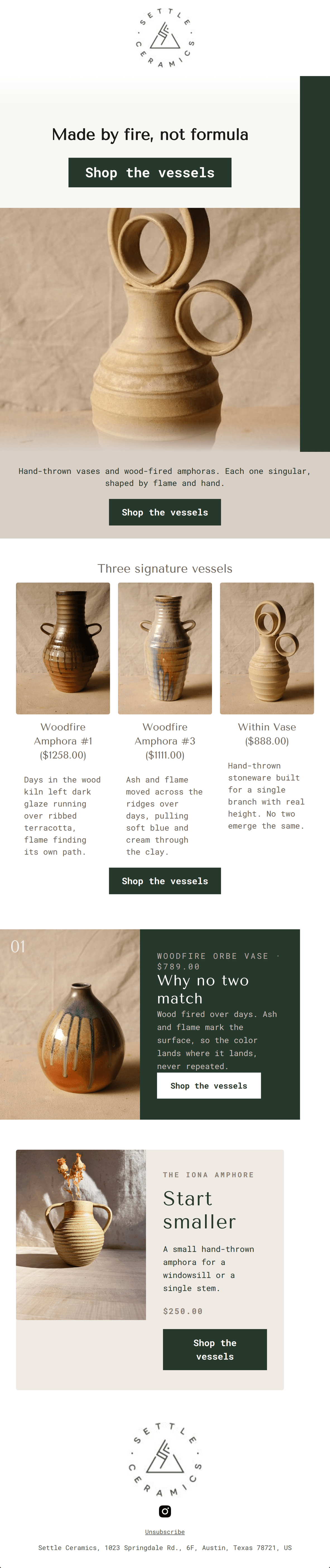
Hand-thrown vases and wood-fired amphoras. Each one singular, shaped by flame and hand.
→ Shop the vessels
Three signature vessels
Woodfire Amphora #1 ($1258.00)
Days in the wood kiln left dark glaze running over ribbed terracotta, flame finding its own path.
Woodfire Amphora #3 ($1111.00)
Ash and flame moved across the ridges over days, pulling soft blue and cream through the clay.
Within Vase ($888.00)
Hand-thrown stoneware built for a single branch with real height. No two emerge the same.
→ Shop the vessels
Unsubscribe
Settle Ceramics, 1023 Springdale Rd., 6F, Austin, Texas 78721, US
Why This Email Works
This email is a visually striking and tonally perfect execution of Settle Ceramics' artisanal brand identity. The photography, typography, and copy masterfully evoke the wabi-sabi, 'slow living' ethos required to sell high-ticket bespoke goods. However, to elevate this from a beautiful digital gallery into a high-converting marketing asset, the hero layout requires structural reordering, and the active 15% off promotion must be prominently featured to incentivize the final click.
Hero Impact
72/100- The headline 'Made by fire, not formula' is an exceptional distillation of the brand's value proposition.
- High-contrast CTA button is immediately visible upon open.
Content Structure & Flow
82/100- Logical top-to-bottom narrative progression.
- Alternating layouts between the grid and the feature blocks keeps visual interest high.
Visual Hierarchy & Layout
85/100- Excellent typographic hierarchy that strictly adheres to the brand's visual identity.
- Strong use of deep greens and earthy taupes to create a moody, cinematic atmosphere.
Call-to-Action Strength
95/100- Perfect adherence to a single primary destination and action.
- Excellent color contrast makes all buttons pop against their respective backgrounds.
Message Clarity & Tone
88/100- Tone is highly elevated and perfectly matched to the affluent, design-conscious target audience.
- Language is evocative and avoids mass-market retail clichés.
Readability & Scannability
82/100- Text blocks are kept brief and punchy.
- High contrast between text and background colors across all sections.
Offer & Value Proposition
65/100- The unique, wabi-sabi nature of the products justifies the premium price point.
- Prices are transparently displayed, filtering for high-intent clicks.
Personalization & Audience Fit
92/100- Deep alignment with the target audience's desire for authenticity and organic textures.
- Cinematic photography clearly signals a luxury positioning.
Copy Conciseness & Word Economy
98/100- No wasted words; highly economical and impactful sentences.
- Headings like 'Why no two match' do heavy lifting in just four words.
Quick Wins
- Fix the text wrapping on the CTA button in the 'Start smaller' section to ensure it remains on a single line.
- Introduce the FALL15 promo code in a subtle announcement bar at the very top of the email.
- Remove the secondary, standalone CTA block immediately following the hero section to improve scrolling momentum.
Create Professional Email Designs
Generate beautiful, on-brand email designs in seconds. Just enter your brand URL and let AI do the rest.