Other Product Launch Email Template
“Ny smak: Juice Head Peach Pineapple Mint”
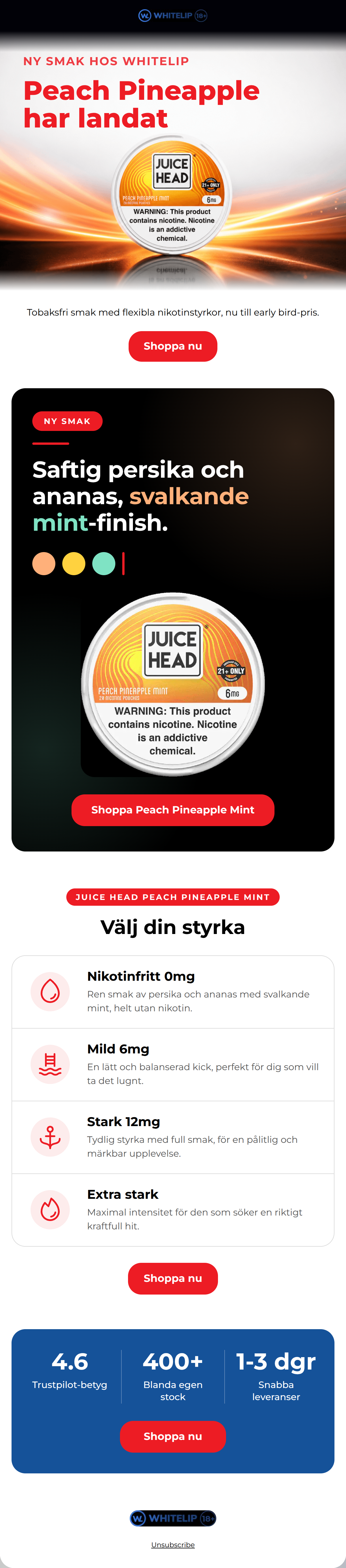
Design Score
82/100This is a strong, high-energy product launch email that effectively utilizes the brand's stark, clinical-yet-vibrant aesthetic. The repetition of a clear, single-intent CTA is excellent and sets the user up for a focused conversion path. However, the email suffers from a disjointed visual flow between sections and buries a key piece of its offer ('early bird-pris') in standard body copy. By smoothing out the visual transitions and making the value proposition more explicit, this campaign could push into the top tier of conversion performance.
Create Your Own
Generate professional email designs like this one in seconds with Kopi AI.
Email Details
- Subject Line
- Ny smak: Juice Head Peach Pineapple Mint
- Brand
- Whitelip
- Industry
- Other
- Email Type
- Product Launch
- Created
- October 3, 2026
Brand Colors
Email Copy
Preview text: Premium tobaksfri smak i flera styrkor. Tidig tillgång, begränsad tid.
Tobaksfri smak med flexibla nikotinstyrkor, nu till early bird-pris.
→ Shoppa nu
Unsubscribe
Why This Email Works
This is a strong, high-energy product launch email that effectively utilizes the brand's stark, clinical-yet-vibrant aesthetic. The repetition of a clear, single-intent CTA is excellent and sets the user up for a focused conversion path. However, the email suffers from a disjointed visual flow between sections and buries a key piece of its offer ('early bird-pris') in standard body copy. By smoothing out the visual transitions and making the value proposition more explicit, this campaign could push into the top tier of conversion performance.
Hero (top/initial part) Impact
72/100- Bold, unmissable headline that clearly announces the new product.
- High-energy visual background that fits the 'streetwear-drop' aesthetic.
Content Structure & Flow
78/100- Logical progression of information that answers the user's questions in the correct order.
- Excellent use of a closing trust bar to reassure the buyer right before the final CTA.
Visual Hierarchy & Layout
80/100- Massive, clear typography that makes skimming effortless.
- The black card effectively forces attention onto the flavor profile.
Call-to-Action Strength
95/100- Relentless focus on a single primary destination.
- Perfect color contrast for the buttons against all three background colors (white, black, blue).
Message Clarity & Tone
85/100- Punchy, action-oriented language.
- Authoritative and expert tone that builds trust.
Readability & Scannability
82/100- Generous whitespace around text blocks.
- Bullet-style layout in the strength section makes complex information easy to digest.
Offer & Value Proposition
70/100- Clear introduction of a desirable new product.
- Trust bar at the bottom strongly reinforces the brand's core value propositions.
Personalization & Audience Fit
85/100- Spot-on visual aesthetic for the young, professional, urban demographic.
- Focus on variety and strength control speaks directly to customer pain points.
Copy Conciseness & Word Economy
90/100- Zero filler words; highly distilled messaging.
- Action-oriented verbs drive the narrative forward.
Quick Wins
- Highlight the 'early bird-pris' visually—do not leave it buried in a standard text paragraph.
- Replace the confusing icons (swimming pool, anchor) in the strength section with simple, universal indicators (like a 4-bar signal).
- Ensure the colored text on the black background has higher contrast for better readability.


Create Professional Email Designs
Generate beautiful, on-brand email designs in seconds. Just enter your brand URL and let AI do the rest.