Travel & Hospitality Promotional Email Template
“A quiet thank you from The Blue Kite”

Design Score
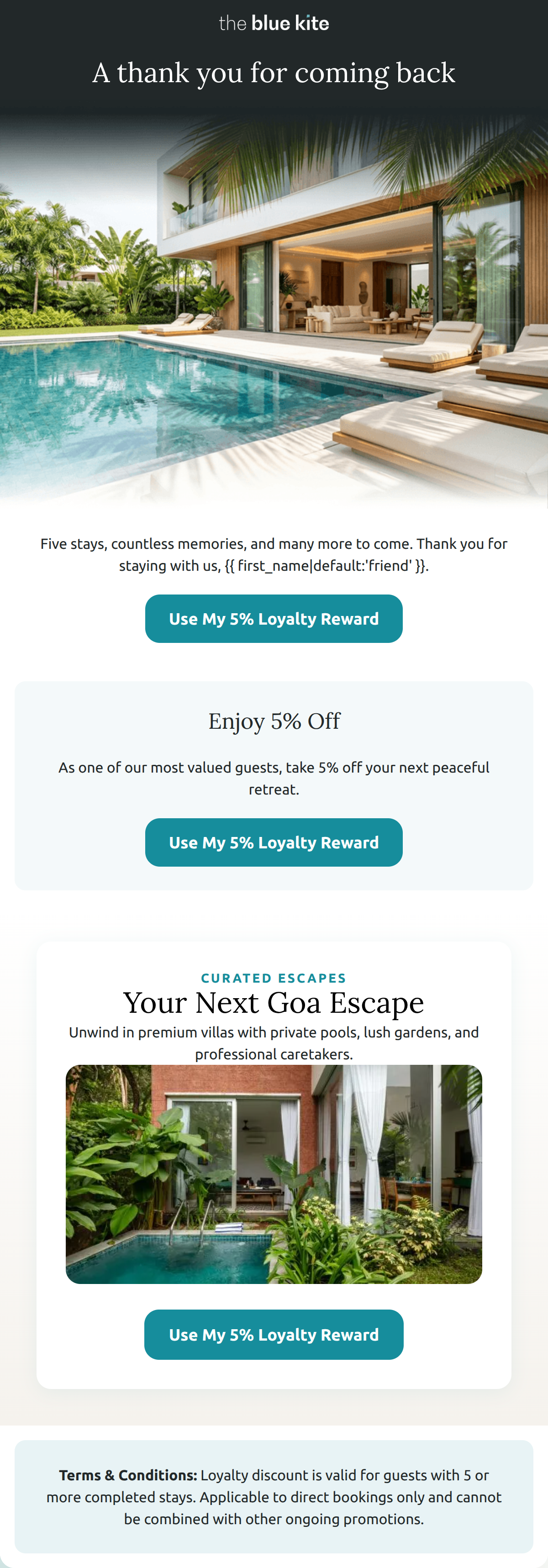
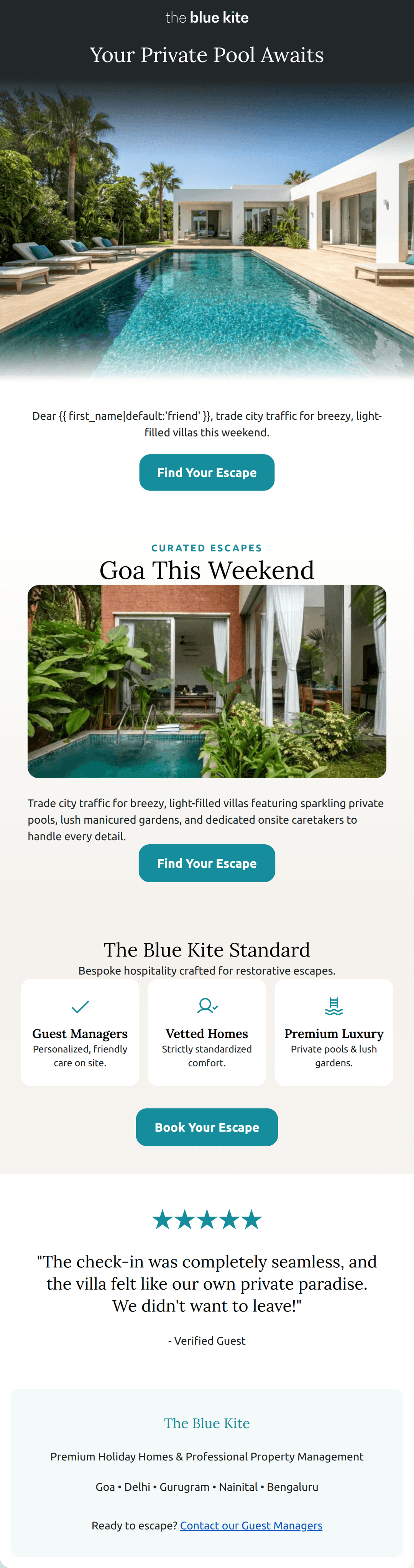
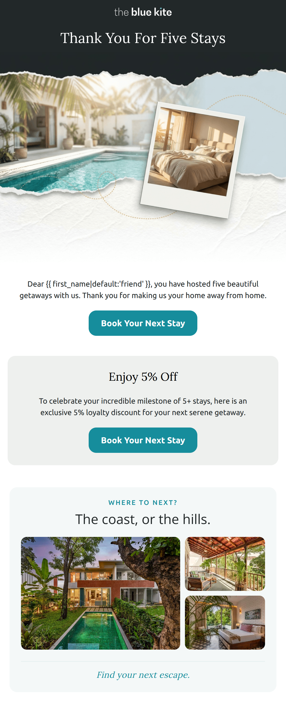
89/100This is a masterclass in 'quiet luxury' marketing. The Blue Kite successfully avoids the transactional traps of typical loyalty programs (points, tiers, expiration dates) in favor of a relationship-based narrative that perfectly aligns with their HNW audience. The tone is sophisticated and the visual rhythm is editorial. The main weakness is a slight redundancy in the copy where the exact same sentence is used twice in immediate succession, and a missed opportunity to leverage the brand's signature teal color to reinforce identity.
Create Your Own
Generate professional email designs like this one in seconds with Kopi AI.
Email Details
- Subject Line
- A quiet thank you from The Blue Kite
- Brand
- The Blue Kite
- Industry
- Travel & Hospitality
- Email Type
- Promotional
- Created
- August 20, 2026
Brand Colors
Email Copy
Preview text: Five stays and counting. Welcoming you back still feels just as special.
A note for one of our most loyal guests — from all of us at The Blue Kite. | View in browser
FOR OUR MOST LOYAL GUESTS
GOA · NAINITAL · DELHI · YOUR HOMES
We adore having you back.
TO PUT IT SIMPLY
Five stays and counting — and somehow, welcoming you back still feels just as special.
→ EXPLORE YOUR NEXT STAY
a quiet thank you
We've kept a small circle for guests who return to us — no points, no tiers to climb. Just a home that remembers you a little better each time, and a few thoughtful touches waiting on your next stay.
→ EXPLORE YOUR NEXT STAY
EXPLORE HOMES
SUNLIT LIVING
QUIET MORNINGS
EVENINGS IN
stay close
New homes, design notes, and a little inspiration for your next escape — first on Instagram.
Facebook Instagram LinkedIn
The Blue Kite, by Vianaar Homes
About Us · List Your Home · FAQ · Terms & Conditions
You are receiving this email because you have stayed with us as our guest. We value your privacy and hope to welcome you home again soon.
Manage preferences · Unsubscribe
Why This Email Works
This is a masterclass in 'quiet luxury' marketing. The Blue Kite successfully avoids the transactional traps of typical loyalty programs (points, tiers, expiration dates) in favor of a relationship-based narrative that perfectly aligns with their HNW audience. The tone is sophisticated and the visual rhythm is editorial. The main weakness is a slight redundancy in the copy where the exact same sentence is used twice in immediate succession, and a missed opportunity to leverage the brand's signature teal color to reinforce identity.
Hero (top/initial part) Impact
82/100- High-contrast color blocking makes the opening feel important.
- Clear brand positioning as a premium 'note' rather than a marketing blast.
Content Structure & Flow
90/100- Logical progression from 'Who we are to you' to 'Where you can go next'.
- The 'The coast, or the hills' section provides a perfect binary choice for the reader.
Visual Hierarchy & Layout
88/100- Strong use of cards to separate the personal note from the tactical benefits.
- Excellent legibility in the destination grid.
Call-to-Action Strength
94/100- Perfect adherence to the 'single primary action' rule.
- High-contrast terracotta buttons pop against the ivory background.
Message Clarity & Tone
96/100- Anti-loyalty-program positioning is brilliant for the target psychographic.
- Language is precise, fluid, and evocative.
Readability & Scannability
85/100- Benefit headers are clear and benefit-driven.
- Inverted pyramid structure in the initial sections helps focus attention.
Offer & Value Proposition
92/100- Focuses on 'time' and 'convenience' (2pm check-in), which are the top pain points for this audience.
- Reinforces the 'professional concierge' brand voice.
Personalization & Audience Fit
93/100- Specific stay-count recognition creates immediate 'buy-in' from the reader.
- Avoids mass-market promotional language.
Copy Conciseness & Word Economy
78/100- The 'Returning Guest Privileges' section uses very few words to communicate high value.
- Zero 'throat-clearing' or filler adjectives.
Quick Wins
- Delete the redundant text block above the first CTA button to improve word economy.
- Introduce the brand's signature 'Ocean Teal' color in the social links or the divider line to better align with the core brand identity.
- Change the 'Learn More' link in the top nav to 'Book Now' to drive more direct intent.
Create Professional Email Designs
Generate beautiful, on-brand email designs in seconds. Just enter your brand URL and let AI do the rest.