Travel & Hospitality Promotional Email Template
“Protect Your Fare: 30% OFF with Bundle Deal”
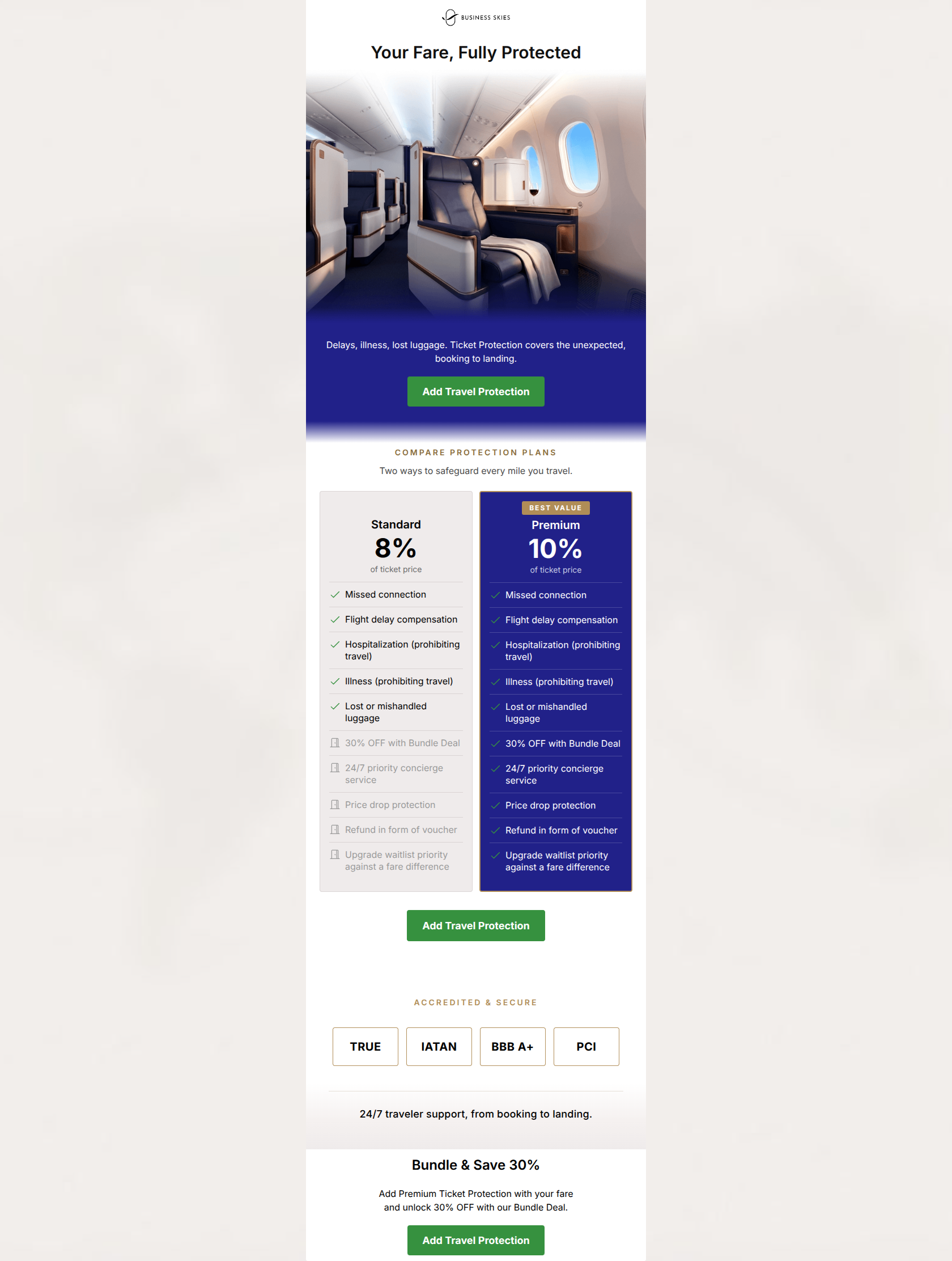
Design Score
83/100This is a strong, professional upsell email that effectively uses visual hierarchy and a clear comparison table to drive users toward the premium option. It aligns well with the brand's authoritative and luxurious identity. The primary strengths are the outstanding consistency of the Call-to-Action, the highly scannable comparison table, and the stark visual contrast that highlights the 'Premium' tier. The main areas for improvement involve clarifying the mechanics of the '30% OFF Bundle Deal'—which is currently ambiguous—and fixing a minor contrast issue in the comparison table.
Create Your Own
Generate professional email designs like this one in seconds with Kopi AI.
Email Details
- Subject Line
- Protect Your Fare: 30% OFF with Bundle Deal
- Brand
- Business Skies
- Industry
- Travel & Hospitality
- Email Type
- Promotional
- Created
- July 10, 2026
Brand Colors
Email Copy
Your Fare, Fully Protected
Delays, illness, lost luggage. Ticket Protection covers the unexpected, booking to landing.
→ Add Travel Protection
Bundle & Save 30%
Add Premium Ticket Protection with your fare and unlock 30% OFF with our Bundle Deal.
→ Add Travel Protection
Why This Email Works
This is a strong, professional upsell email that effectively uses visual hierarchy and a clear comparison table to drive users toward the premium option. It aligns well with the brand's authoritative and luxurious identity. The primary strengths are the outstanding consistency of the Call-to-Action, the highly scannable comparison table, and the stark visual contrast that highlights the 'Premium' tier. The main areas for improvement involve clarifying the mechanics of the '30% OFF Bundle Deal'—which is currently ambiguous—and fixing a minor contrast issue in the comparison table.
1. Hero (top/initial part) Impact
85/100- Immediate introduction of the core topic without preamble.
- Aspirational imagery matches the high-end brand identity.
- Quick transition to the primary CTA above the fold.
2. Content Structure & Flow
82/100- The comparison table is placed centrally, acting as the undisputed core of the message.
- Trust badges are positioned immediately after the core pitch to overcome final hesitations.
3. Visual Hierarchy & Layout
88/100- The 'Premium' card visually dominates the 'Standard' card.
- High contrast between the crisp white background and the dark navy sections.
- Clean, structured layout mirrors the brand's promise of control and order.
4. Call-to-Action Strength
98/100- Perfect consistency in CTA copy.
- High-contrast green buttons stand out clearly against both white and navy backgrounds.
- Strategic placement at the top, middle, and bottom of the email.
5. Message Clarity & Tone
85/100- Professional, reassuring tone aligns perfectly with the brand voice.
- Addresses specific pain points (Delays, illness, lost luggage) directly.
6. Readability & Scannability
78/100- The side-by-side comparison makes digesting complex information easy.
- Generous use of whitespace prevents the email from feeling cluttered.
7. Offer & Value Proposition
75/100- Framing the cost as a percentage of the ticket price contextualizes the expense.
- The feature list clearly outlines tangible benefits (e.g., 'Refund in form of voucher').
8. Personalization & Audience Fit
72/100- Benefits are tailored to high-end travelers (concierge, upgrades).
9. Copy Conciseness & Word Economy
88/100- Bullet points in the table are punchy and easily digestible.
- The introductory copy ('Delays, illness, lost luggage...') sets the stage in just six words.
Quick Wins
- Fix the color contrast of the unavailable features in the 'Standard' comparison card; the current gray-on-gray is too difficult to read.
- Clarify the wording in the final 'Bundle & Save 30%' section so the user knows exactly what the 30% discount is applied against.
Create Professional Email Designs
Generate beautiful, on-brand email designs in seconds. Just enter your brand URL and let AI do the rest.