Arete Syndicate
Email Review
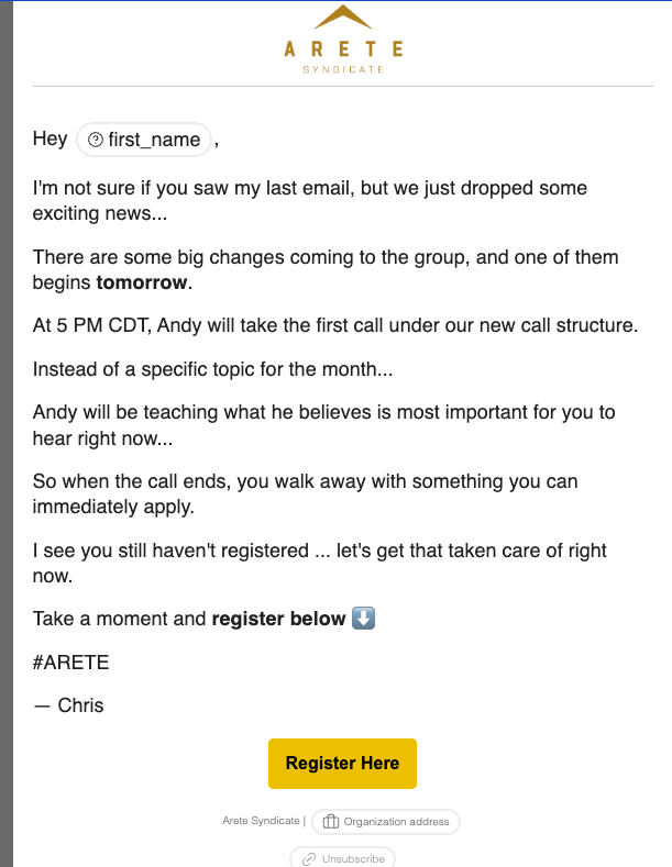
“Big changes coming to the group”
Kopi AI analysis from September 22, 2026
The email suffers from a critical personalization error in the salutation and a lack of visual hierarchy that buries the value proposition. While the personal tone is a strength, the broken 'first_name' tag and text-heavy layout create a low-trust experience. Fixing the placeholder and adding a clear hero section should be the first priority.
Email Screenshot
Quick Wins
- Fix the broken first_name merge tag immediately.
- Add a second text-link CTA in the first three paragraphs for users ready to click early.
- Bold the '5 PM CDT' to help it stand out as a key logistical fact.
Priority Actions
- Implement a 'Call Details' section or box that visually summarizes the Who/What/When of the event.
- Rewrite the primary CTA button to be more outcome-oriented (e.g., 'Join the New Call Structure').
- Add a high-impact headline below the logo to establish the context of the 'exciting news' within 2 seconds of opening.
Category Breakdown
Detailed Feedback
Hero Impact
35/100The logo is clearly positioned at the top for brand recognition.
Visual Hierarchy & Layout
40/100The use of white space between short paragraphs prevents a literal wall of text.
CTA Strength
62/100The yellow button provides high contrast against the white background.
Message Clarity & Tone
55/100The conversational 'I see you still haven't registered' creates a direct, one-to-one feeling.
Readability & Scannability
65/100Paragraphs are broken into 1-2 sentences each, which is good for mobile users.
Personalization & Audience Fit
10/100The intent to use the subscriber's first name is appropriate for the brand's 'Syndicate' community feel.
Color & Contrast Notes
- The yellow button (#EBB700 range) pops well against the white canvas, passing the squint test.
- The gold/brown logo color is sophisticated but provides softer contrast than the black body text.
- The gray used for the organization address at the bottom is near the edge of legibility and could be slightly darker.
Want to Create Better Emails?
Use Kopi AI to generate professional, on-brand marketing emails that convert. AI-powered email creation in seconds.