Fashion & Apparel Cart Abandonment Email Template
“Your shopping cart is getting weird.”
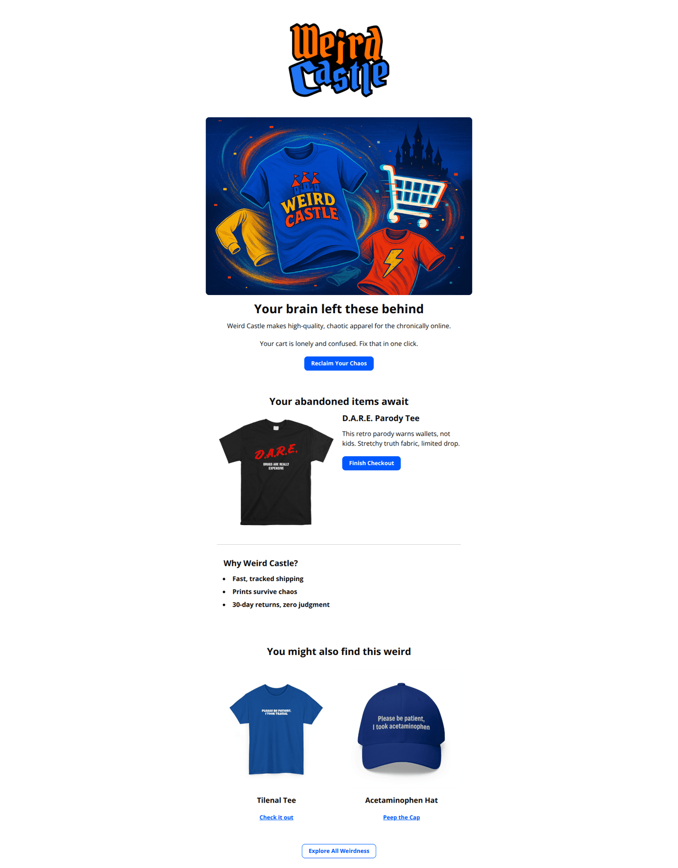
Design Score
76/100Strong, on-brand abandoned-cart email with a striking hero, clear path back to cart, and quick reassurance. Biggest gaps are missing cart details (price/variant/total), weak urgency/incentive, and light personalization. Tightening CTAs and adding cart-specific info will lift recoveries.
Create Your Own
Generate professional email designs like this one in seconds with Kopi AI.
Email Details
- Subject Line
- Your shopping cart is getting weird.
- Brand
- Weird Castle
- Industry
- Fashion & Apparel
- Email Type
- Cart Abandonment
- Created
- October 22, 2025
Brand Colors
Email Copy
Your brain left these behind
Weird Castle makes high-quality, chaotic apparel for the chronically online.
Your cart is lonely and confused. Fix that in one click.
→ Reclaim Your Chaos
Your abandoned items await
D.A.R.E. Parody Tee
This retro parody warns wallets, not kids. Stretchy truth fabric, limited drop.
→ Finish Checkout
Why Weird Castle?
- Fast, tracked shipping
- Prints survive chaos
- 30-day returns, zero judgment
You might also find this weird
Tilenal Tee
Check it out
Acetaminophen Hat
Peep the Cap
→ Explore All Weirdness
Why This Email Works
Strong, on-brand abandoned-cart email with a striking hero, clear path back to cart, and quick reassurance. Biggest gaps are missing cart details (price/variant/total), weak urgency/incentive, and light personalization. Tightening CTAs and adding cart-specific info will lift recoveries.
Hero (top/initial part) Impact
85/100- Bold, attention-grabbing visual that fits the brand.
- Clear, above-the-fold CTA pointing straight to the cart.
Content Structure & Flow
78/100- Logical, compact sections without walls of text.
- Reassurance list reduces purchase anxiety.
Visual Hierarchy & Layout
84/100- Clean hierarchy with clear section labels.
- Images are uncluttered and product-first.
Call-to-Action Strength
73/100- Primary CTA placement and contrast are strong.
- “Finish Checkout” is explicit and action-oriented.
Message Clarity & Tone
80/100- Consistently humorous tone aligned with Weird Castle.
- Clear reassurance bullets address common objections.
Readability & Scannability
88/100- Excellent use of brevity and white space.
- Headlines are clear and layered for fast scanning.
Offer & Value Proposition
60/100- Reassurance bullets communicate core value (speed, durability, easy returns).
Personalization & Audience Fit
55/100- Audience-appropriate humor and product selection.
Quick Wins
- Add the abandoned item price and selected variant under its image.
- Repeat a final “Finish Checkout” button at the bottom after the cross-sell.
- Insert a single-line urgency cue near the product (e.g., “Limited drop—items not reserved”).
- Place a tiny trust line under the hero CTA: “Fast, tracked shipping • 30‑day returns.”
- Swap cross-sell link CTAs for compact buttons and include prices.

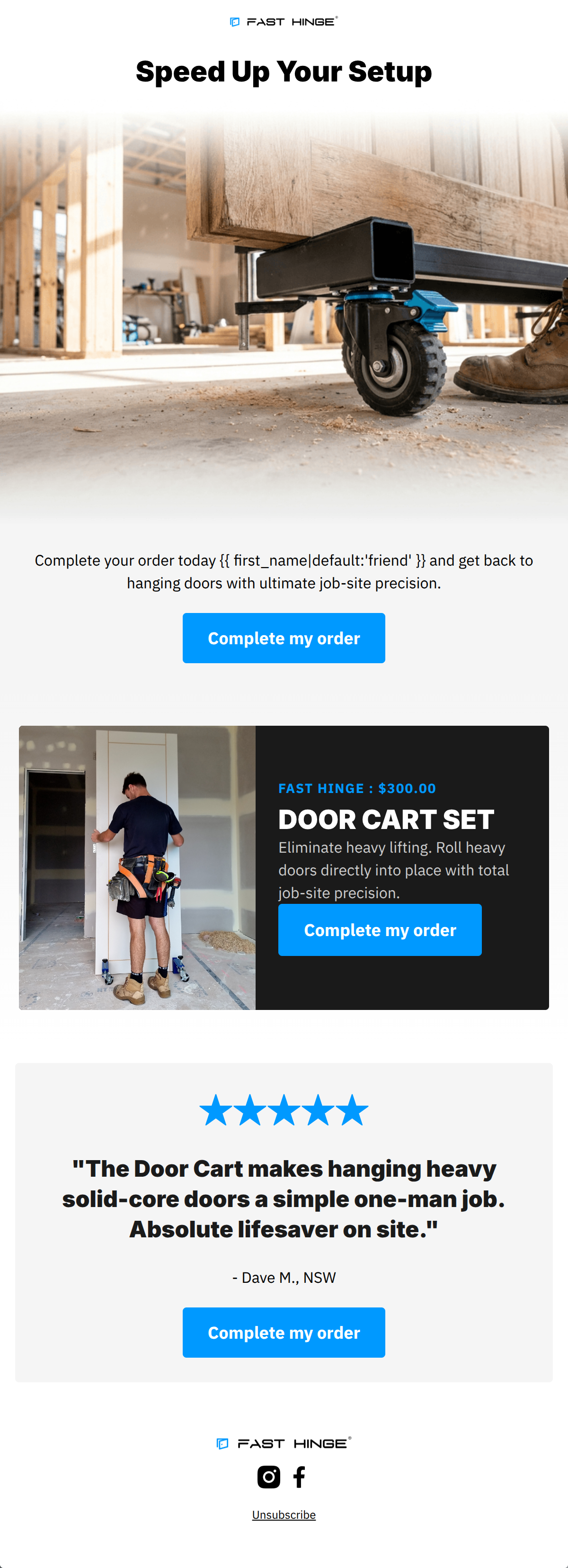
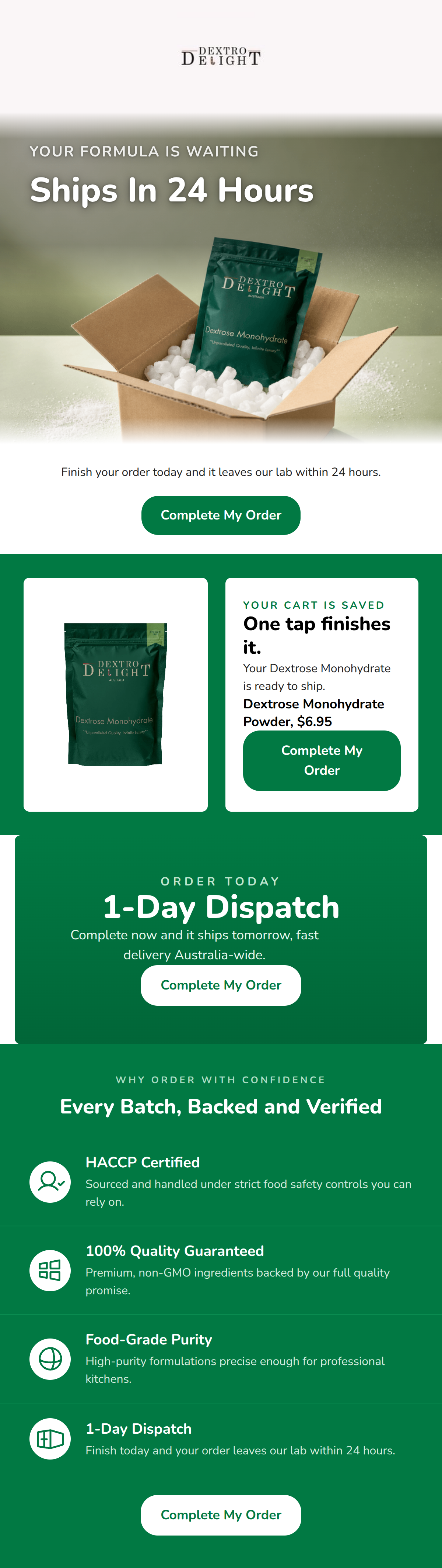
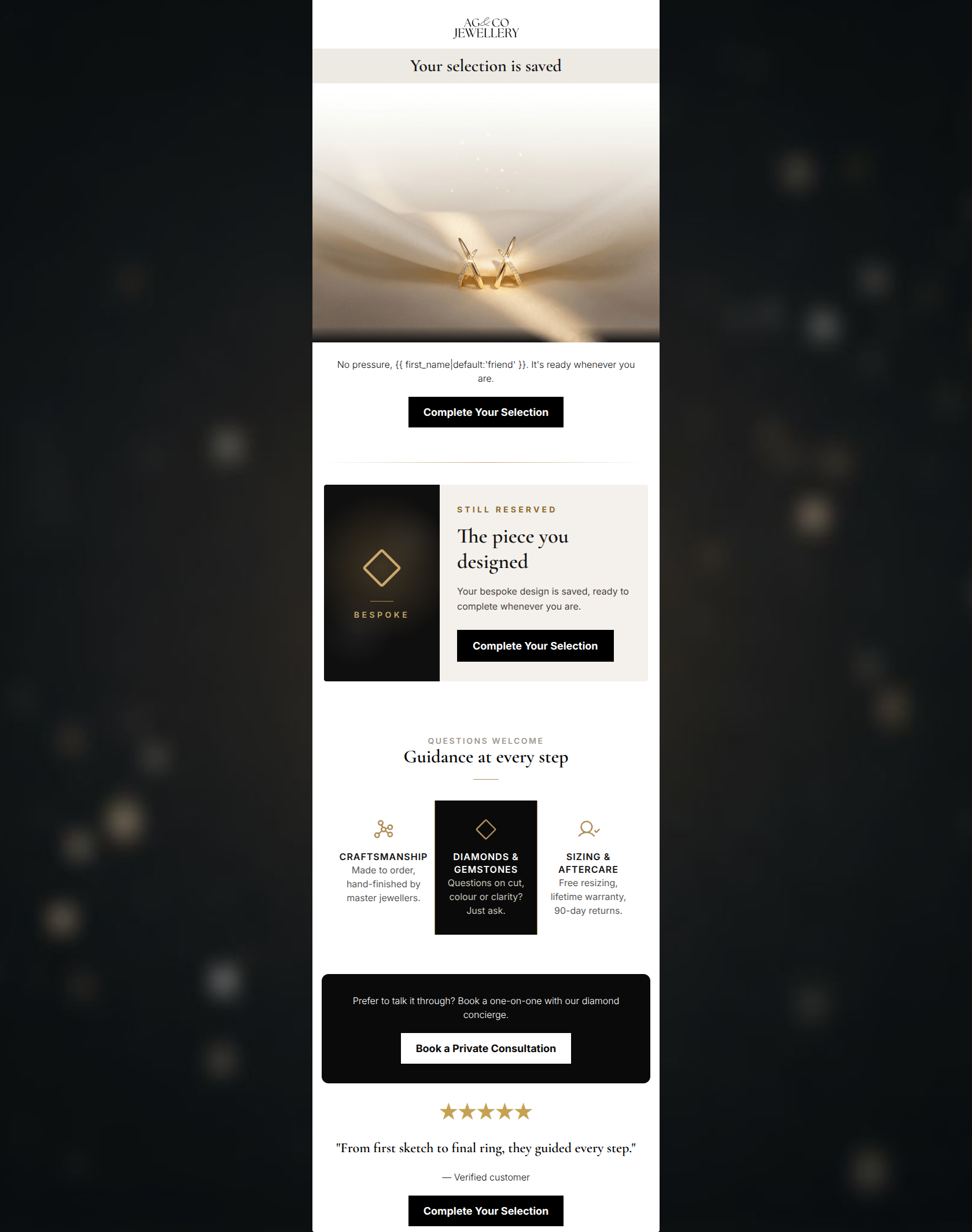
Create Professional Email Designs
Generate beautiful, on-brand email designs in seconds. Just enter your brand URL and let AI do the rest.