Food & Beverage Cart Abandonment Email Template
“Your formula is waiting (and it ships in 24 hours).”
Design Score
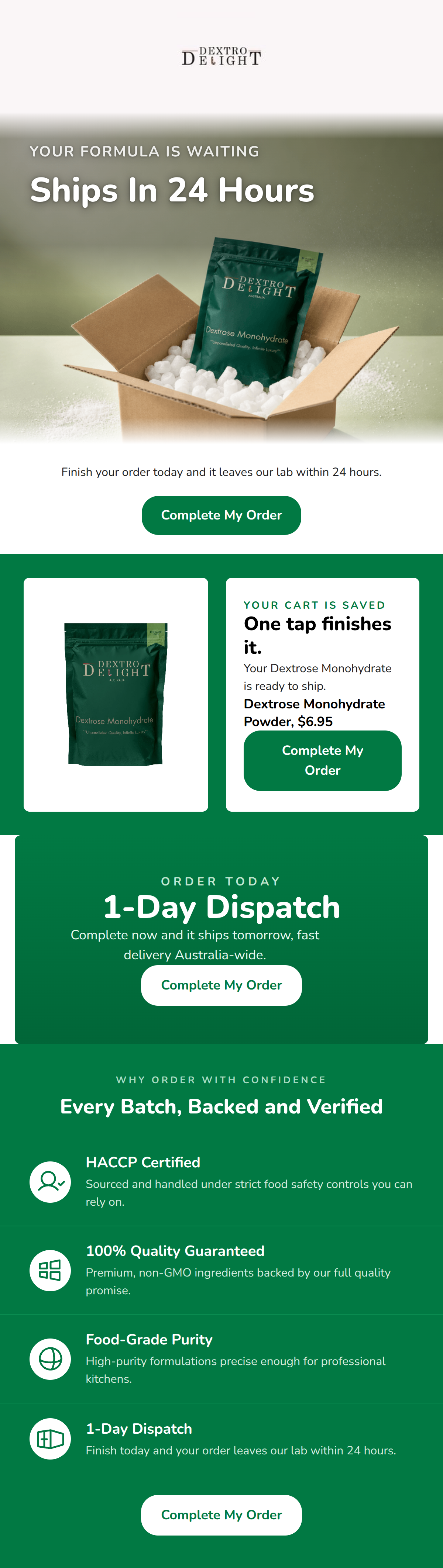
81/100This cart abandonment email successfully leverages Dextro Delight's clinical, authoritative brand voice to drive urgency. The visual aesthetic is clean and heavily relies on the brand's primary green, creating a trustworthy and professional atmosphere. The primary CTA is highly consistent and clear. However, the email suffers from significant message repetition—the '24-hour dispatch' value proposition is restated four separate times across different sections, wasting valuable real estate that could be used to highlight other core brand pillars, such as accessible sizing or transparent pricing.
Create Your Own
Generate professional email designs like this one in seconds with Kopi AI.
Email Details
- Subject Line
- Your formula is waiting (and it ships in 24 hours).
- Brand
- Dextro Delight
- Industry
- Food & Beverage
- Email Type
- Cart Abandonment
- Created
- August 3, 2026
Brand Colors
Email Copy
Finish your order today and it leaves our lab within 24 hours.
→ Complete My Order
Why This Email Works
This cart abandonment email successfully leverages Dextro Delight's clinical, authoritative brand voice to drive urgency. The visual aesthetic is clean and heavily relies on the brand's primary green, creating a trustworthy and professional atmosphere. The primary CTA is highly consistent and clear. However, the email suffers from significant message repetition—the '24-hour dispatch' value proposition is restated four separate times across different sections, wasting valuable real estate that could be used to highlight other core brand pillars, such as accessible sizing or transparent pricing.
Hero Impact
85/100- Strong, urgency-driven headline.
- On-brand, tailored kicker copy ('Your formula is waiting').
- High-quality, relevant imagery.
Content Structure & Flow
75/100- Clear progression from the primary hook to the specific abandoned product.
- Strong concluding section focused on mitigating buyer risk.
Visual Hierarchy & Layout
80/100- Excellent use of contrast to highlight the abandoned product card.
- Clean, grid-like alignment that suits the 'clinical' brand aesthetic.
Call-to-Action Strength
90/100- Unwavering consistency in CTA copy.
- High-contrast button styling that passes the squint test.
- Repetition reinforces the singular conversion goal.
Message Clarity & Tone
88/100- Perfect execution of the 'senior lab technician' brand persona.
- Use of specific, industry-relevant terminology (HACCP, Food-Grade).
- Authoritative, confident tone.
Readability & Scannability
82/100- Great use of icons to break up text in the trust section.
- Strong headline contrast makes the main points unmissable.
Offer & Value Proposition
85/100- Clear focus on speed of delivery as the primary urgency driver.
- Excellent use of trust signals to reduce perceived purchasing risk.
Personalization & Audience Fit
88/100- Highly relevant terminology for food creators.
- Direct connection to the user's specific abandoned item.
Copy Conciseness & Word Economy
65/100- Individual sentences are generally punchy and active.
- Trust block copy is tight and benefit-driven.
Quick Wins
- Delete the text block immediately below the hero image to reduce redundancy.
- Fix the CTA button width in the product card so 'Complete My Order' fits on one line.
- Remove the mid-email 'Order Today / 1-Day Dispatch' banner entirely to tighten the flow.


Create Professional Email Designs
Generate beautiful, on-brand email designs in seconds. Just enter your brand URL and let AI do the rest.