Other Promotional Email Template
“Your Logo, Their Hands: Cube Sale”
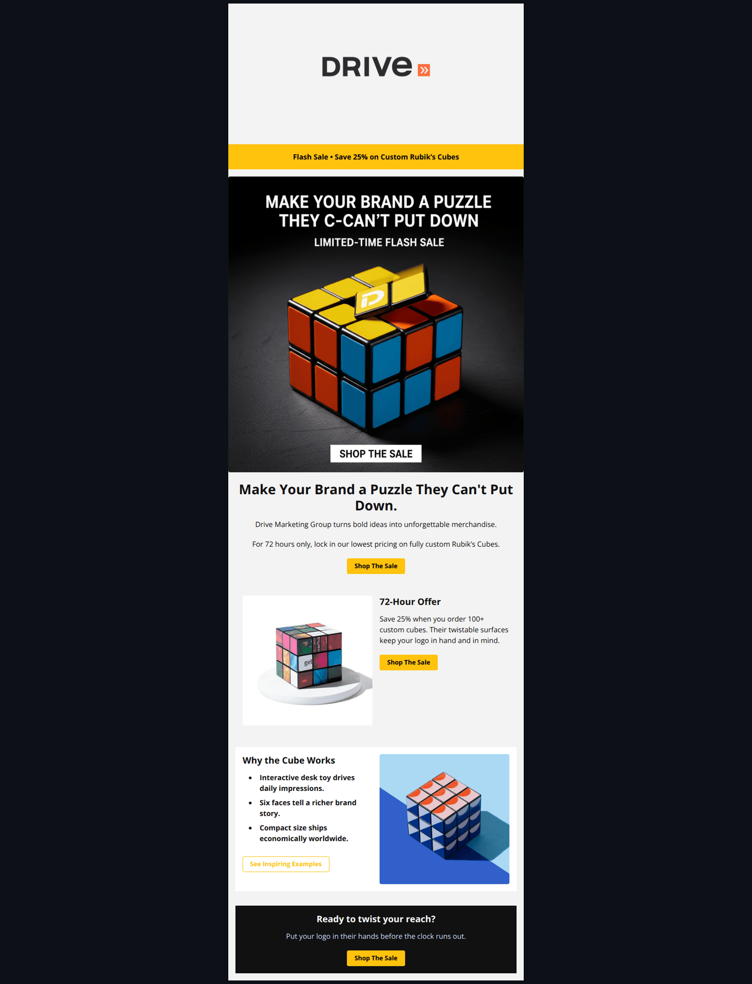
Design Score
77/100Strong, visually compelling flash-sale email with clear urgency and a tight structure. Biggest conversion blockers are CTA inconsistency (links go to different destinations and “Shop” implies e‑commerce) and lack of explicit redemption details (end date/time zone, how to claim, basic terms). Add a focused landing path, tighten offer specifics, and weave in quick social proof to lift response.
Create Your Own
Generate professional email designs like this one in seconds with Kopi AI.
Email Details
- Subject Line
- Your Logo, Their Hands: Cube Sale
- Brand
- Drive Marketing Group
- Industry
- Other
- Email Type
- Promotional
- Created
- November 13, 2025
Brand Colors
Email Copy
Flash Sale • Save 25% on Custom Rubik’s Cubes
Make Your Brand a Puzzle They Can't Put Down.
Drive Marketing Group turns bold ideas into unforgettable merchandise.
For 72 hours only, lock in our lowest pricing on fully custom Rubik’s Cubes.
→ Shop The Sale
72-Hour Offer
Save 25% when you order 100+ custom cubes. Their twistable surfaces keep your logo in hand and in mind.
→ Shop The Sale
Why the Cube Works
- Interactive desk toy drives daily impressions.
- Six faces tell a richer brand story.
- Compact size ships economically worldwide.
→ See Inspiring Examples
Ready to twist your reach?
Put your logo in their hands before the clock runs out.
→ Shop The Sale
Why This Email Works
Strong, visually compelling flash-sale email with clear urgency and a tight structure. Biggest conversion blockers are CTA inconsistency (links go to different destinations and “Shop” implies e‑commerce) and lack of explicit redemption details (end date/time zone, how to claim, basic terms). Add a focused landing path, tighten offer specifics, and weave in quick social proof to lift response.
Hero (top/initial part) Impact
85/100- High-impact imagery with strong contrast draws attention.
- Clear, benefit-led headline aligned to the product’s tactile nature.
Content Structure & Flow
80/100- Clear progression from problem/benefit to offer to reasons to believe.
- Bulleted benefits keep the body copy lightweight.
Visual Hierarchy & Layout
90/100- Consistent heading sizes and adequate spacing create a smooth reading rhythm.
- Buttons are prominent and visually consistent.
Call-to-Action Strength
65/100- CTA frequency is good; clear placement after each content block.
Message Clarity & Tone
78/100- Clear benefits: interactivity, six faces for storytelling, compact shipping.
- Concise copy avoids jargon.
Readability & Scannability
90/100- Good use of bullets and short blocks to avoid walls of text.
- Clear typographic contrast supports quick scanning.
Offer & Value Proposition
70/100- Clear articulation of product value (interactivity and storytelling across six faces).
- Explicit MOQ (100+) minimizes surprises.
Personalization & Audience Fit
55/100- Core benefits align with marketer pain points (memorability, daily impressions).
Quick Wins
- Unify all primary CTAs to a single Rubik’s Cube flash‑sale landing/quote page and align the label to the action (e.g., “Get a Quote”).
- Add the explicit end date/time zone to the hero subhead and footer CTA block.
- Insert a one-line terms snippet near the footer CTA (valid dates, MOQ 100+, exclusions).
- Add UTMs to all links for clean attribution.
- Replace the generic “See Inspiring Examples” URL with a Rubik’s Cube–specific gallery/case study link.

Create Professional Email Designs
Generate beautiful, on-brand email designs in seconds. Just enter your brand URL and let AI do the rest.