Home & Garden Promotional Email Template
“A table worth gathering around”
Design Score
86/100This email is a masterclass in brand-aligned visual storytelling and tonal execution. The wabi-sabi aesthetic is perfectly captured through moody photography, restrained typography, and a cohesive color palette. The conversion path is highly focused, utilizing a singular, evocative CTA repeated throughout the layout. However, a significant strategic oversight prevents this from being a near-perfect execution: the provided brand context indicates an active '15% off (FALL15)' promotion, which is entirely absent from the email content. While the emotional hook and urgency drivers are strong, omitting a primary financial incentive leaves substantial conversion potential on the table.
Create Your Own
Generate professional email designs like this one in seconds with Kopi AI.
Email Details
- Subject Line
- A table worth gathering around
- Brand
- Settle Ceramics
- Industry
- Home & Garden
- Email Type
- Promotional
- Created
- October 22, 2026
Brand Colors
Email Copy
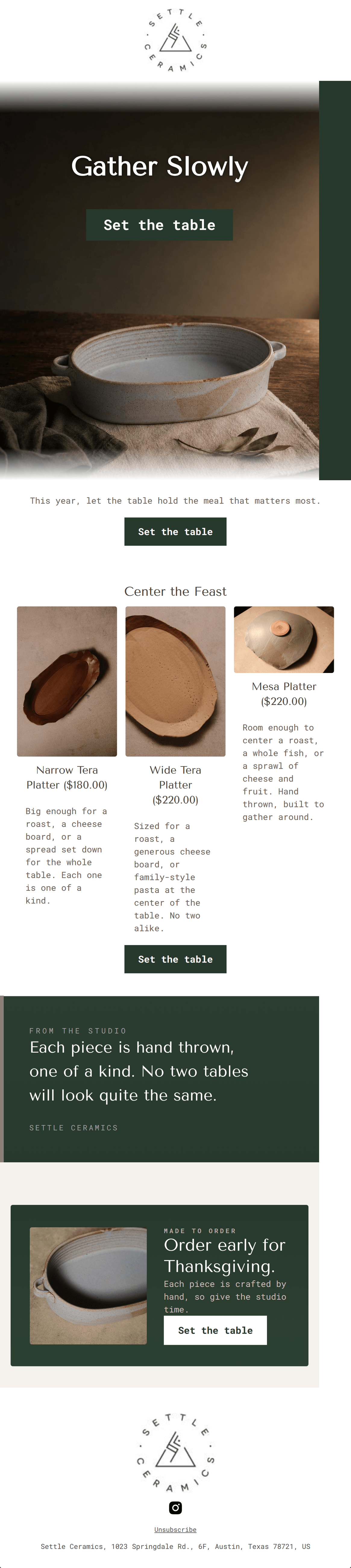
This year, let the table hold the meal that matters most.
→ Set the table
Center the Feast
Narrow Tera Platter ($180.00)
Big enough for a roast, a cheese board, or a spread set down for the whole table. Each one is one of a kind.
Wide Tera Platter ($220.00)
Sized for a roast, a generous cheese board, or family-style pasta at the center of the table. No two alike.
Mesa Platter ($220.00)
Room enough to center a roast, a whole fish, or a sprawl of cheese and fruit. Hand thrown, built to gather around.
→ Set the table
Unsubscribe
Settle Ceramics, 1023 Springdale Rd., 6F, Austin, Texas 78721, US
Why This Email Works
This email is a masterclass in brand-aligned visual storytelling and tonal execution. The wabi-sabi aesthetic is perfectly captured through moody photography, restrained typography, and a cohesive color palette. The conversion path is highly focused, utilizing a singular, evocative CTA repeated throughout the layout. However, a significant strategic oversight prevents this from being a near-perfect execution: the provided brand context indicates an active '15% off (FALL15)' promotion, which is entirely absent from the email content. While the emotional hook and urgency drivers are strong, omitting a primary financial incentive leaves substantial conversion potential on the table.
Hero Impact
85/100- Striking, cinematic imagery that showcases product texture.
- Concise, evocative headline.
- CTA is immediately visible above the fold.
Content Structure & Flow
88/100- Logical progression from inspiration to specific products to urgency.
- Alternating background colors create clear, digestible sections.
- Ends on a strong, conversion-focused note rather than fading out.
Visual Hierarchy & Layout
92/100- Flawless execution of brand typography.
- Clear distinction between structural elements (headers, body text, buttons).
- High-quality, stylized product photography.
Call-to-Action Strength
96/100- Perfect repetition of a single primary goal.
- High-contrast button styling ensures they stand out clearly against both dark and light backgrounds.
- The copy ('Set the table') is action-oriented and contextually brilliant.
Message Clarity & Tone
95/100- Evocative phrases like 'Center the Feast' and 'built to gather around'.
- Authentic, 'maker' tone in the studio quote.
- Avoids generic marketing filler.
Readability & Scannability
88/100- Bite-sized copy blocks.
- Excellent use of contrast for text legibility.
- Clear hierarchy guides the eye naturally down the page.
Offer & Value Proposition
60/100- Strong justification of premium pricing through the emphasis on hand-thrown craftsmanship.
- Genuine logistical urgency ('give the studio time') is much more compelling than artificial countdown timers.
Personalization & Audience Fit
85/100- Deeply aligned with the customer's aspiration for slow, intentional living.
- Visuals match the audience's high design standards.
Copy Conciseness & Word Economy
92/100- High impact with low word count.
- Avoids generic adjectives in favor of specific, sensory language.
- Headings do the heavy lifting for scanning.
Quick Wins
- Add a promotional banner or text block featuring the active '15% off with code FALL15' offer.
- Merge the text from the second section ('This year, let the table...') into the hero image overlay to tighten the layout.
- Ensure product grid descriptions are uniform in length to maintain perfect visual alignment of the elements.
Create Professional Email Designs
Generate beautiful, on-brand email designs in seconds. Just enter your brand URL and let AI do the rest.