Beauty & Skincare Promotional Email Template
“Still washing with 3-in-1? We need to talk.”
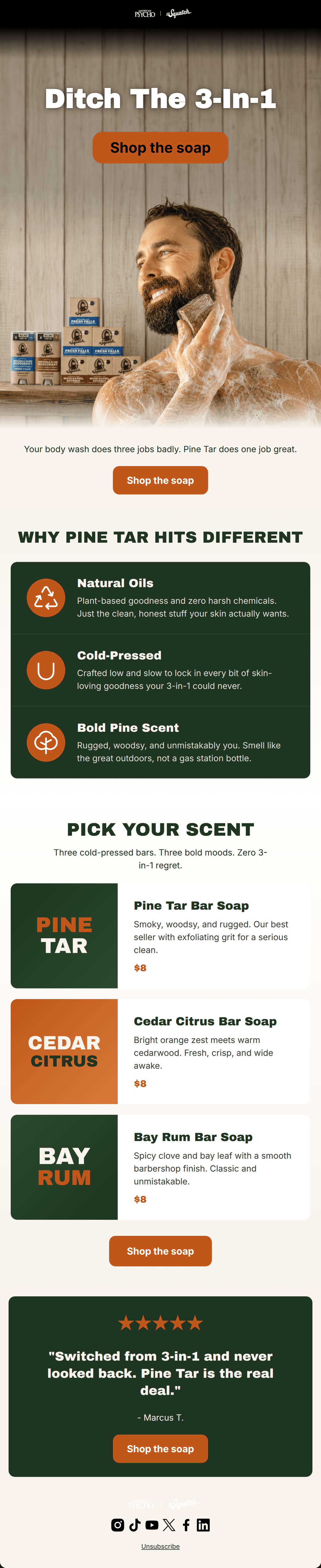
Design Score
87/100This is a highly effective, well-written promotional email that perfectly captures the Dr. Squatch brand voice. The inverted pyramid structure clearly funnels attention from a strong problem-aware headline down to the solution. The copy is tight, punchy, and speaks directly to the target audience's pain points regarding generic 3-in-1 body washes. The primary area for improvement is a slight narrative disconnect: the first half heavily isolates 'Pine Tar' as the solution, but the second half introduces a choice of three scents. Additionally, relying on text-based graphics rather than product photography in the selection cards misses an opportunity to showcase the product's physical texture.
Create Your Own
Generate professional email designs like this one in seconds with Kopi AI.
Email Details
- Subject Line
- Still washing with 3-in-1? We need to talk.
- Brand
- Dr. Squatch
- Industry
- Beauty & Skincare
- Email Type
- Promotional
- Created
- October 24, 2026
Brand Colors
Email Copy
Preview text: Pine Tar does what body wash can't. Real ingredients, real scent, real clean.
Stop settling for mediocre 3-in-1 washes. Pine Tar delivers a superior natural clean that actually lasts.
→ Upgrade your shower
★★★★★
"Switched from 3-in-1 and never looked back. Pine Tar is the real deal."
- Marcus T.
→ Upgrade your shower
Why This Email Works
This is a highly effective, well-written promotional email that perfectly captures the Dr. Squatch brand voice. The inverted pyramid structure clearly funnels attention from a strong problem-aware headline down to the solution. The copy is tight, punchy, and speaks directly to the target audience's pain points regarding generic 3-in-1 body washes. The primary area for improvement is a slight narrative disconnect: the first half heavily isolates 'Pine Tar' as the solution, but the second half introduces a choice of three scents. Additionally, relying on text-based graphics rather than product photography in the selection cards misses an opportunity to showcase the product's physical texture.
Hero Impact
85/100- Bold, uncompromising headline that demands attention.
- High-quality lifestyle imagery that resonates with the target demographic.
- Immediate placement of the primary CTA above the fold.
Content Structure & Flow
82/100- Logical progression from identifying a problem to offering a solution.
- Clear delineation between different sections using background color changes.
- Excellent use of social proof at the bottom to close the deal.
Visual Hierarchy & Layout
75/100- Effective use of brand colors to create distinct, readable sections.
- The feature block uses custom icons that draw the eye down the page.
- Excellent contrast between the dark green background and cream text in the features block.
Call-to-Action Strength
95/100- Consistent use of 'Shop the soap' across all buttons.
- High contrast orange color makes the buttons pop against both dark and light backgrounds.
- No competing secondary actions distracting from the primary goal.
Message Clarity & Tone
88/100- Punchy, relatable phrases like 'Zero 3-in-1 regret' and 'not a gas station bottle'.
- Focuses heavily on the benefits of the product (how it makes you feel/smell) rather than just listing ingredients.
- Tone perfectly matches the psychographics of a man looking to upgrade his grooming routine.
Readability & Scannability
92/100- Great use of bullet-style icons to break up text in the features section.
- High text-to-background contrast across all modules.
- Avoids long walls of text; every paragraph is concise.
Offer & Value Proposition
85/100- Direct comparison against the legacy alternative ('Your body wash does three jobs badly').
- Transparent pricing on the product cards.
- Clear linkage between the ingredient (Cold-Pressed) and the outcome (locks in goodness).
Personalization & Audience Fit
90/100- Addresses the specific pain point of 'gas station bottle' scents.
- Uses 'You' and 'Your' effectively to make the copy feel like a one-on-one conversation.
Copy Conciseness & Word Economy
96/100- Three-word headline that tells the entire story.
- Brilliant, condensed copy in the transition: 'Three cold-pressed bars. Three bold moods. Zero 3-in-1 regret.'
- Feature descriptions are limited to exactly what the user needs to know.
Quick Wins
- Remove the 'American Psycho' header logo to align the branding with the core product message.
- Change the 'WHY PINE TAR HITS DIFFERENT' headline to 'WHY SQUATCH HITS DIFFERENT' to better support the multi-scent product grid below it.

Create Professional Email Designs
Generate beautiful, on-brand email designs in seconds. Just enter your brand URL and let AI do the rest.