Health & Wellness Welcome Email Template

72/100Fair

Your immune barrier, decoded

ARMRA [eval 2026-03-26]
Share:
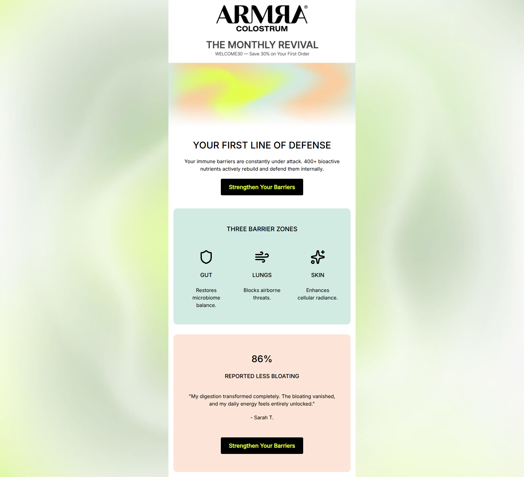
ARMRA welcome email featuring a 30% off code and three icons representing gut, lung, and skin health.

Design Score

72/100
C - Fair

This email establishes a strong, clinical brand aesthetic and effectively highlights key benefits, but it suffers from being overly conceptual. The glaring absence of a physical product image makes the messaging feel abstract, and burying a highly compelling 30% off offer in the pre-hero text is a significant missed opportunity. While the scannability and layout are solid, the email needs to ground its scientific claims with tangible product representation and more direct, action-oriented calls to action to maximize conversion.

Create Your Own

Generate professional email designs like this one in seconds with Kopi AI.

Start Creating

Email Details

Subject Line
Your immune barrier, decoded
Brand
ARMRA [eval 2026-03-26]
Industry
Health & Wellness
Email Type
Welcome
Created
March 26, 2026

Brand Colors

Email Copy

YOUR FIRST LINE OF DEFENSE

Your immune barriers are constantly under attack. 400+ bioactive nutrients actively rebuild and defend them internally.

Strengthen Your Barriers

THREE BARRIER ZONES

GUT

Restores microbiome balance.

LUNGS

Blocks airborne threats.

SKIN

Enhances cellular radiance.

86%

REPORTED LESS BLOATING

"My digestion transformed completely. The bloating vanished, and my daily energy feels entirely unlocked."

- Sarah T.

Strengthen Your Barriers

Why This Email Works

This email establishes a strong, clinical brand aesthetic and effectively highlights key benefits, but it suffers from being overly conceptual. The glaring absence of a physical product image makes the messaging feel abstract, and burying a highly compelling 30% off offer in the pre-hero text is a significant missed opportunity. While the scannability and layout are solid, the email needs to ground its scientific claims with tangible product representation and more direct, action-oriented calls to action to maximize conversion.

Hero Impact

60/100
  • The primary headline 'YOUR FIRST LINE OF DEFENSE' is strong and benefit-driven.
  • The stark black-and-white logo treatment immediately establishes a premium, authoritative brand feel.

Content Structure & Flow

75/100
  • Logical progression from high-level problem/solution to specific functional benefits.
  • Clear demarcation of sections using distinct background colors prevents the content from blending together.

Visual Hierarchy & Layout

75/100
  • Excellent use of pastel background blocks (#D1EBE3 and #FCE5D8) to visually separate key content areas without adding clutter.
  • The massive '86%' typographic treatment successfully draws the eye to the social proof.

Call-to-Action Strength

68/100
  • The CTA buttons use a stark black background with the brand's signature neon lime (#DFFF3D) text, ensuring they pop against all backgrounds.

Message Clarity & Tone

65/100
  • The vocabulary ('bioactive nutrients', 'microbiome balance', 'cellular radiance') perfectly aligns with the target audience's desire for science-backed wellness.
  • Maintains a confident, expert tone without resorting to cheap sales hyperbole.

Readability & Scannability

80/100
  • The three-column icon layout makes the core benefits instantly understandable at a glance.
  • Strong contrast between the black text and the pastel/white backgrounds ensures easy reading.

Offer & Value Proposition

65/100
  • The intrinsic value proposition—whole-body defense via three key zones—is articulated clearly.
  • The social proof section effectively validates the value proposition with a concrete, relatable outcome (less bloating).

Personalization & Audience Fit

75/100
  • Uses 'You/Your' language effectively ('Your immune barriers', 'Your First Line of Defense') to place the reader in the center of the narrative.
  • The testimonial specifically targets 'bloating' and 'energy', two major pain points for the wellness demographic.

Copy Conciseness & Word Economy

85/100
  • The three-word descriptions under the icons ('Restores microbiome balance', 'Blocks airborne threats') are masterclasses in concise benefit communication.
  • Zero wasted space on generic brand introductions; it gets straight to the value.

Quick Wins

  • Change the CTA button text to something direct like 'Shop ARMRA' or 'Claim 30% Off'.
  • Make the 'WELCOME30' promo code visually prominent in the hero section, not just the pre-header.
  • Bold the key phrases in the customer testimonial to improve scannability.

Create Professional Email Designs

Generate beautiful, on-brand email designs in seconds. Just enter your brand URL and let AI do the rest.

Start Creating for Free