Health & Wellness Announcement Email Template
“More than hydration.”
Design Score
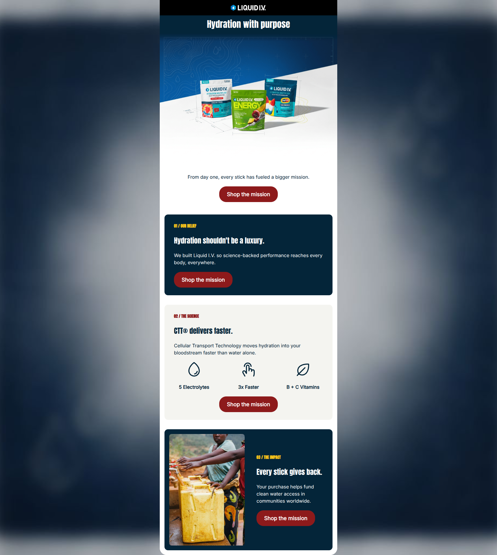
81/100This email is visually striking and exceptionally well-structured, utilizing strong contrast and clear chunking to guide the reader. Its greatest strength is its conciseness and flawless execution of CTA repetition. However, it operates too heavily as an 'About Us' brochure rather than a conversion-driving engine. By focusing entirely on the brand's 'we/our' narrative and mission, it neglects to connect the product to the tangible, daily pain points of its high-performing target audience, leaving potential clicks on the table due to a lack of immediate personal relevance.
Create Your Own
Generate professional email designs like this one in seconds with Kopi AI.
Email Details
- Subject Line
- More than hydration.
- Brand
- Liquid IV [eval-prod 2026-06-04]
- Industry
- Health & Wellness
- Email Type
- Announcement
- Created
- June 4, 2026
Brand Colors
Email Copy
Preview text: From day one, every stick has fueled a bigger mission.
Hydration with purpose
From day one, every stick has fueled a bigger mission.
→ Shop the mission
01 / OUR BELIEF
Hydration shouldn't be a luxury.
We built Liquid I.V. so science-backed performance reaches every body, everywhere.
→ Shop the mission
02 / THE SCIENCE
CTT® delivers faster.
Cellular Transport Technology moves hydration into your bloodstream faster than water alone.
5 Electrolytes
3x Faster
B + C Vitamins
→ Shop the mission
03 / THE IMPACT
Every stick gives back.
Your purchase helps fund clean water access in communities worldwide.
→ Shop the mission
Why This Email Works
This email is visually striking and exceptionally well-structured, utilizing strong contrast and clear chunking to guide the reader. Its greatest strength is its conciseness and flawless execution of CTA repetition. However, it operates too heavily as an 'About Us' brochure rather than a conversion-driving engine. By focusing entirely on the brand's 'we/our' narrative and mission, it neglects to connect the product to the tangible, daily pain points of its high-performing target audience, leaving potential clicks on the table due to a lack of immediate personal relevance.
Hero (top/initial part) Impact
65/100- High-quality, vibrant product photography immediately identifies the category and offerings.
- The blueprint background texture subtlely reinforces the 'clinical/science' aspect of the brand identity.
Content Structure & Flow
90/100- Numbered steps (01, 02, 03) establish a clear and effortless scan path.
- The narrative flows logically from high-level philosophy, to product mechanics, to real-world impact.
Visual Hierarchy & Layout
88/100- Excellent use of contrasting cards (dark blue vs. off-white) to visually separate content blocks.
- The yellow accent color for the section kickers ('01 / OUR BELIEF') successfully draws the eye down the page.
Call-to-Action Strength
95/100- Perfect repetition: four buttons, one unified message, all driving to the exact same destination.
- The primary red (#8D1A1B) provides striking contrast against all three background colors used in the email.
Message Clarity & Tone
75/100- The complex proprietary technology (CTT) is brilliantly distilled into one easily digestible sentence ('moves hydration into your bloodstream faster...').
- The confident, decisive tone perfectly matches the brand's psychographic profile.
Readability & Scannability
98/100- Aggressive and effective pruning of paragraphs; no text block exceeds two sentences.
- Consistent left-alignment of text in the cards aids natural reading gravity.
Offer & Value Proposition
70/100- Successfully articulates a dual-layered value proposition (personal health + global impact) without feeling cluttered.
Personalization & Audience Fit
60/100- Aligns with the premium, socially-conscious positioning expected by the demographic.
Copy Conciseness & Word Economy
95/100- Punchy, definitive statements ('Hydration shouldn't be a luxury.', 'Every stick gives back.') command attention.
- Absence of filler adjectives keeps the focus on the core message.
Quick Wins
- Rewrite the hero headline to focus on a direct user benefit (e.g., 'Hydrate faster. Impact further.').
- Thicken the stroke weight on the icons in the '02 / THE SCIENCE' section to match the visual weight of the headings.
- Reduce the vertical whitespace between the hero image and the introductory text block.

Create Professional Email Designs
Generate beautiful, on-brand email designs in seconds. Just enter your brand URL and let AI do the rest.