Health & Wellness Promotional Email Template
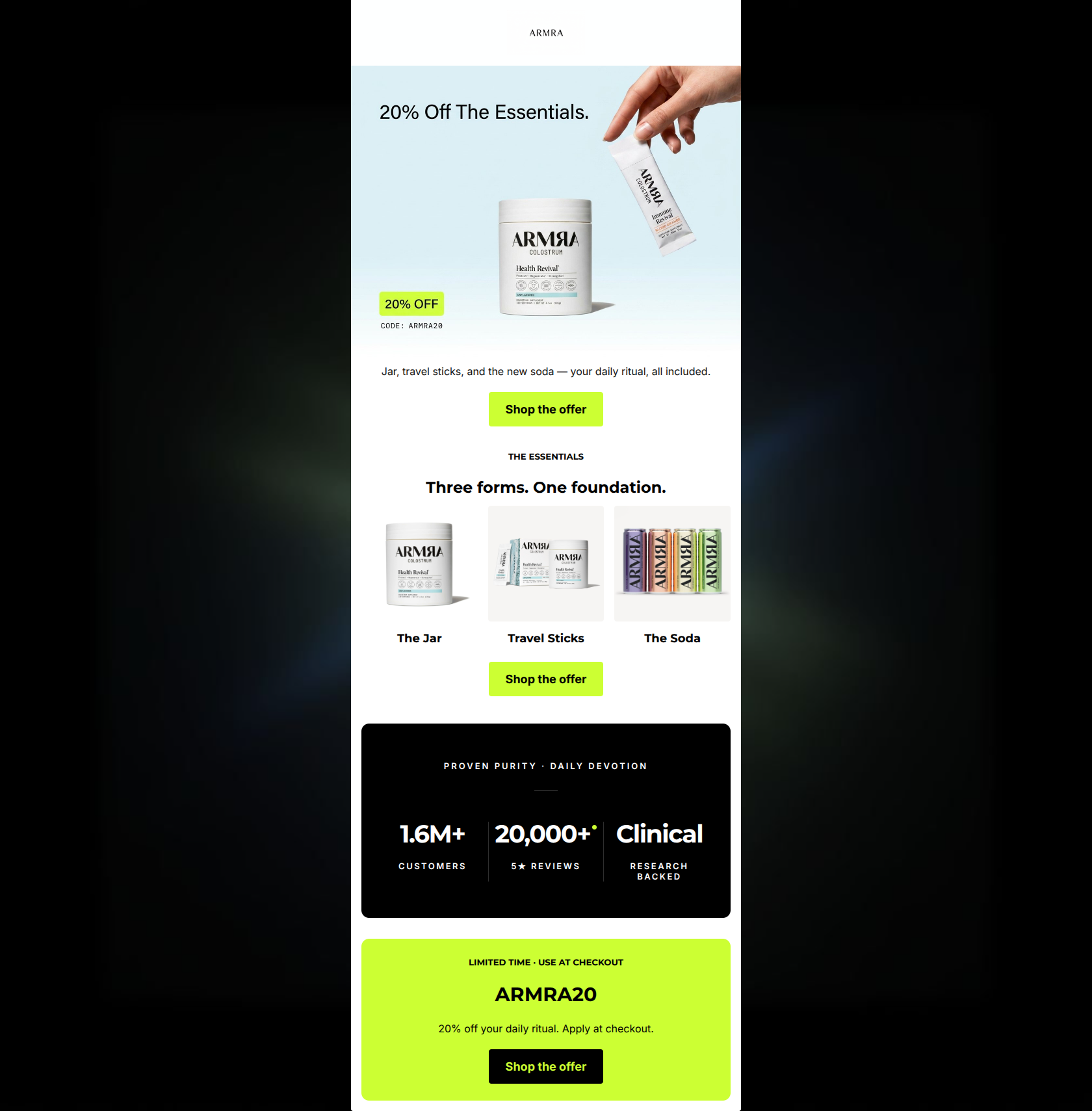
“20% off your daily revival — code ARMRA20”
Design Score
86/100This is a highly effective, visually arresting promotional email that nails the brand's premium, bio-tech aesthetic. The use of stark contrast (black, white, and volt green) directs the eye exactly where it needs to go: the 20% off offer and the primary CTAs. The repetition of a single, focused CTA ('Shop the offer') creates a frictionless conversion path. The structural flow from the hero offer to product formats, down to high-impact social proof, and closing with a clear promo code block is textbook conversion architecture. However, while the email excels visually and structurally, it assumes the reader already knows *why* they need colostrum. It sells the discount perfectly but neglects to sell the underlying product benefits (immunity, gut health, revitalization), leaving some potential conversions on the table for users who need a slight reminder of the value before clicking.
Create Your Own
Generate professional email designs like this one in seconds with Kopi AI.
Email Details
- Subject Line
- 20% off your daily revival — code ARMRA20
- Brand
- ARMRA
- Industry
- Health & Wellness
- Email Type
- Promotional
- Created
- May 21, 2026
Brand Colors
Email Copy
Jar, travel sticks, and the new soda — your daily ritual, all included.
→ Shop the offer
THE ESSENTIALS
Three forms. One foundation.
The Jar
Travel Sticks
The Soda
→ Shop the offer
LIMITED TIME · USE AT CHECKOUT
ARMRA20
20% off your daily ritual. Apply at checkout.
→ Shop the offer
Why This Email Works
This is a highly effective, visually arresting promotional email that nails the brand's premium, bio-tech aesthetic. The use of stark contrast (black, white, and volt green) directs the eye exactly where it needs to go: the 20% off offer and the primary CTAs. The repetition of a single, focused CTA ('Shop the offer') creates a frictionless conversion path. The structural flow from the hero offer to product formats, down to high-impact social proof, and closing with a clear promo code block is textbook conversion architecture. However, while the email excels visually and structurally, it assumes the reader already knows *why* they need colostrum. It sells the discount perfectly but neglects to sell the underlying product benefits (immunity, gut health, revitalization), leaving some potential conversions on the table for users who need a slight reminder of the value before clicking.
Hero Impact
85/100- Immediate clarity of the 20% discount.
- High-end art direction in the hero image that matches brand positioning.
- Seamless integration of the promo code near the point of highest visual attention.
Content Structure & Flow
92/100- Excellent pacing; the email breathes well with generous vertical spacing.
- The black trust card acts as a perfect visual 'speed bump' to re-engage scrollers before the final offer.
- Clear demarcation between the educational product section and the transactional promo sections.
Visual Hierarchy & Layout
95/100- Flawless use of the brand's volt green to indicate action.
- The black social proof card creates a necessary contrast break that prevents visual fatigue.
- Exceptional use of negative space throughout, reinforcing the premium brand feel.
Call-to-Action Strength
96/100- Repetition of a single, unified action.
- High-contrast buttons that easily pass the squint test.
- CTAs are placed at every logical decision point (Hero, Post-Product, Post-Social Proof).
Message Clarity & Tone
80/100- Sophisticated, confident copywriting.
- Avoids gimmicky sales language despite being a promotional email.
- The 'PROVEN PURITY · DAILY DEVOTION' eyebrow text perfectly encapsulates the brand ethos.
Readability & Scannability
88/100- Short, punchy sentences.
- Data is presented visually as oversized stats rather than buried in paragraphs.
- Clear distinction between eyebrow text, headers, and body copy.
Offer & Value Proposition
82/100- The promo code is unmissable.
- The scope of the offer ('The Essentials' - all three main formats) is clearly visualized.
- The bottom banner acts as a perfect 'cut-out-and-keep' style coupon block.
Personalization & Audience Fit
78/100- Aesthetic alignment with a high-end, health-conscious demographic.
- Focus on 'clinical' and 'research-backed' claims appeals directly to informed wellness consumers.
Copy Conciseness & Word Economy
94/100- No wasted paragraphs.
- 'Three forms. One foundation.' communicates a complex product ecosystem in four words.
- Distills social proof into three digestible data points.
Quick Wins
- Update all CTA button text from 'Shop the offer' to 'Claim 20% Off' to make the value explicit on the tap target.
- Add a single, tight sentence beneath 'Three forms. One foundation.' that explicitly states the biological benefit (e.g., 'Strengthen your immune barrier and revitalize your gut health.').
- Add a few pixels of vertical padding above the H4 titles ('The Jar', 'Travel Sticks', 'The Soda') in the product grid to improve legibility.

Create Professional Email Designs
Generate beautiful, on-brand email designs in seconds. Just enter your brand URL and let AI do the rest.