Fashion & Apparel Promotional Email Template
“Your basic tee is outdated.”
Design Score
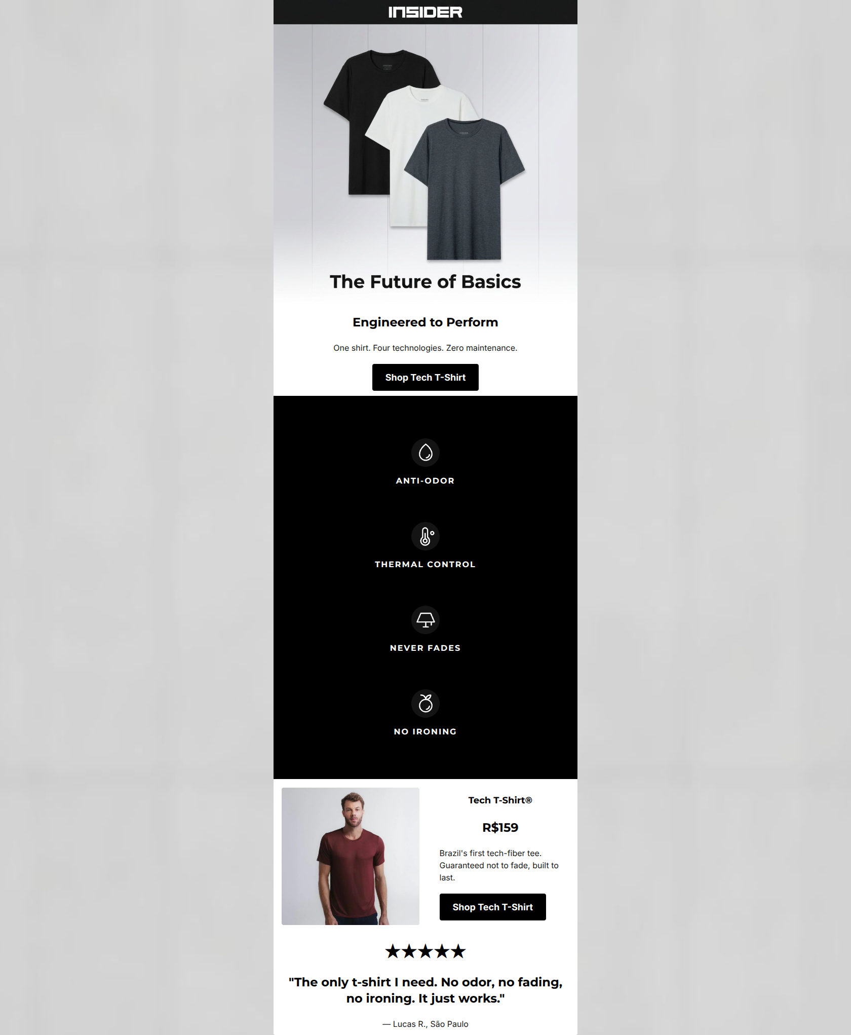
88/100This is a highly effective, clinical, and precise email that perfectly captures the brand's 'Silicon Valley uniform' positioning. The inverted pyramid structure is textbook, funneling attention from a strong, benefit-driven value proposition down to concrete features and social proof. The copywriting is exceptionally tight, demonstrating tremendous restraint and focusing entirely on customer outcomes ('Zero maintenance'). The primary areas for improvement are structural: fixing an overly long vertical scroll in the features section, ensuring demographic representation, and closing the loop with a final CTA at the bottom of the email.
Create Your Own
Generate professional email designs like this one in seconds with Kopi AI.
Email Details
- Subject Line
- Your basic tee is outdated.
- Brand
- Insider
- Industry
- Fashion & Apparel
- Email Type
- Promotional
- Created
- April 24, 2026
Brand Colors
Email Copy
Engineered to Perform
One shirt. Four technologies. Zero maintenance.
→ Shop Tech T-Shirt
Tech T-Shirt®
R$159
Brazil's first tech-fiber tee. Guaranteed not to fade, built to last.
→ Shop Tech T-Shirt
★★★★★
"The only t-shirt I need. No odor, no fading, no ironing. It just works."
— Lucas R., São Paulo
Why This Email Works
This is a highly effective, clinical, and precise email that perfectly captures the brand's 'Silicon Valley uniform' positioning. The inverted pyramid structure is textbook, funneling attention from a strong, benefit-driven value proposition down to concrete features and social proof. The copywriting is exceptionally tight, demonstrating tremendous restraint and focusing entirely on customer outcomes ('Zero maintenance'). The primary areas for improvement are structural: fixing an overly long vertical scroll in the features section, ensuring demographic representation, and closing the loop with a final CTA at the bottom of the email.
Hero (top/initial part) Impact
90/100- Immediate clarity of value proposition.
- Exceptional word economy in the subheadline.
- Strong contrast between the black CTA and white background.
Content Structure & Flow
90/100- Textbook inverted pyramid structure.
- Strategic placement of social proof at the end to catch non-converters.
- Clear delineation of sections using background color.
Visual Hierarchy & Layout
75/100- The stark black block acts as a powerful visual pattern interrupt, ensuring the features get noticed.
- Consistent use of the brand's minimalist, architectural visual language.
Call-to-Action Strength
95/100- Repetition of the exact same primary CTA copy and destination reinforces the desired action.
- High contrast (black button on white background) ensures the CTA dominates the visual hierarchy in its respective sections.
Message Clarity & Tone
95/100- Zero hyperbole or filler adjectives; relies strictly on factual performance claims.
- Directly addresses the mental load and pain points of the target persona.
Readability & Scannability
85/100- Generous whitespace around text elements.
- High-contrast typography (pure black on white, pure white on black).
Offer & Value Proposition
85/100- Transparent pricing qualifies intent before the user clicks.
- The 'zero maintenance' angle serves as a powerful, non-monetary value proposition.
Personalization & Audience Fit
85/100- The 'Silicon Valley uniform' aesthetic is executed flawlessly.
- The testimonial reflects a relatable urban professional demographic (São Paulo).
Copy Conciseness & Word Economy
100/100- Punchy, staccato phrasing ('Guaranteed not to fade, built to last').
- Complete absence of filler openers or throat-clearing.
Quick Wins
- Reformat the four feature icons in the black block into a 2x2 grid to drastically reduce unnecessary scrolling.
- Add a final 'Shop Tech T-Shirt' CTA button at the very bottom beneath the testimonial to close the loop.


Create Professional Email Designs
Generate beautiful, on-brand email designs in seconds. Just enter your brand URL and let AI do the rest.