SaaS & Software Promotional Email Template
“Your 90s website is costing you sales.”
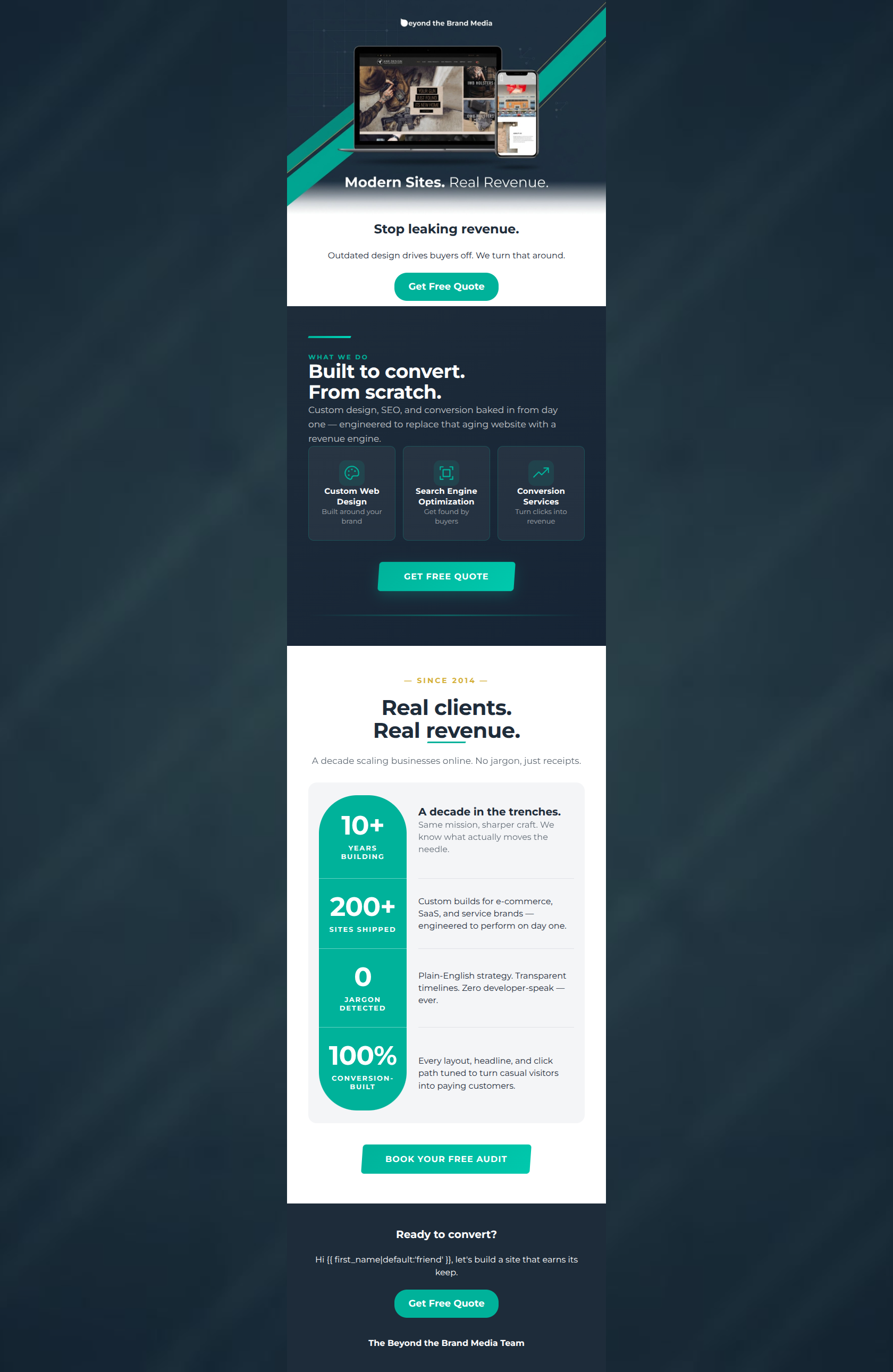
Design Score
83/100This is a strong, professional B2B promotional email that effectively communicates the agency's value proposition: driving revenue through modern web design. The visual design is bold and aligns well with the brand guidelines, utilizing high contrast and scannable sections. The primary issue holding this email back is a drift in the Call-to-Action copy, which introduces unnecessary cognitive friction. Overall, the copy is punchy, addresses client pain points directly, and establishes authority.
Create Your Own
Generate professional email designs like this one in seconds with Kopi AI.
Email Details
- Subject Line
- Your 90s website is costing you sales.
- Brand
- Beyond the Brand Media®
- Industry
- SaaS & Software
- Email Type
- Promotional
- Created
- April 30, 2026
Brand Colors
Email Copy
Stop leaking revenue.
Outdated design drives buyers off. We turn that around.
→ Get Free Quote
Ready to convert?
Hi friend, let's build a site that earns its keep.
→ Get Free Quote
The Beyond the Brand Media Team
Why This Email Works
This is a strong, professional B2B promotional email that effectively communicates the agency's value proposition: driving revenue through modern web design. The visual design is bold and aligns well with the brand guidelines, utilizing high contrast and scannable sections. The primary issue holding this email back is a drift in the Call-to-Action copy, which introduces unnecessary cognitive friction. Overall, the copy is punchy, addresses client pain points directly, and establishes authority.
Hero (top/initial part) Impact
85/100- Direct, benefit-oriented headline.
- Clear visual representation of the product (website on multiple devices).
- Immediate placement of the primary CTA.
Content Structure & Flow
88/100- Excellent use of the inverted pyramid principle.
- Clear distinction between different sections using background colors.
- Logical progression from problem awareness to proof.
Visual Hierarchy & Layout
82/100- Strong use of brand colors (navy and teal) to guide the eye.
- Bold, readable typography for primary headings.
- Effective use of whitespace in the stats section.
Call-to-Action Strength
65/100- Buttons are visually prominent using the high-contrast brand teal.
- Excellent repetition of the CTA across multiple sections.
Message Clarity & Tone
90/100- Confident, jargon-free language.
- Focus on business outcomes (revenue, conversion) rather than just technical features.
- Strong brand voice.
Readability & Scannability
88/100- Great use of icons and bulleted layouts (cards, stats block).
- Short, punchy paragraphs.
- Effective typographic hierarchy.
Offer & Value Proposition
85/100- Strong focus on ROI and results.
- Clear differentiation from competitors ('No jargon').
Personalization & Audience Fit
78/100- Deeply empathetic to the target audience's pain points (wasted money, jargon).
- Positions the agency as a capable partner.
Copy Conciseness & Word Economy
85/100- No throat-clearing openers.
- High impact-to-word ratio in headings.
Quick Wins
- Unify all CTA buttons to read 'Get Free Quote' to eliminate cognitive friction regarding the offer.
- Update the personalization fallback from 'friend' to a more professional greeting.
- Increase the font size and color lightness of the descriptive text inside the dark service cards.


Create Professional Email Designs
Generate beautiful, on-brand email designs in seconds. Just enter your brand URL and let AI do the rest.