Electronics & Tech Cart Abandonment Email Template
“You left something behind”
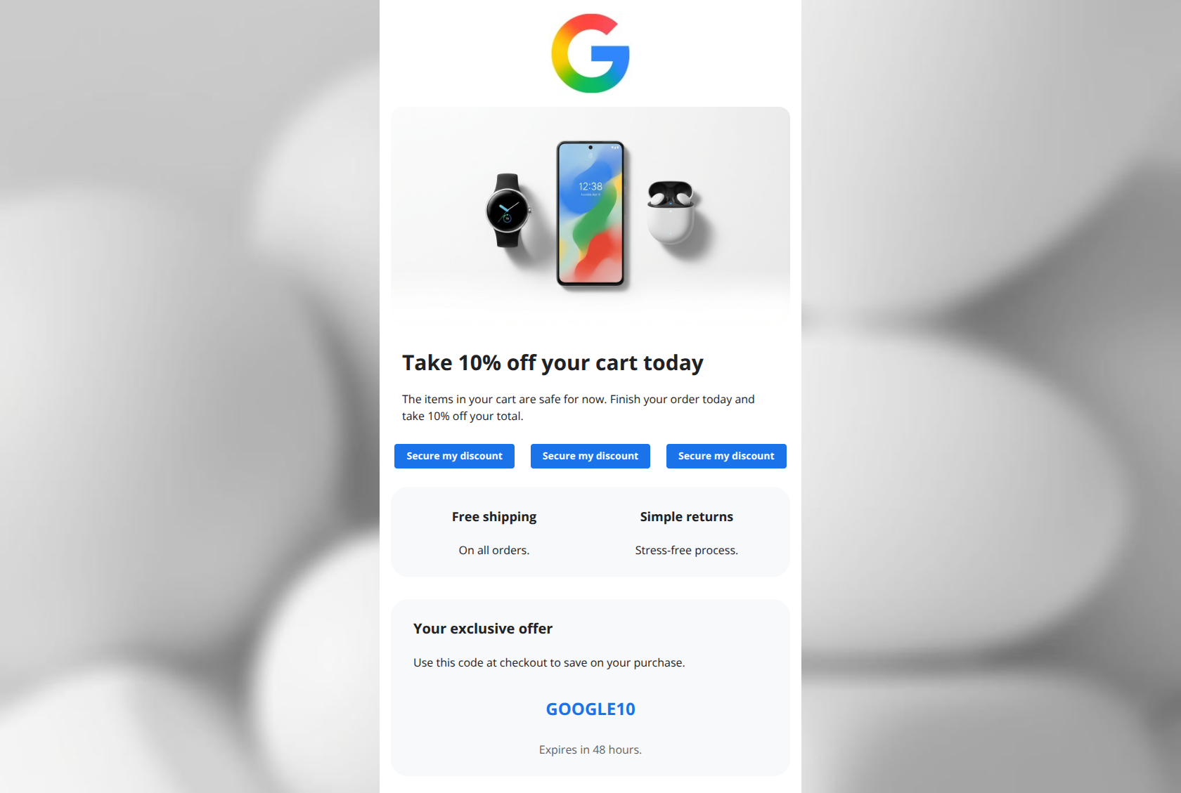
Design Score
80/100This is a visually pristine, brand-aligned email that successfully communicates trust but buries its primary hook. While the 'Material Design' aesthetic ensures excellent readability, the generic headline ('Still thinking about it?') wastes valuable real estate, and the layout introduces unnecessary friction by including a cross-sell section ('Better together') before the transaction is closed.
Create Your Own
Generate professional email designs like this one in seconds with Kopi AI.
Email Details
- Subject Line
- You left something behind
- Brand
- Industry
- Electronics & Tech
- Email Type
- Cart Abandonment
- Created
- January 30, 2026
Brand Colors
Email Copy
Take 10% off your cart today
The items in your cart are safe for now. Finish your order today and take 10% off your total.
→ Secure my discount
→ Secure my discount
→ Secure my discount
Free shipping
On all orders.
Simple returns
Stress-free process.
Your exclusive offer
Use this code at checkout to save on your purchase.
GOOGLE10
Expires in 48 hours.
Why This Email Works
This is a visually pristine, brand-aligned email that successfully communicates trust but buries its primary hook. While the 'Material Design' aesthetic ensures excellent readability, the generic headline ('Still thinking about it?') wastes valuable real estate, and the layout introduces unnecessary friction by including a cross-sell section ('Better together') before the transaction is closed.
Hero (top/initial part) Impact
75/100- Clean, high-quality product photography immediately identifies the context.
- Uncluttered layout focuses attention on the text and button.
Content Structure & Flow
70/100- The primary conversion path (Hero -> Offer) is placed first.
- Trust signals (Shipping/Returns) are present at the bottom to reassure users.
Visual Hierarchy & Layout
85/100- Ample whitespace prevents cognitive overload.
- The primary CTA button color (#1A73E8) pops clearly against the white/grey background.
Call-to-Action Strength
80/100- Primary button looks like a button—standard Google blue fill with white text.
- Good separation between the primary action and the text above it.
Message Clarity & Tone
85/100- Language is simple, accessible, and devoid of jargon.
- The phrasing 'The items in your cart are safe for now' reduces anxiety.
Readability & Scannability
95/100- Typography is legible with high contrast (#202124 on white).
- Paragraphs are kept to 1-2 sentences, making them effortless to skim.
Offer & Value Proposition
75/100- 10% off is a meaningful incentive for high-ticket hardware.
- Free shipping and simple returns address key barriers to entry.
Personalization & Audience Fit
75/100- The email is clearly triggered by high-intent behavior (abandoned cart).
Quick Wins
- Change the Hero Headline from 'Still thinking about it?' to 'Take 10% off your cart today'.
- Remove the 'Better together' section to eliminate the 'Learn more' exit leak.
- Update the primary CTA button text to 'Secure my discount' or 'Complete my order'.
Create Professional Email Designs
Generate beautiful, on-brand email designs in seconds. Just enter your brand URL and let AI do the rest.