Travel & Hospitality Cart Abandonment Email Template
“You left something behind”
Design Score
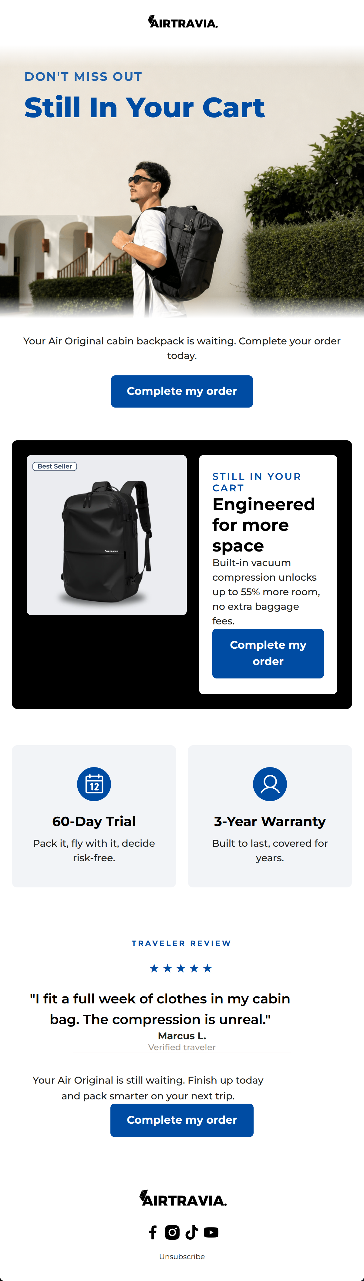
82/100This cart abandonment email is visually striking and effectively leverages the brand's high-contrast, premium aesthetic. The structural flow is logical, moving the reader from a clear reminder to a strong value proposition, risk-reversal (warranty/trial), and social proof. The use of consistent, highly visible Call-to-Action buttons is excellent. However, there are minor issues with redundant copy, generic urgency phrasing that detracts from the premium positioning, and a few visual alignment disconnects between sections.
Create Your Own
Generate professional email designs like this one in seconds with Kopi AI.
Email Details
- Subject Line
- You left something behind
- Brand
- Airtravia
- Industry
- Travel & Hospitality
- Email Type
- Cart Abandonment
- Created
- September 28, 2026
Brand Colors
Email Copy
Your Air Original cabin backpack is waiting. Complete your order today.
→ Complete my order
Unsubscribe
Why This Email Works
This cart abandonment email is visually striking and effectively leverages the brand's high-contrast, premium aesthetic. The structural flow is logical, moving the reader from a clear reminder to a strong value proposition, risk-reversal (warranty/trial), and social proof. The use of consistent, highly visible Call-to-Action buttons is excellent. However, there are minor issues with redundant copy, generic urgency phrasing that detracts from the premium positioning, and a few visual alignment disconnects between sections.
Hero Impact
75/100- Unambiguous declaration of why the email was sent.
- High-quality lifestyle imagery that resonates with the target demographic.
- Excellent legibility of text overlaid on the image via the gradient.
Content Structure & Flow
85/100- Logical narrative progression that addresses objections (space, risk, trust).
- Each section serves a distinct, singular purpose without bleeding into the next.
- Ample white space prevents the email from feeling cluttered.
Visual Hierarchy & Layout
78/100- The black product feature block successfully commands attention and highlights the core engineering value.
- Iconography in the reassurance cards is clean and perfectly sized.
- Typography scale clearly delineates headings from body copy.
Call-to-Action Strength
98/100- Perfect consistency in CTA copy across all buttons.
- High-contrast cobalt blue ensures the buttons pop against both white and black backgrounds.
- Strategic placement ensures a CTA is always within a short scroll.
Message Clarity & Tone
82/100- Direct, benefit-driven explanation of the product's core feature.
- Authoritative and confident tone in the product description.
- Testimonial directly validates the primary claim (compression/space).
Readability & Scannability
88/100- Excellent use of chunked information, particularly the two-column reassurance cards.
- Strong typographic contrast between heavy headings and legible body copy.
- No walls of text; copy is kept punchy and digestible.
Offer & Value Proposition
85/100- Maintains premium brand positioning by avoiding immediate discounts.
- Clearly connects the product feature (compression) to the customer outcome (no extra baggage fees).
- Prominent placement of risk-free guarantees.
Personalization & Audience Fit
80/100- The lifestyle image accurately reflects the target demographic's sleek, urban-traveler vibe.
- Messaging bypasses fluff and speaks directly to efficiency and logistics.
Copy Conciseness & Word Economy
76/100- Reassurance cards use excellent word economy ('Pack it, fly with it, decide risk-free.').
- The product feature description is distilled to its most impactful elements.
Quick Wins
- Remove the orphaned '01' graphic behind the backpack image in the black section.
- Delete the redundant 'Still in your cart' kicker from the black product feature block.
- Trim the copy directly above the first CTA to remove redundancy with the button text.
Create Professional Email Designs
Generate beautiful, on-brand email designs in seconds. Just enter your brand URL and let AI do the rest.