Fashion & Apparel Promotional Email Template
“Why we make shoes out of trees”
Design Score
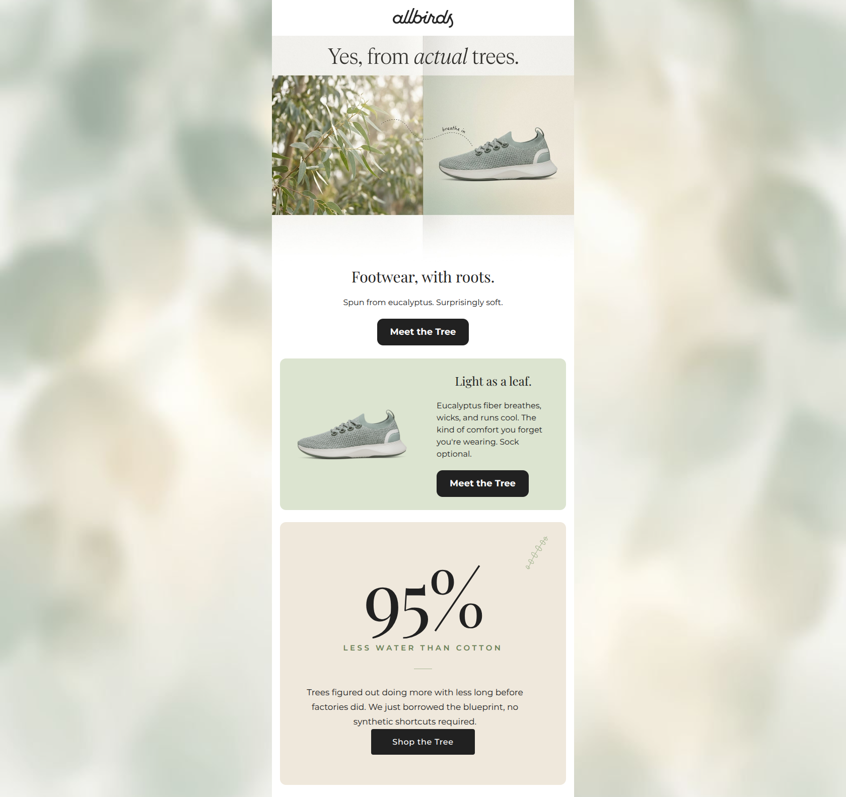
89/100This is an exceptionally strong, highly focused product education email. It brilliantly leverages the Allbirds brand voice and visual aesthetic to communicate a single, compelling narrative: the comfort and sustainability of eucalyptus fiber. The 'Inverted Pyramid' structure is perfectly executed, guiding the reader from a conceptual hook down to concrete physical benefits, and finally to an environmental proof point. The reliance on concise copy, generous whitespace, and a strict, repetitive primary call-to-action makes the conversion path frictionless. The primary area for improvement lies in showcasing product variety, as the current execution risks losing readers who are sold on the material but don't care for the specific sage green colorway shown.
Create Your Own
Generate professional email designs like this one in seconds with Kopi AI.
Email Details
- Subject Line
- Why we make shoes out of trees
- Brand
- Kopi Agent Eval [2026-05-22]
- Industry
- Fashion & Apparel
- Email Type
- Promotional
- Created
- May 22, 2026
Brand Colors
Email Copy
Footwear, with roots.
Spun from eucalyptus. Surprisingly soft.
→ Meet the Tree
Light as a leaf.
Eucalyptus fiber breathes, wicks, and runs cool. The kind of comfort you forget you're wearing. Sock optional.
→ Meet the Tree
Why This Email Works
This is an exceptionally strong, highly focused product education email. It brilliantly leverages the Allbirds brand voice and visual aesthetic to communicate a single, compelling narrative: the comfort and sustainability of eucalyptus fiber. The 'Inverted Pyramid' structure is perfectly executed, guiding the reader from a conceptual hook down to concrete physical benefits, and finally to an environmental proof point. The reliance on concise copy, generous whitespace, and a strict, repetitive primary call-to-action makes the conversion path frictionless. The primary area for improvement lies in showcasing product variety, as the current execution risks losing readers who are sold on the material but don't care for the specific sage green colorway shown.
Hero (top/initial part) Impact
92/100- Brilliant visual metaphor linking the eucalyptus leaves directly to the shoe.
- Ultra-concise supporting copy ('Spun from eucalyptus. Surprisingly soft.') respects the reader's time.
- Immediate placement of the primary CTA above the fold.
Content Structure & Flow
95/100- Perfect 'Inverted Pyramid' execution, funneling attention downward.
- Distinct, easily digestible sections prevent cognitive overload.
- Each section reinforces the core message without repeating the same phrasing.
Visual Hierarchy & Layout
88/100- Excellent use of alternating background colors (white, sage, cream) to delineate content blocks.
- Generous padding and margins create an airy, premium feel.
- High-contrast formatting ensures headlines and buttons dominate the visual hierarchy.
Call-to-Action Strength
98/100- Repetition of the primary action eliminates any ambiguity about what the user is supposed to do.
- The dark charcoal buttons provide excellent contrast against all three background colors.
- The CTA copy is specific to the product rather than a generic 'Click Here'.
Message Clarity & Tone
94/100- Benefit-driven copy ('breathes, wicks, and runs cool') tells the user exactly why they should care.
- Playful, on-brand phrasing like 'Sock optional' adds personality without sacrificing clarity.
- Complex sustainability concepts are distilled into easily understood, conversational language.
Readability & Scannability
90/100- Short, punchy paragraphs drastically reduce cognitive load.
- Clear distinction between headlines and body text.
- The use of a large numerical stat (95%) acts as a strong visual anchor for scanning eyes.
Offer & Value Proposition
85/100- The core product benefit is impossible to miss.
- The combination of physical comfort and environmental responsibility creates a strong dual-value proposition.
Personalization & Audience Fit
80/100- Directly addresses the audience's pain point of wanting comfort without compromising on environmental ethics.
- The aesthetic perfectly matches the 'urban lifestyle' demographic preferences.
Copy Conciseness & Word Economy
96/100- Zero filler phrasing or throat-clearing openers.
- Every sentence adds new information or reinforces a core benefit.
- Fragments are used intentionally and effectively to create a rhythmic, fast-paced read.
Quick Wins
- Tighten the phrasing in the final stat card to make it as punchy as the top half of the email.
- Increase the size or remove the tiny 'breathe in' text embedded in the hero image graphic.
- Add a subtle utility bar or footer callout mentioning the active '30% off $150+' site promotion to capture high-intent buyers.




Create Professional Email Designs
Generate beautiful, on-brand email designs in seconds. Just enter your brand URL and let AI do the rest.