Fashion & Apparel Promotional Email Template
“Why professionals choose Blåkläder”
Design Score
86/100This email is a visually striking, highly scannable brand awareness piece that perfectly captures Blåkläder's rugged, technical identity. Its strengths lie in a rigorous visual hierarchy, exceptional scannability, and a perfectly executed, repetitive CTA strategy that leaves no ambiguity about the desired action. However, the messaging leans slightly too far into B2B corporate language (e.g., 'Strong delivery capability') and the overall flow lacks a specific product hook to drive immediate, high-intent clicks. Shifting the copy to focus purely on end-user benefits and providing direct paths to top-selling gear will elevate its conversion potential.
Create Your Own
Generate professional email designs like this one in seconds with Kopi AI.
Email Details
- Subject Line
- Why professionals choose Blåkläder
- Brand
- Blåkläder
- Industry
- Fashion & Apparel
- Email Type
- Promotional
- Created
- May 12, 2026
Brand Colors
Email Copy
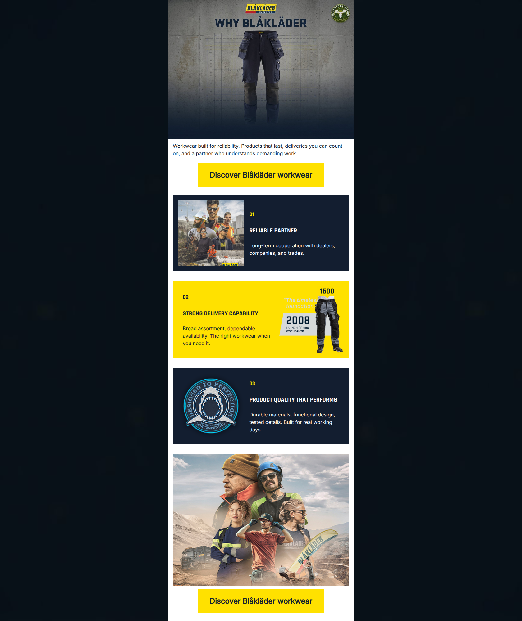
Workwear built for reliability. Products that last, deliveries you can count on, and a partner who understands demanding work.
→ Discover Blåkläder workwear
01
RELIABLE PARTNER
Long-term cooperation with dealers, companies, and trades.
02
STRONG DELIVERY CAPABILITY
Broad assortment, dependable availability. The right workwear when you need it.
03
PRODUCT QUALITY THAT PERFORMS
Durable materials, functional design, tested details. Built for real working days.
→ Discover Blåkläder workwear
Why This Email Works
This email is a visually striking, highly scannable brand awareness piece that perfectly captures Blåkläder's rugged, technical identity. Its strengths lie in a rigorous visual hierarchy, exceptional scannability, and a perfectly executed, repetitive CTA strategy that leaves no ambiguity about the desired action. However, the messaging leans slightly too far into B2B corporate language (e.g., 'Strong delivery capability') and the overall flow lacks a specific product hook to drive immediate, high-intent clicks. Shifting the copy to focus purely on end-user benefits and providing direct paths to top-selling gear will elevate its conversion potential.
Hero Impact
82/100- Striking, on-brand hero graphic that immediately communicates the product category.
- Clear, high-contrast primary CTA placed high above the fold.
- No clutter or competing elements in the initial viewport.
Content Structure & Flow
90/100- Excellent use of numerical anchors to create a predictable scanning path.
- Logical narrative progression from the main brand promise to specific supporting pillars.
- Strong closing lifestyle image that reinforces the emotional appeal before the final click.
Visual Hierarchy & Layout
88/100- Bold, intentional use of brand colors that directly supports the hierarchy.
- Clear distinction between text content areas and supporting imagery.
- Section headings visually dominate the supporting body copy, facilitating easy skimming.
Call-to-Action Strength
95/100- Identical destination and user intent for both buttons.
- Excellent color contrast (black text on safety yellow) that passes the 'squint test' effortlessly.
- Strategic placement at both the point of introduction and the point of conclusion.
Message Clarity & Tone
78/100- Unapologetically tough, direct, and professional tone.
- Confident declarations of product quality and reliability.
Readability & Scannability
92/100- Concise, capitalized headings that act as complete thoughts.
- Bite-sized supporting copy that doesn't overwhelm the visual space.
- Distinct visual blocks that prevent the content from blending into a wall of text.
Offer & Value Proposition
75/100- Clear articulation of the three main brand pillars.
- Strong emphasis on durability and rigorous testing.
Personalization & Audience Fit
90/100- Authentic, gritty lifestyle photography that respects the profession.
- Absence of overly polished, fake-looking models.
- Design language that aligns seamlessly with a blue-collar professional identity.
Copy Conciseness & Word Economy
88/100- Zero filler words or fluffy marketing jargon.
- Immediate delivery of the core message in every section.
- Respects the reader's cognitive load by using the absolute minimum number of words necessary.
Quick Wins
- Reformat the top introductory paragraph into a slightly larger, styled subheadline to bridge the visual gap between the hero graphic and the primary CTA.
- Translate the B2B terminology in sections 01 and 02 into wearer-centric benefits (e.g., change 'Strong delivery capability' to something like 'Ready to Ship. Ready to Work.').
- Ensure all text embedded within images (like the quote in the section 02 graphic) has sufficient contrast against its background.



Create Professional Email Designs
Generate beautiful, on-brand email designs in seconds. Just enter your brand URL and let AI do the rest.