Pets Promotional Email Template
“Why millions of pet parents switched”
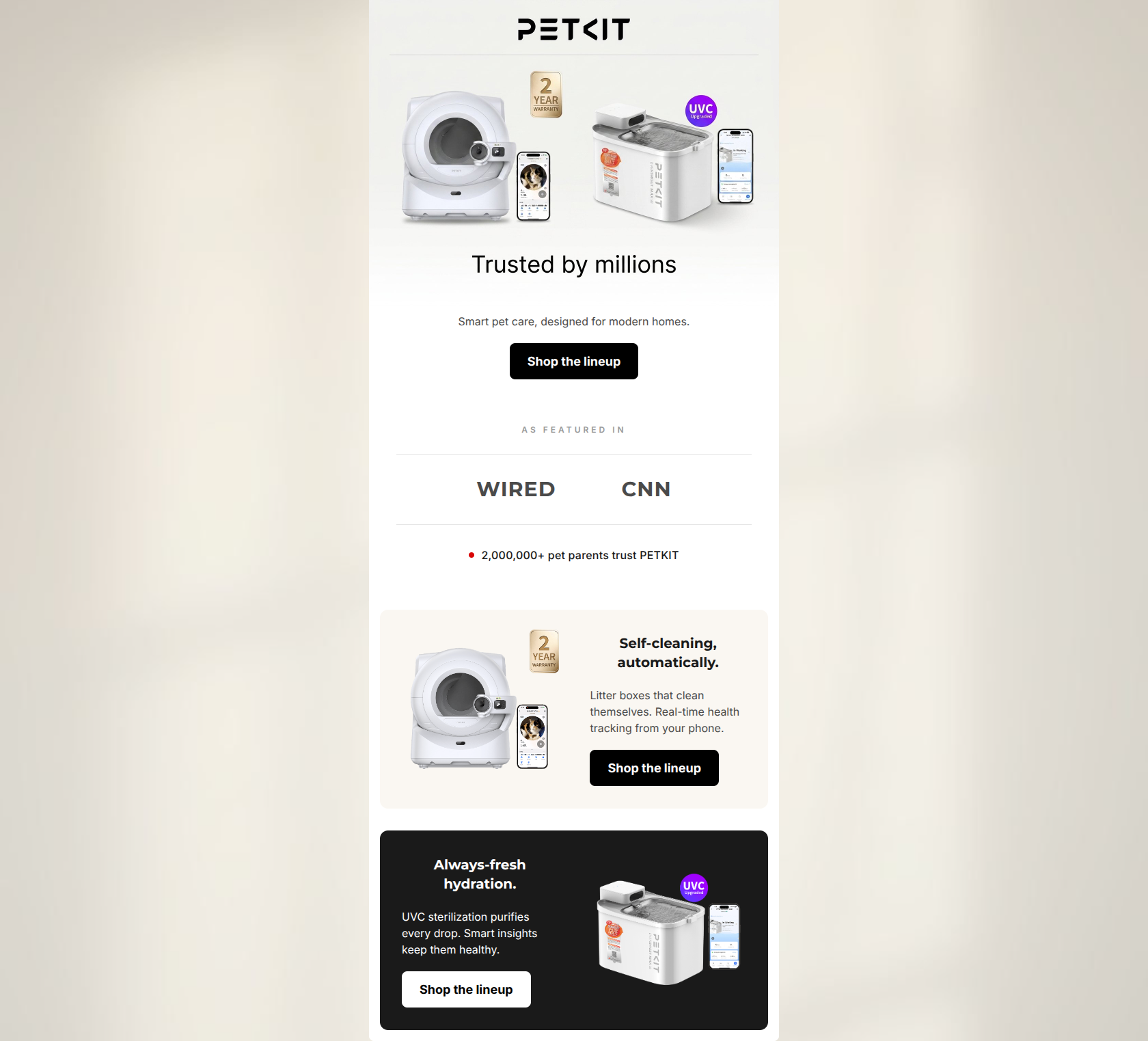
Design Score
81/100This is a visually sleek, on-brand promotional email that effectively communicates PETKIT's premium positioning and 'Smart Home Minimalist' aesthetic. The structure is logical, funneling the reader from brand-level trust builders down to specific product highlights, and the use of contrasting background colors creates excellent visual rhythm. However, a significant conversion hurdle exists in the link routing: while the CTA buttons uniformly drive to the 'All Collections' page, the product images drive to specific category pages. This mixed-destination approach creates a disjointed user experience and dilutes the primary goal.
Create Your Own
Generate professional email designs like this one in seconds with Kopi AI.
Email Details
- Subject Line
- Why millions of pet parents switched
- Brand
- PETKIT
- Industry
- Pets
- Email Type
- Promotional
- Created
- April 29, 2026
Brand Colors
Email Copy
Smart pet care, designed for modern homes.
→ Shop the lineup
Self-cleaning, automatically.
Litter boxes that clean themselves. Real-time health tracking from your phone.
→ Shop the lineup
Always-fresh hydration.
UVC sterilization purifies every drop. Smart insights keep them healthy.
→ Shop the lineup
Why This Email Works
This is a visually sleek, on-brand promotional email that effectively communicates PETKIT's premium positioning and 'Smart Home Minimalist' aesthetic. The structure is logical, funneling the reader from brand-level trust builders down to specific product highlights, and the use of contrasting background colors creates excellent visual rhythm. However, a significant conversion hurdle exists in the link routing: while the CTA buttons uniformly drive to the 'All Collections' page, the product images drive to specific category pages. This mixed-destination approach creates a disjointed user experience and dilutes the primary goal.
Hero Impact
85/100- Clear, high-quality product imagery that immediately signals the tech category.
- Visual inclusion of the smartphone app immediately communicates the 'smart' value proposition.
- Strong visual contrast between the hero image and the primary CTA button.
Content Structure & Flow
88/100- Excellent use of an alternating layout (light to dark) to separate content blocks clearly.
- Placement of the social proof/trust bar high up in the email validates the premium positioning before asking the user to dig into product details.
- Clean, distinct sections prevent the email from feeling like a wall of content.
Visual Hierarchy & Layout
92/100- Stark, effective contrast between the #FAF7F2 litter box block and the #1A1A1A fountain block.
- The 'As Featured In' bar is perfectly restrained—gallery-quiet and editorial, which builds trust without distracting from the products.
- Headings clearly dominate body copy, making scanning effortless.
Call-to-Action Strength
65/100- The primary CTA button text ('Shop the lineup') is consistently repeated, reinforcing the action.
- Buttons feature excellent high-contrast colors (black on white/light backgrounds, white on dark backgrounds) that pass the squint test easily.
- Buttons are positioned logically below the supporting text in every section.
Message Clarity & Tone
82/100- Brand voice is consistent: sophisticated and focused on proactive health.
- Features are clearly stated without overly dense jargon.
- The connection between the app ('from your phone') and the physical product is made explicitly clear.
Readability & Scannability
90/100- Excellent use of short paragraphs and bite-sized sentences.
- Strong typographic hierarchy; headings are instantly distinguishable from body text.
- Generous padding and margins prevent any feeling of visual crowding.
Offer & Value Proposition
75/100- Clearly communicates the core benefits: automation and health monitoring.
- Maintains the premium brand positioning by avoiding discount-heavy messaging.
Personalization & Audience Fit
85/100- Visual aesthetic perfectly matches the 'Smart Home Minimalist' lifestyle of the target buyer.
- Addresses the primary pain points (cleaning litter, stale water) head-on.
Copy Conciseness & Word Economy
82/100- No throat-clearing openers or filler adjectives.
- Text blocks are kept short and impactful.
Quick Wins
- Fix the repetitive copy in the litter box section to ensure the body text adds new information rather than restating the heading.
- Remove the duplicated 'Trusted by millions' messaging to streamline the narrative flow.
- Update 'keep them healthy' to 'keep your pet healthy' for a more personal touch.


Create Professional Email Designs
Generate beautiful, on-brand email designs in seconds. Just enter your brand URL and let AI do the rest.