Fashion & Apparel Win-Back Email Template
“We're back: here's your personal 10% off”
Design Score
81/100This is a strong, highly targeted win-back campaign that effectively leverages a specific operational update (the return of shipping to island territories) to drive conversions. The email perfectly aligns with Apparel.com's utilitarian, no-nonsense brand identity, utilizing a stark color palette and direct messaging. The primary strengths are its scannability, the clear presence of a tangible offer, and excellent adherence to CTA repetition. However, the email suffers slightly from structural redundancy and some minor copy bloat, repeating the core message across multiple stacked sections rather than delivering a single, fluid narrative.
Create Your Own
Generate professional email designs like this one in seconds with Kopi AI.
Email Details
- Subject Line
- We're back: here's your personal 10% off
- Brand
- Apparel.com
- Industry
- Fashion & Apparel
- Email Type
- Win-Back
- Created
- October 6, 2026
Brand Colors
Email Copy
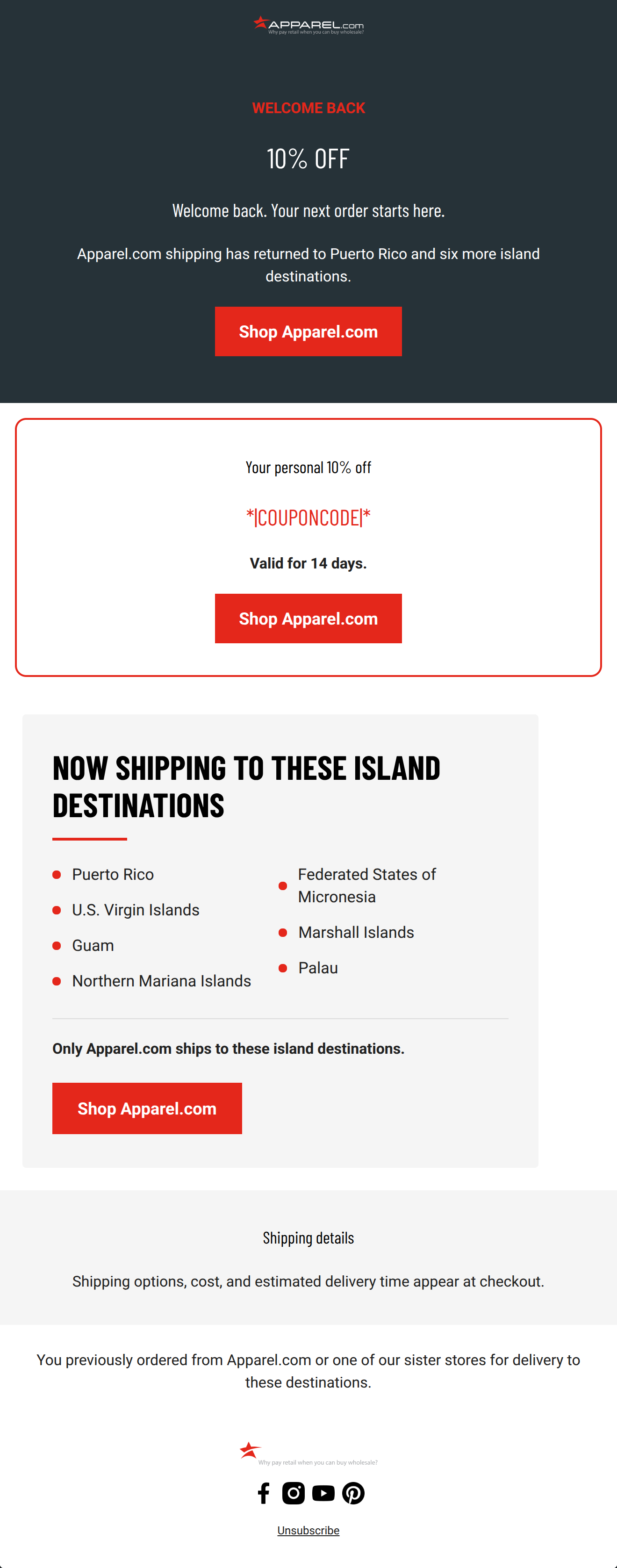
Preview text: Apparel.com shipping has returned to Puerto Rico and more island destinations.
WELCOME BACK
10% OFF
Welcome back. Your next order starts here.
Apparel.com shipping has returned to Puerto Rico and six more island destinations.
→ Shop Apparel.com
Your personal 10% off
*|COUPONCODE|*
Valid for 14 days.
→ Shop Apparel.com
Shipping details
Shipping options, cost, and estimated delivery time appear at checkout.
You previously ordered from Apparel.com or one of our sister stores for delivery to these destinations. Apparel.com 1894 E William St, Ste 4-504 Carson City, NV 89701, US
Unsubscribe
Update preferences
Why This Email Works
This is a strong, highly targeted win-back campaign that effectively leverages a specific operational update (the return of shipping to island territories) to drive conversions. The email perfectly aligns with Apparel.com's utilitarian, no-nonsense brand identity, utilizing a stark color palette and direct messaging. The primary strengths are its scannability, the clear presence of a tangible offer, and excellent adherence to CTA repetition. However, the email suffers slightly from structural redundancy and some minor copy bloat, repeating the core message across multiple stacked sections rather than delivering a single, fluid narrative.
Hero (top/initial part) Impact
75/100- Immediate introduction of a strong, percentage-based offer.
- High-contrast dark background forces focus onto the white and red typography.
- Explicitly states the operational update right away.
Content Structure & Flow
68/100- Clear delineation between different blocks of information using borders and background colors.
- The most critical conversion element (the coupon code) is centrally located.
Visual Hierarchy & Layout
82/100- Excellent use of the primary red brand color to draw the eye to actionable or critical items.
- The two-column list for destinations is highly scannable and space-efficient.
- Bold, sans-serif typography reinforces the authoritative tone.
Call-to-Action Strength
95/100- Flawless repetition of the primary conversion goal.
- Unambiguous button copy that sets clear expectations.
- High visual prominence against all background colors.
Message Clarity & Tone
88/100- Perfectly nails the 'warehouse manager' brand voice.
- Uses bold competitive positioning effectively.
- No unnecessary adjectives or emotive language.
Readability & Scannability
90/100- Excellent use of a two-column bulleted list to present data.
- High contrast text on all backgrounds.
- Clear, distinct headers for every section.
Offer & Value Proposition
88/100- Clear, tangible financial incentive.
- Inclusion of an expiration timeframe to drive immediate action.
- Coupon code is prominently displayed and easy to copy.
Personalization & Audience Fit
85/100- Excellent use of segmentation to deliver highly relevant logistical news.
- Dynamic coupon code makes the offer feel exclusive.
Copy Conciseness & Word Economy
72/100- Individual sentences are generally short and punchy.
- No long paragraphs.
Quick Wins
- Remove 'Welcome back. Your next order starts here.' from the hero to make the messaging punchier and more direct.
- Consolidate the two plain-text sections at the bottom of the email into a single, concise logistical footer block.
- Left-align the paragraph text in the hero section to improve scannability.

Create Professional Email Designs
Generate beautiful, on-brand email designs in seconds. Just enter your brand URL and let AI do the rest.