Fashion & Apparel Promotional Email Template
“Thank you. This one is on us.”
Design Score
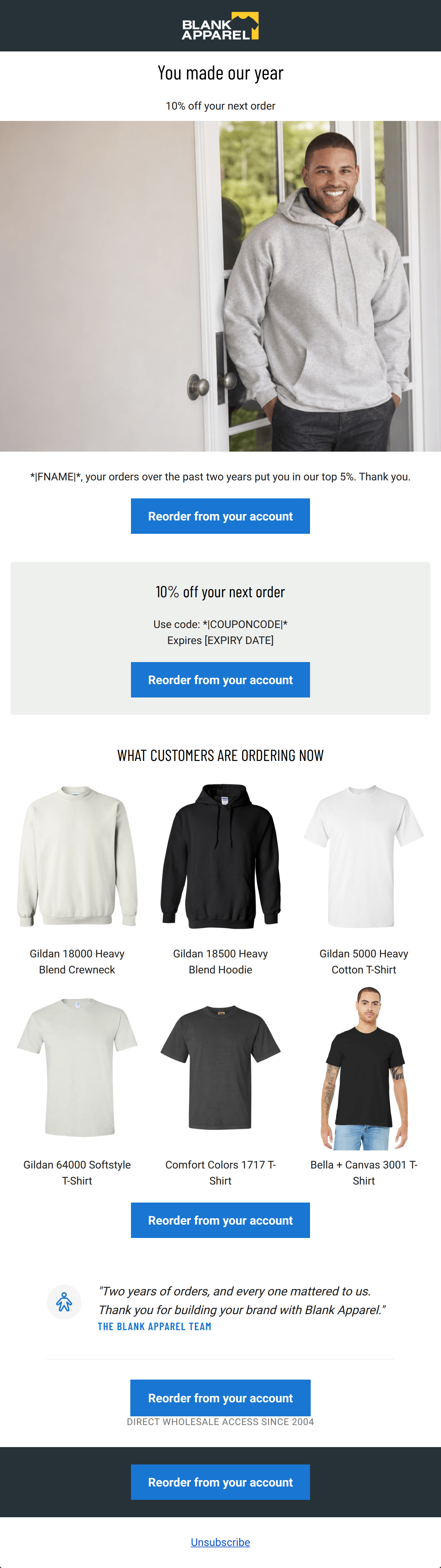
82/100This is a strong, highly concise winback/loyalty email that effectively leverages customer data ('top 5%') to deliver a clear, personalized offer. The execution of the primary CTA ('Reorder in one click') is text-book perfect, providing consistent off-ramps throughout the scroll. However, the email suffers from a significant visual misstep in the product grid, where abstract icons are used instead of actual garment photography, missing a crucial opportunity to showcase the product quality Blank Apparel is known for.
Create Your Own
Generate professional email designs like this one in seconds with Kopi AI.
Email Details
- Subject Line
- Thank you. This one is on us.
- Brand
- Blank Apparel
- Industry
- Fashion & Apparel
- Email Type
- Promotional
- Created
- October 2, 2026
Brand Colors
Email Copy
Preview text: Two years of orders, and we noticed. A little something for our best customers.
You made our year
10% off your next order
*|FNAME|*, your orders over the past two years put you in our top 5%. Thank you.
→ Reorder from your account
10% off your next order
Your code
*|COUPONCODE|*
Expires [EXPIRY DATE]
→ Reorder from your account
WHAT CUSTOMERS ARE ORDERING NOW
Gildan 18000 Heavy Blend Crewneck
Gildan 18500 Heavy Blend Hoodie
Gildan 5000 Heavy Cotton T-Shirt
Gildan 64000 Softstyle T-Shirt
Comfort Colors 1717 T-Shirt
Bella + Canvas 3001 T-Shirt
→ Reorder from your account
Why This Email Works
This is a strong, highly concise winback/loyalty email that effectively leverages customer data ('top 5%') to deliver a clear, personalized offer. The execution of the primary CTA ('Reorder in one click') is text-book perfect, providing consistent off-ramps throughout the scroll. However, the email suffers from a significant visual misstep in the product grid, where abstract icons are used instead of actual garment photography, missing a crucial opportunity to showcase the product quality Blank Apparel is known for.
Hero (top/initial part) Impact
70/100- The lifestyle image of the man in the blank gray hoodie perfectly aligns with the brand's core product offering.
- The text overlay is easy to read against the clean background of the image.
Content Structure & Flow
85/100- Clear delineation between sections using background colors (white, light gray, dark slate).
- The progression from the personalized offer to general best-sellers is a proven conversion path.
Visual Hierarchy & Layout
60/100- Excellent use of whitespace throughout the email, preventing any feeling of clutter.
- The dark slate block at the bottom effectively grounds the email and draws the eye to the final thank you message.
Call-to-Action Strength
98/100- Perfect consistency in button copy ('Reorder in one click').
- High-contrast blue buttons stand out sharply against the white, gray, and dark slate backgrounds.
- The repetition reinforces the primary conversion goal without confusing the user.
Message Clarity & Tone
90/100- Directly acknowledging the customer's loyalty ('top 5%') builds strong goodwill.
- The messaging strictly focuses on the customer and their business/needs ('building your brand with Blank Apparel').
Readability & Scannability
95/100- Excellent use of clear, bold sans-serif typography.
- Text blocks are kept to absolute minimums; there are no walls of text to decipher.
Offer & Value Proposition
88/100- The offer is presented clearly and prominently in its own dedicated visual card.
- The inclusion of an explicit 'Expires [EXPIRY DATE]' adds necessary urgency to drive immediate clicks.
Personalization & Audience Fit
92/100- Use of the first name merge tag.
- Referencing the specific tenure ('past two years') and status ('top 5%') demonstrates that the brand is paying attention to their account.
Copy Conciseness & Word Economy
96/100- The final sign-off is only two sentences but delivers high impact.
- The coupon section relies on typography and layout to communicate rather than explanatory paragraphs.
Quick Wins
- Move the '10% off your next order' headline into the hero section to immediately hook the reader.
- Combine the one-sentence intro text into the gray coupon card to tighten the layout.
- Move the final, bottom-most CTA button inside the dark slate 'Note of Thanks' block so it doesn't appear to be floating.




Create Professional Email Designs
Generate beautiful, on-brand email designs in seconds. Just enter your brand URL and let AI do the rest.