Other Announcement Email Template
“Welcome to the Target Baby Boutique”
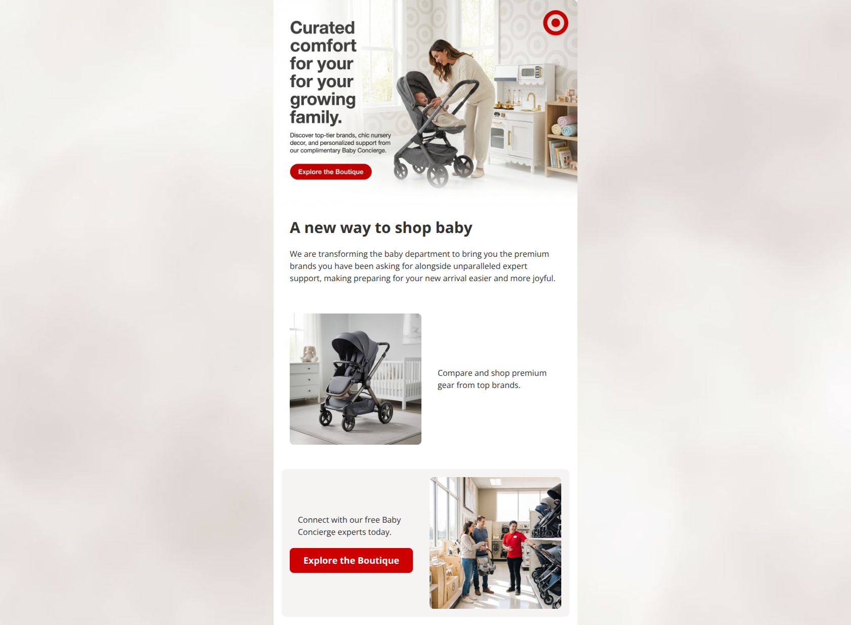
Design Score
65/100This email visually hits the mark for a clean, aspirational Target experience, but fails fundamentally in execution. While the layout is breathable and the photography is strong, a glaring typo in the hero graphic completely undermines the 'premium' messaging, and vague copy leaves potential clicks on the table.
Create Your Own
Generate professional email designs like this one in seconds with Kopi AI.
Email Details
- Subject Line
- Welcome to the Target Baby Boutique
- Brand
- Target
- Industry
- Other
- Email Type
- Announcement
- Created
- March 3, 2026
Brand Colors
Email Copy
A new way to shop baby
We are transforming the baby department to bring you the premium brands you have been asking for alongside unparalleled expert support, making preparing for your new arrival easier and more joyful.
Compare and shop premium gear from top brands.
Connect with our free Baby Concierge experts today.
→ Explore the Boutique
Why This Email Works
This email visually hits the mark for a clean, aspirational Target experience, but fails fundamentally in execution. While the layout is breathable and the photography is strong, a glaring typo in the hero graphic completely undermines the 'premium' messaging, and vague copy leaves potential clicks on the table.
Hero Impact
60/100- Aspirational, high-quality photography clearly signals the target audience and context.
- The Target bullseye logo is prominently but cleanly placed.
Content Structure & Flow
80/100- Clear progression from the overall announcement to specific features (gear, concierge).
- The alternating 'zig-zag' layout for the content cards creates a nice visual rhythm that encourages scrolling.
Visual Hierarchy & Layout
75/100- Excellent use of whitespace and background color blocking to separate sections without clutter.
- Images and text are well-balanced and don't overwhelm the reader.
Call-to-Action Strength
65/100- The brand red (#CC0000) provides excellent contrast against the light backgrounds, making the buttons unmissable.
- Button design is clean and clearly tappable.
Message Clarity & Tone
40/100- The concept of bringing 'premium brands' and 'expert support' together is a strong, clear value proposition.
- The tone feels supportive and optimistic, aligning with the brand guidelines.
Readability & Scannability
65/100- Text blocks are generally kept short and manageable.
- High contrast between the dark text (#333333) and light backgrounds ensures easy reading.
Offer & Value Proposition
70/100- Clearly highlights two distinct reasons to shop: premium gear and free expert help.
- Positions the new department as a solution to the stress of preparing for a baby ('easier and more joyful').
Personalization & Audience Fit
70/100- Photography features relatable, diverse families and realistic retail environments.
- Directly addresses the needs of the target demographic (convenience, quality, and support).
Quick Wins
- Fix the glaring 'for your for your' typographical error in the hero image graphic.
- Add a CTA (e.g., 'Shop Top Brands') to the first content card alongside the stroller image.
- Break the long introductory sentence under 'A new way to shop baby' into two shorter sentences for better readability.
Create Professional Email Designs
Generate beautiful, on-brand email designs in seconds. Just enter your brand URL and let AI do the rest.