Nonprofit Announcement Email Template
“80 Female Media Students Strengthen Their Digital”
Design Score
80/100This email is a visually striking, highly professional execution that perfectly captures the authoritative, institutional identity of the SEMC brand. The grid-based layout, bold use of brand colors, and clear typography build immediate trust and credibility. However, as a conversion vehicle designed to drive clicks, it suffers from a critical strategic flaw: it acts as a comprehensive summary rather than a compelling teaser. By giving away the core facts, expert quotes, and student testimonials directly in the email body, it entirely closes the curiosity gap, leaving the reader with no compelling reason to click the primary CTA. It is a beautiful newsletter that fundamentally cannibalizes its own landing page traffic.
Create Your Own
Generate professional email designs like this one in seconds with Kopi AI.
Email Details
- Subject Line
- 80 Female Media Students Strengthen Their Digital
- Brand
- Studies & Economic Media Center (SEMC)
- Industry
- Nonprofit
- Email Type
- Announcement
- Created
- June 8, 2026
Brand Colors
Email Copy
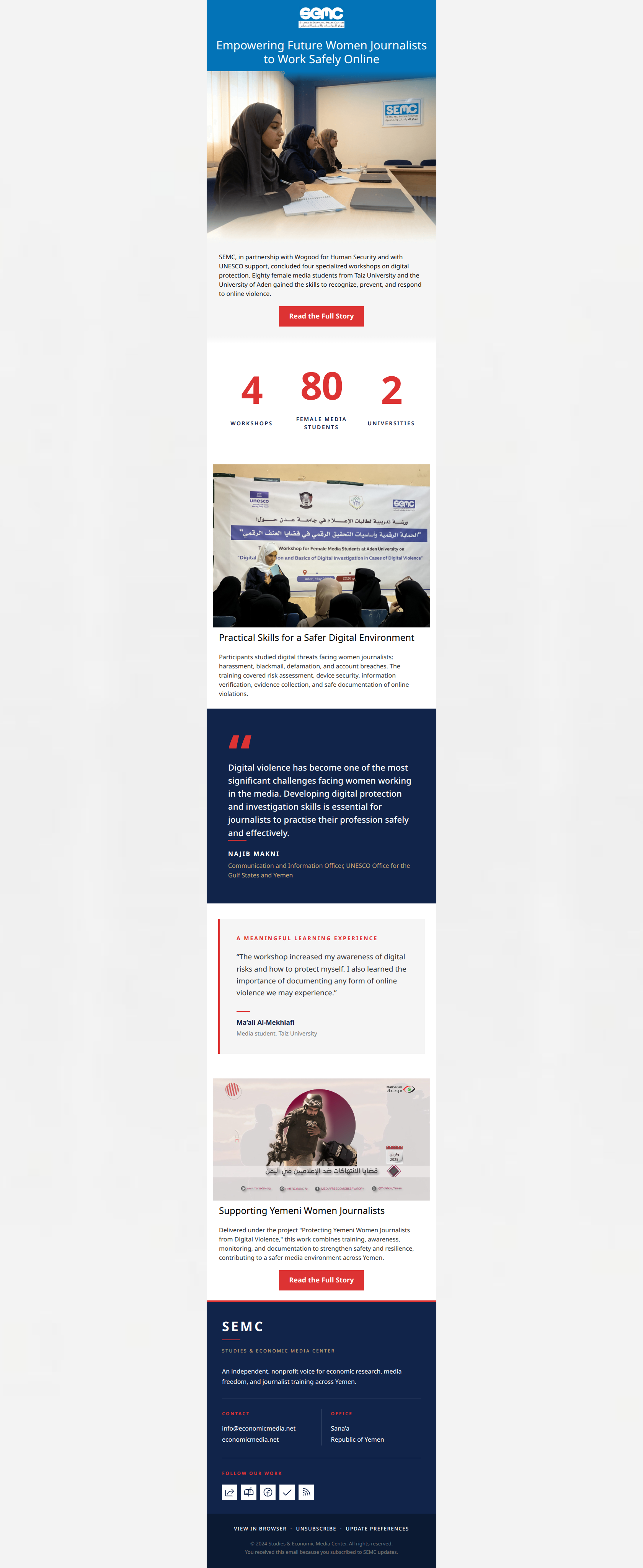
Empowering Future Women Journalists to Work Safely Online
SEMC, in partnership with Wogood for Human Security and with UNESCO support, concluded four specialized workshops on digital protection. Eighty female media students from Taiz University and the University of Aden gained the skills to recognize, prevent, and respond to online violence.
→ Read the Full Story
Practical Skills for a Safer Digital Environment
Participants studied digital threats facing women journalists: harassment, blackmail, defamation, and account breaches. The training covered risk assessment, device security, information verification, evidence collection, and safe documentation of online violations.
Supporting Yemeni Women Journalists
Delivered under the project "Protecting Yemeni Women Journalists from Digital Violence," this work combines training, awareness, monitoring, and documentation to strengthen safety and resilience, contributing to a safer media environment across Yemen.
→ Read the Full Story
Why This Email Works
This email is a visually striking, highly professional execution that perfectly captures the authoritative, institutional identity of the SEMC brand. The grid-based layout, bold use of brand colors, and clear typography build immediate trust and credibility. However, as a conversion vehicle designed to drive clicks, it suffers from a critical strategic flaw: it acts as a comprehensive summary rather than a compelling teaser. By giving away the core facts, expert quotes, and student testimonials directly in the email body, it entirely closes the curiosity gap, leaving the reader with no compelling reason to click the primary CTA. It is a beautiful newsletter that fundamentally cannibalizes its own landing page traffic.
1. Hero (top/initial part) Impact
85/100- Unambiguous, professional headline that directly addresses the core value proposition.
- High-quality, relevant hero image that matches the brand's factual, news-driven tone.
- Excellent color contrast between the navy header and white text.
2. Content Structure & Flow
82/100- Logical, journalistic progression of information.
- Excellent use of the statistics block (4 Workshops, 80 Students) to break up the narrative and provide instant, scannable proof of impact.
3. Visual Hierarchy & Layout
92/100- Masterful use of color-blocking to separate distinct sections (Hero, Stats, Quotes).
- The custom HTML stats block is a high-impact, low-cognitive-load way to deliver value.
- Typography size and weight are perfectly balanced to guide the eye down the page.
4. Call-to-Action Strength
95/100- Perfect consistency in CTA copy ('Read the Full Story') pointing to the same destination.
- High-contrast red buttons (#DD3333) practically leap off the light gray and white backgrounds.
- Appropriate frequency (repeated twice) for the length of the email.
5. Message Clarity & Tone
88/100- Zero sensationalism; the copy relies on facts, numbers, and direct quotes.
- Use of real names and institutional titles (UNESCO, Taiz University) builds immense credibility.
6. Readability & Scannability
78/100- The stats block and quote cards provide visual 'breathing room' between text sections.
- Headings are sized appropriately to guide the reader's eye.
7. Offer & Value Proposition
55/100- The baseline value (important information regarding media safety) is highly relevant to the audience's pain points.
8. Personalization & Audience Fit
85/100- Highlights practical, tangible empowerment for a vulnerable group (female journalists in Yemen).
- Uses culturally and professionally relevant context markers (specific universities, UNESCO partnership).
9. Copy Conciseness & Word Economy
65/100- Avoids fluffy, hyperbolic adjectives in favor of concrete nouns and verbs.
Quick Wins
- Format the 'Practical Skills' paragraph into a short 3-point bulleted list to dramatically improve scannability.
- Move the first 'Read the Full Story' button up to sit immediately below the Hero image, before the dense introductory text.
- Shorten the lengthy UNESCO job title in the quote card to reduce visual clutter and keep focus on the quote itself.
Create Professional Email Designs
Generate beautiful, on-brand email designs in seconds. Just enter your brand URL and let AI do the rest.