SaaS & Software Product Launch Email Template
“Two new ways to get more from VendorBay”
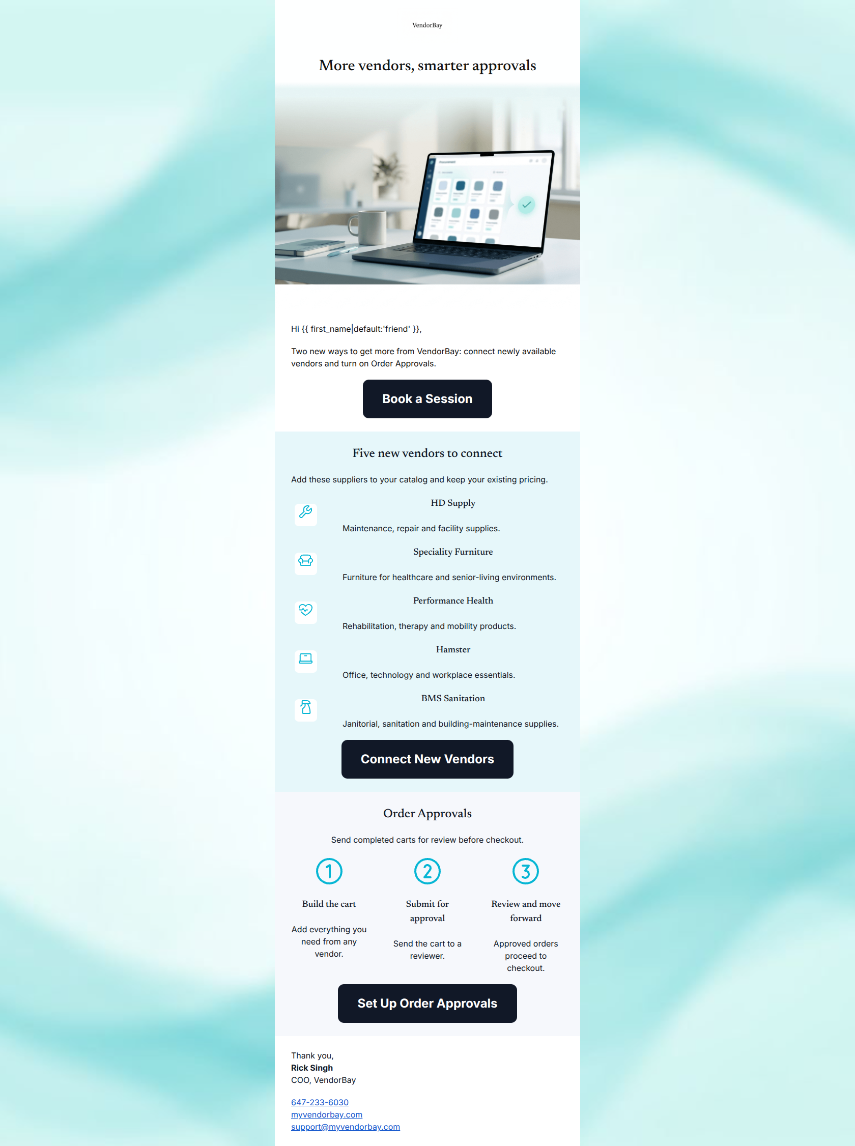
Design Score
80/100This is a clean, scannable, and structurally sound product announcement email that effectively communicates two highly relevant updates. The word economy is excellent, and the visual hierarchy guides the eye smoothly. However, the email suffers from a significant conversion friction point: the CTA copy creates a 'bait-and-switch' experience. While all buttons correctly point to a single conversion goal (a calendar booking link), the localized button text implies in-app actions, which will likely cause users to bounce when they land on a calendar instead of a settings page.
Create Your Own
Generate professional email designs like this one in seconds with Kopi AI.
Email Details
- Subject Line
- Two new ways to get more from VendorBay
- Brand
- VendorBay
- Industry
- SaaS & Software
- Email Type
- Product Launch
- Created
- July 7, 2026
Brand Colors
Email Copy
More vendors, smarter approvals
Hi friend,
Two new ways to get more from VendorBay: connect newly available vendors and turn on Order Approvals.
→ Book a Session
Five new vendors to connect
Add these suppliers to your catalog and keep your existing pricing.
HD Supply
Maintenance, repair and facility supplies.
Speciality Furniture
Furniture for healthcare and senior-living environments.
Performance Health
Rehabilitation, therapy and mobility products.
Hamster
Office, technology and workplace essentials.
BMS Sanitation
Janitorial, sanitation and building-maintenance supplies.
→ Connect New Vendors
Order Approvals
Send completed carts for review before checkout.
Build the cart
Add everything you need from any vendor.
Submit for approval
Send the cart to a reviewer.
Review and move forward
Approved orders proceed to checkout.
→ Set Up Order Approvals
Thank you, Rick Singh COO, VendorBay
647-233-6030 myvendorbay.com support@myvendorbay.com
Why This Email Works
This is a clean, scannable, and structurally sound product announcement email that effectively communicates two highly relevant updates. The word economy is excellent, and the visual hierarchy guides the eye smoothly. However, the email suffers from a significant conversion friction point: the CTA copy creates a 'bait-and-switch' experience. While all buttons correctly point to a single conversion goal (a calendar booking link), the localized button text implies in-app actions, which will likely cause users to bounce when they land on a calendar instead of a settings page.
Hero Impact
68/100- The headline instantly answers 'What is this about?'
- The layout is clean and the text size establishes a clear starting point.
Content Structure & Flow
85/100- Distinct, color-blocked sections make the transition between topics obvious.
- The introduction provides a concise roadmap of what the reader will find in the email.
Visual Hierarchy & Layout
82/100- Excellent use of alternating background colors (#E6F7FA, #F6F8FC) to delineate sections.
- Headings visually dominate the body text, establishing a clear scan path.
Call-to-Action Strength
60/100- You correctly repeated the primary destination throughout the email.
- The buttons use the dark slate brand color (#111827), providing excellent contrast against all backgrounds.
Message Clarity & Tone
82/100- The line 'keep your existing pricing' is brilliant—it addresses a major pain point directly and clearly.
- The 3-step approval explanation is distilled down to its absolute essence.
Readability & Scannability
92/100- No walls of text; information is chunked into highly digestible cards and rows.
- The 3-column layout for the order approvals process reduces cognitive load significantly.
Offer & Value Proposition
85/100- Vendor descriptions are hyper-specific (e.g., 'Janitorial, sanitation...').
- The connection between the feature ('send carts for review') and the outcome is easy to grasp.
Personalization & Audience Fit
75/100- The selected vendors are highly relevant to the target demographic of nursing homes and clinics.
- Sign-off from the COO adds a layer of authority and personal touch.
Copy Conciseness & Word Economy
95/100- No 'We are excited to announce...' filler text.
- Descriptions for vendors are limited to a single, descriptive sentence.
Quick Wins
- Change the fallback in the greeting from 'friend' to a more professional B2B term, or remove the word entirely if the first name is missing.
- Update the localized button copy ('Connect New Vendors', 'Set Up Order Approvals') to accurately reflect that the user will be booking a calendar session (e.g., 'Book a Setup Call').
- Add one sentence to the 'Order Approvals' section explicitly stating that it 'eliminates rogue spending'.
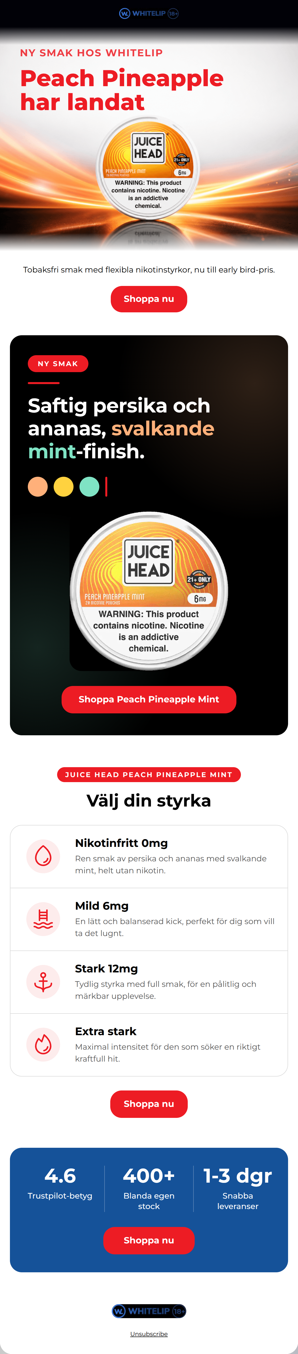


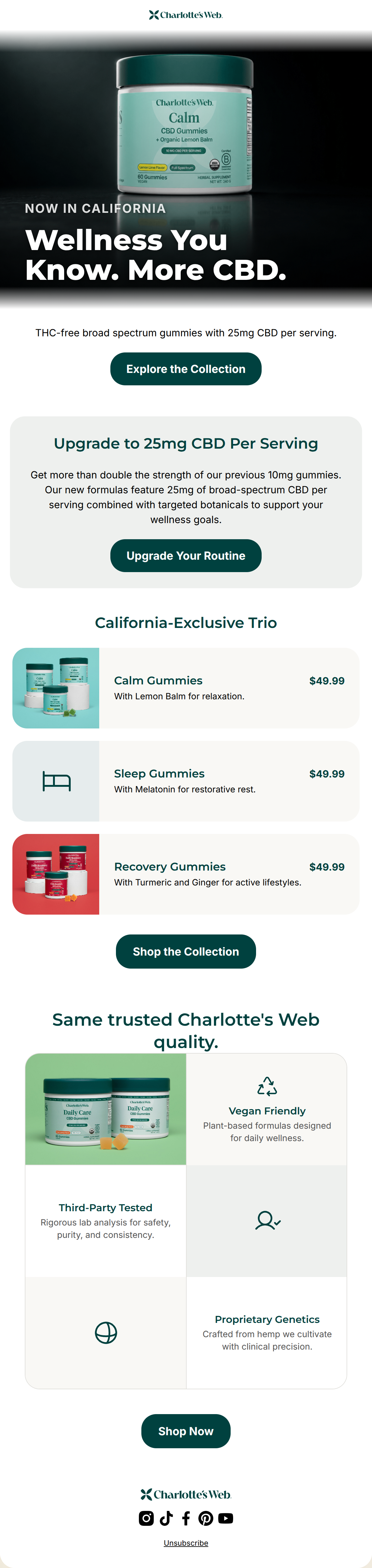
Create Professional Email Designs
Generate beautiful, on-brand email designs in seconds. Just enter your brand URL and let AI do the rest.