Health & Wellness Welcome Email Template
“Welcome to the hydration upgrade”
Design Score
82/100A visually striking and highly scannable welcome email that nails brand aesthetics, word economy, and structural best practices. The disciplined repetition of a single primary CTA ('Shop Best Sellers') creates a frictionless conversion path. However, the email leaves significant revenue on the table by omitting a clear introductory offer (like a welcome discount) and relying on slightly cliché hero copy. It functions excellently as a brand introduction but misses the psychological trigger needed to drive immediate first-purchase conversion.
Create Your Own
Generate professional email designs like this one in seconds with Kopi AI.
Email Details
- Subject Line
- Welcome to the hydration upgrade
- Brand
- Liquid I.V.
- Industry
- Health & Wellness
- Email Type
- Welcome
- Created
- May 20, 2026
Brand Colors
Email Copy
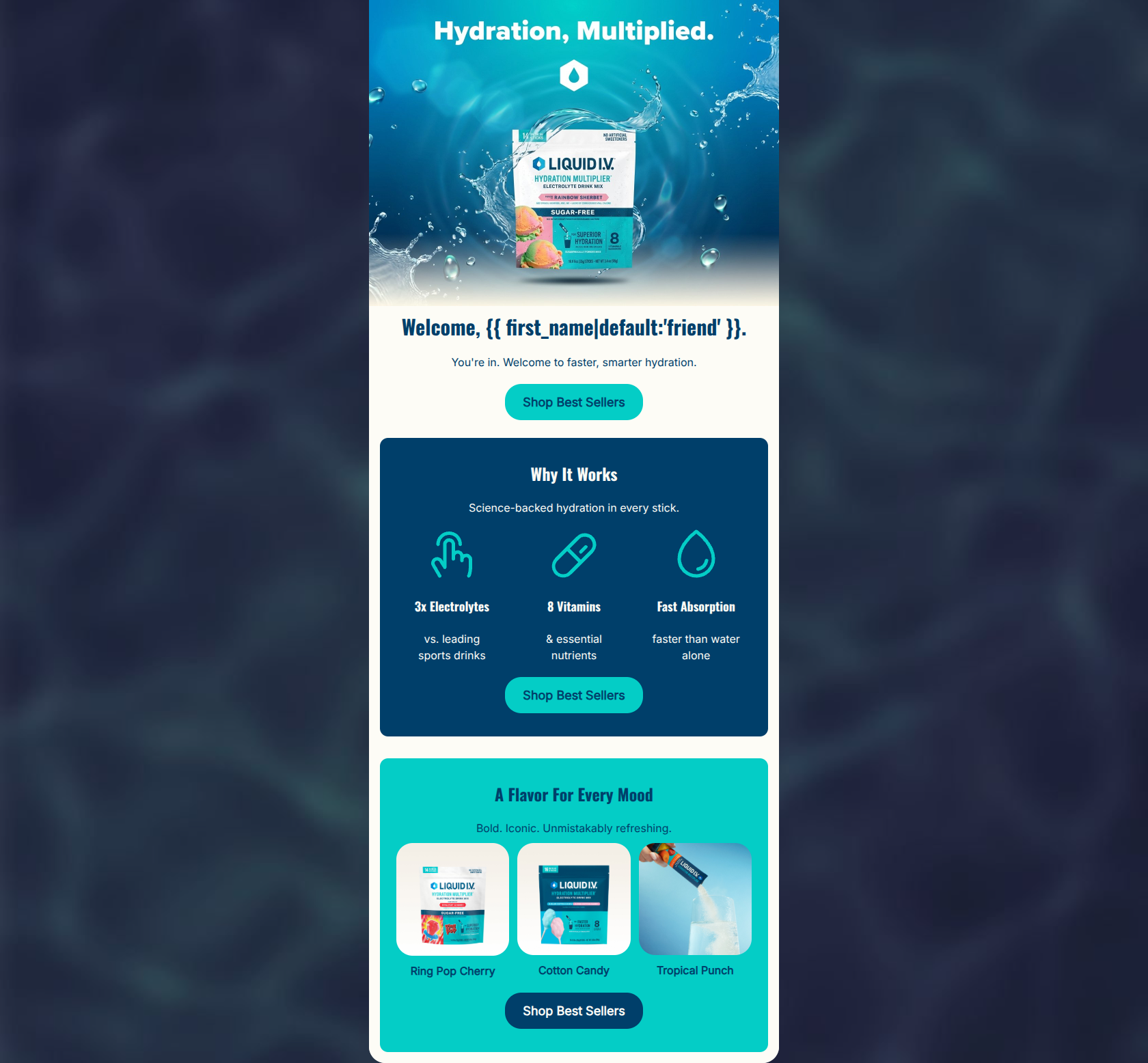
Welcome, friend.
You're in. Welcome to faster, smarter hydration.
→ Shop Best Sellers
Why It Works
Science-backed hydration in every stick.
3x Electrolytes
vs. leading sports drinks
8 Vitamins
& essential nutrients
Fast Absorption
faster than water alone
→ Shop Best Sellers
A Flavor For Every Mood
Bold. Iconic. Unmistakably refreshing.
Ring Pop Cherry
Cotton Candy
Tropical Punch
→ Shop Best Sellers
Why This Email Works
A visually striking and highly scannable welcome email that nails brand aesthetics, word economy, and structural best practices. The disciplined repetition of a single primary CTA ('Shop Best Sellers') creates a frictionless conversion path. However, the email leaves significant revenue on the table by omitting a clear introductory offer (like a welcome discount) and relying on slightly cliché hero copy. It functions excellently as a brand introduction but misses the psychological trigger needed to drive immediate first-purchase conversion.
Hero Impact
72/100- High-quality, energetic product imagery immediately sets the brand tone.
- Uses dynamic personalization tags for the greeting.
- Clear, high-contrast CTA button immediately visible without scrolling.
Content Structure & Flow
88/100- Excellent use of color-blocking to delineate distinct content sections.
- Logical progression from education ('Why It Works') to product selection ('A Flavor For Every Mood').
Visual Hierarchy & Layout
85/100- Excellent contrast between background colors and text/CTAs.
- The three-column icon layout is visually balanced and prevents the email from feeling text-heavy.
Call-to-Action Strength
95/100- Unwavering focus on a single destination URL and user action.
- Consistent button language creates a predictable and reliable click expectation.
- Exceptional color contrast ensures buttons pass the 'squint test' effortlessly.
Message Clarity & Tone
82/100- Authoritative and energetic tone matches the brand's athletic/modern positioning.
- Avoids overly clinical language while still communicating scientific benefits.
Readability & Scannability
92/100- Zero walls of text; relies entirely on short, punchy phrases.
- Icons do the heavy lifting for communicating the functional benefits.
Offer & Value Proposition
65/100- The core functional benefits of the product are distilled into three highly digestible points.
Personalization & Audience Fit
75/100- Vibe and visual language accurately reflect the active, premium target demographic.
Copy Conciseness & Word Economy
90/100- Zero redundant sentences.
- Relies on strong, specific nouns and verbs rather than fluffy adjectives.
Quick Wins
- Add an explicit introductory offer (discount code or free shipping callout) to the hero section to immediately incentivize the first purchase.
- Increase the image size of the flavor pouches in the third section to improve visual appeal and product recognition.
- Change the hero subcopy from 'You're in. Welcome to...' to a more benefit-driven hook.
Create Professional Email Designs
Generate beautiful, on-brand email designs in seconds. Just enter your brand URL and let AI do the rest.