Health & Wellness Welcome Email Template
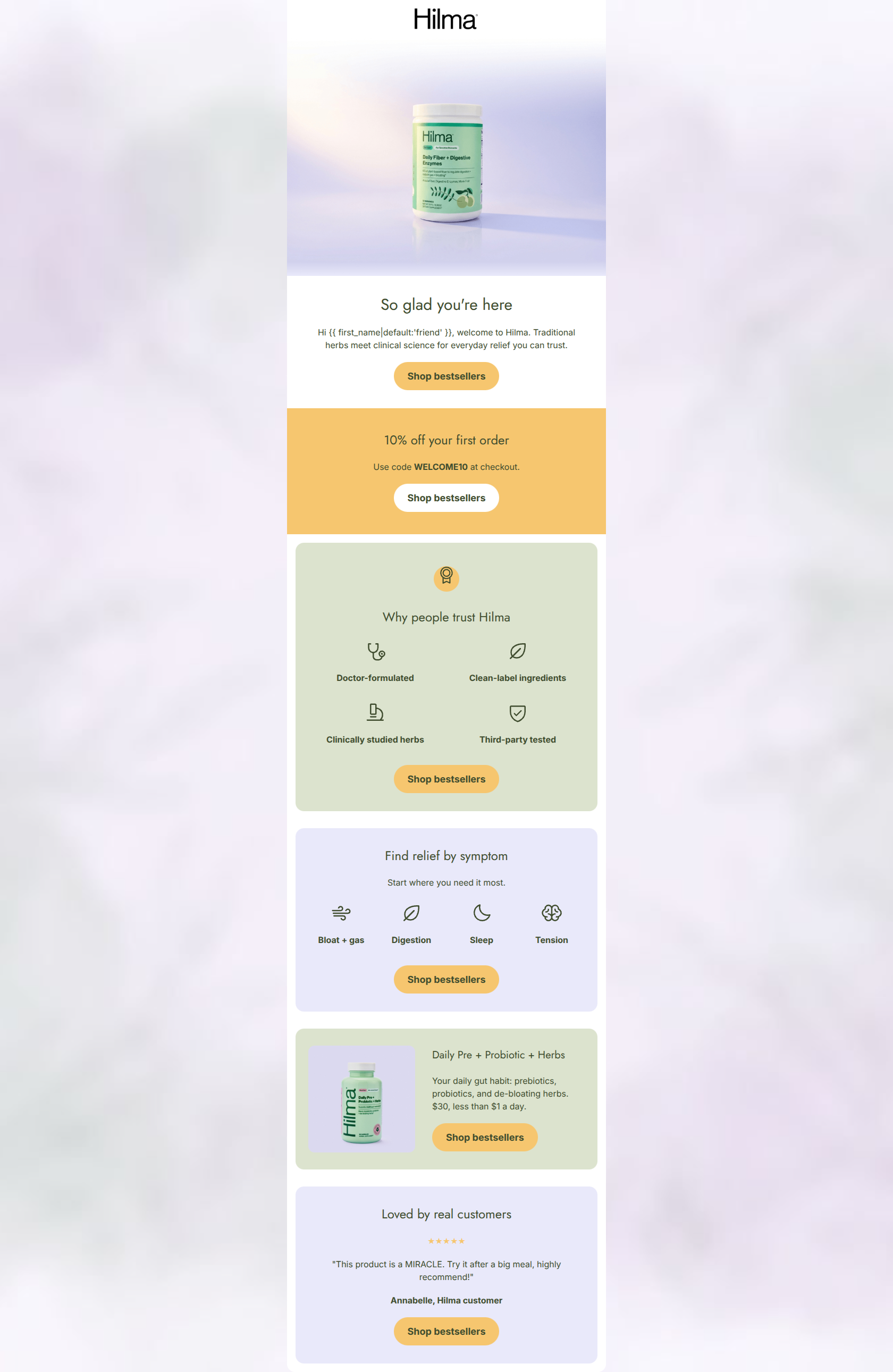
“Welcome to Hilma — we're so glad you're here”
Design Score
80/100This welcome email establishes strong brand trust and clearly communicates Hilma's value proposition through a clean, scannable layout. The visual hierarchy effectively guides the reader from the hero to authority-building elements ('Made with doctors') and specific pain points. The repetitive use of a single primary CTA ('Shop bestsellers') is excellent for conversion focus. However, the email leaves money on the table by burying the welcome offer at the very bottom and using vague copy that forces the user to click just to discover their incentive. A welcome email's primary job is to convert new subscribers with an introductory offer, and making that offer ambiguous introduces unnecessary friction.
Create Your Own
Generate professional email designs like this one in seconds with Kopi AI.
Email Details
- Subject Line
- Welcome to Hilma — we're so glad you're here
- Brand
- Hilma
- Industry
- Health & Wellness
- Email Type
- Welcome
- Created
- June 17, 2026
Brand Colors
Email Copy
Preview text: Welcome to Hilma. Meet the natural remedies backed by clinical science.
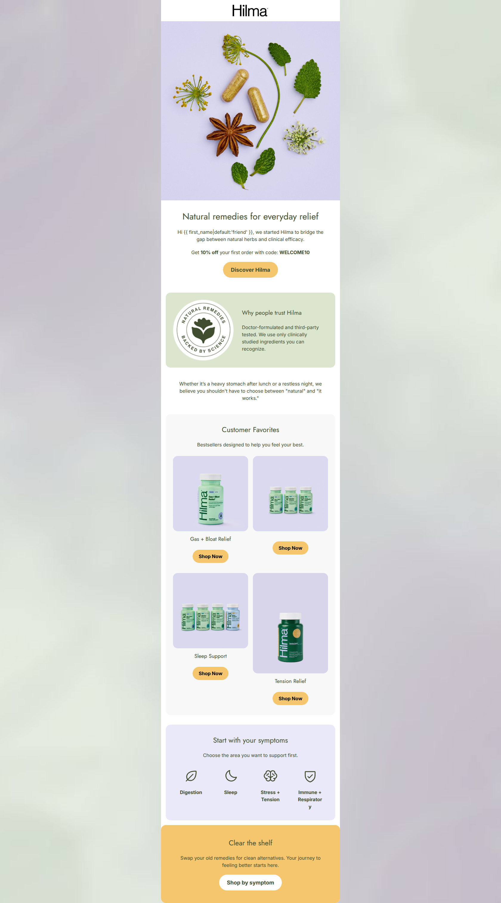
Natural remedies for everyday relief
Hi friend, we started Hilma to bridge the gap between traditional herbs and clinical science.
Use code WELCOME10 for 10% off your first order.
→ Start your journey
Clinical efficacy, naturally
Doctor-formulated and third-party tested. We use only clean, clinically studied ingredients you can recognize.
Whether it’s a heavy stomach or a restless night, you shouldn't have to choose between natural and what works.
Find your relief
Select a category to explore our natural solutions.
Gas + Bloat
Occasional heavy stomach relief.
Digestion
Daily support for gut health.
Sleep
Restorative, drug-free rest.
Stress + Tension
Head and body herbal support.
Clear your shelf
Swap your old medicine cabinet for clean alternatives.
→ Explore all remedies
Why This Email Works
This welcome email establishes strong brand trust and clearly communicates Hilma's value proposition through a clean, scannable layout. The visual hierarchy effectively guides the reader from the hero to authority-building elements ('Made with doctors') and specific pain points. The repetitive use of a single primary CTA ('Shop bestsellers') is excellent for conversion focus. However, the email leaves money on the table by burying the welcome offer at the very bottom and using vague copy that forces the user to click just to discover their incentive. A welcome email's primary job is to convert new subscribers with an introductory offer, and making that offer ambiguous introduces unnecessary friction.
Hero (top/initial part) Impact
75/100- High-quality, contextual lifestyle photography.
- Headline focuses on the ultimate customer benefit ('relief').
Content Structure & Flow
70/100- Logical progression of trust-building elements.
- Sections are clearly delineated by alternating background colors.
Visual Hierarchy & Layout
82/100- Excellent use of iconography to break up text.
- Alternating background colors (#FFFFFF, #DCE5CE, #E9E9FA) create clear visual boundaries without feeling disjointed.
Call-to-Action Strength
95/100- Perfect consistency in destination URL.
- Repetition of the primary button reinforces the conversion goal.
Message Clarity & Tone
80/100- Strong brand voice that balances warmth with clinical credibility.
- Direct language that focuses on solving pain points ('Real solutions for everyday ailments').
Readability & Scannability
88/100- Very tight word count; prevents the 'wall of text' effect.
- Icons and bolding guide the eye down the page naturally.
Offer & Value Proposition
65/100- The '$1/day' framing minimizes the perceived cost of the product.
- Clearly highlights the product as 'more than a probiotic' by listing prebiotics and herbs.
Personalization & Audience Fit
85/100- Directly addresses the exact symptoms the audience struggles with.
- Highlights 'third-party tested' and 'clean-label', which are critical trust signals for this specific consumer.
Copy Conciseness & Word Economy
80/100- The 'Made with doctors' section uses fragments effectively to convey authority quickly.
- No redundant paragraphs; every section introduces a new angle (welcome -> authority -> symptoms -> product).
Quick Wins
- Reveal the exact discount percentage or dollar amount in the welcome offer block.
- Delete 'we're so glad you're here' from the hero and replace it with a one-sentence value proposition.
- Ensure the final CTA button has sufficient contrast against the golden background.
Create Professional Email Designs
Generate beautiful, on-brand email designs in seconds. Just enter your brand URL and let AI do the rest.